PHOTOGRAPHIC PRACTICE
PROCESS - PLANNING - REFINEMENT
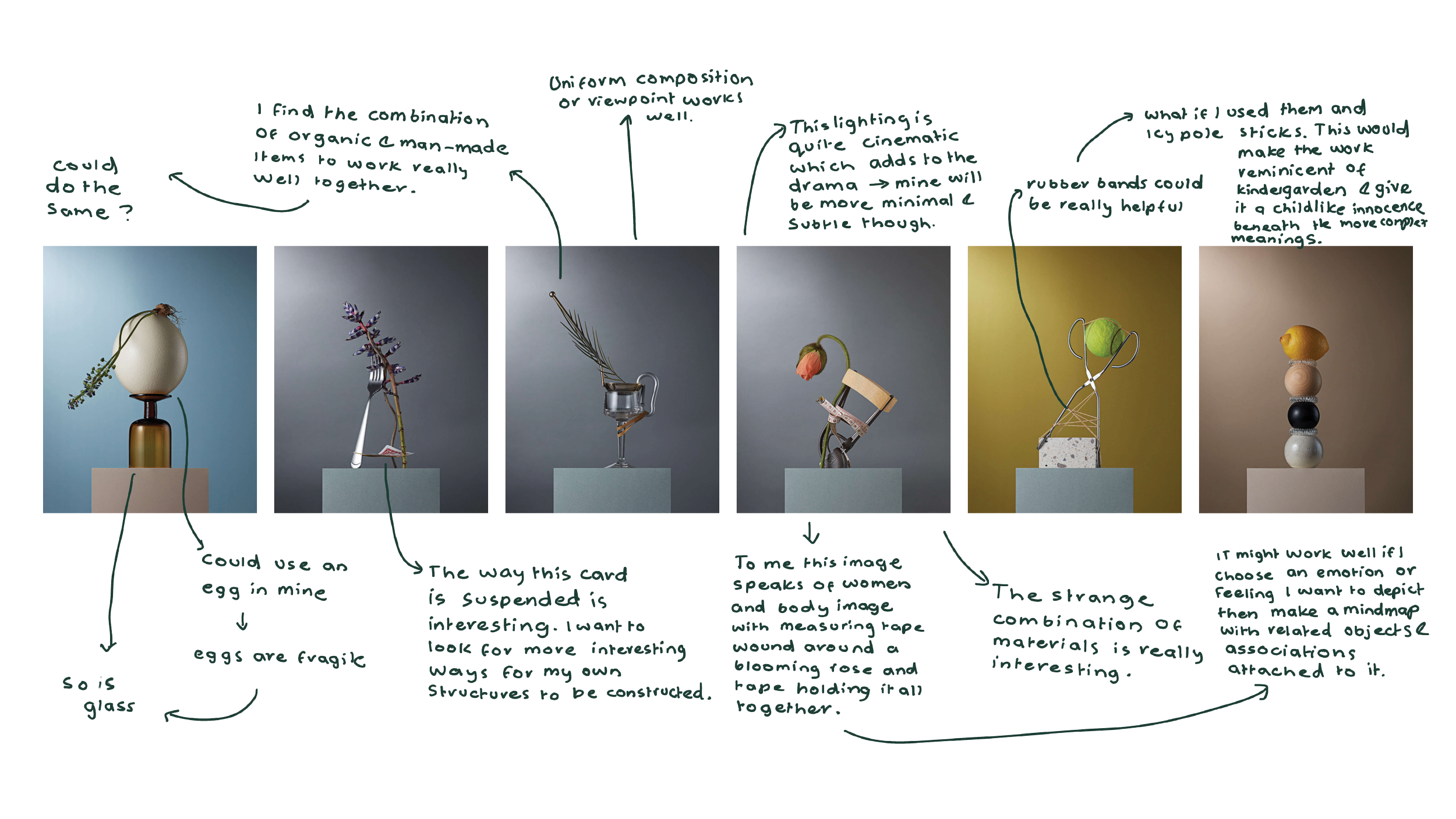
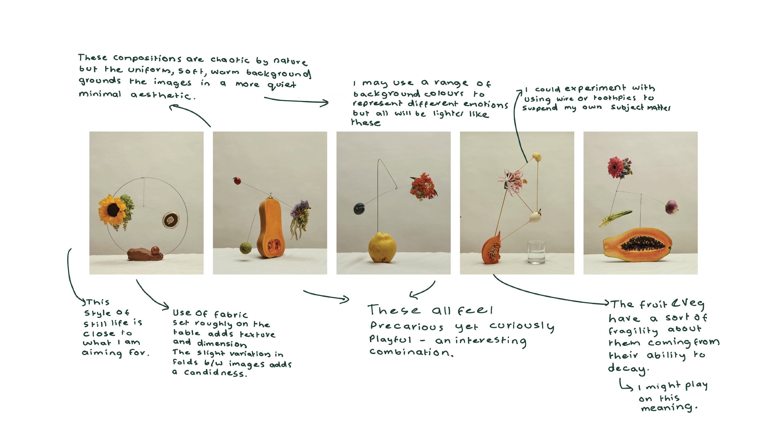
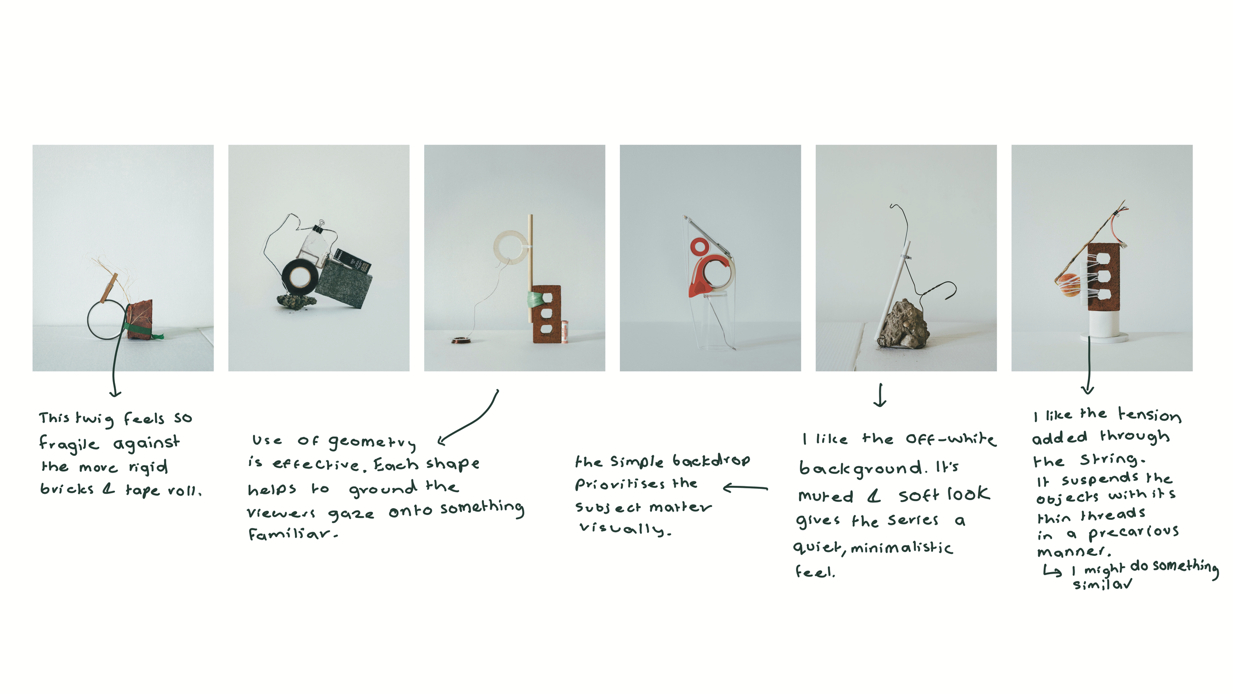
Research and ideation
Began my research by finding artists with similar visuals to my own. I find it easier to ideate and generate ideas for my own works by annotating the works of artists.
Here I drew inspiration from their concepts, compositions, subject matter and aesthetic qualities.
For more in depth artist research visit:
'Totem', Elodie Farge, 2019

Tensioni series', Nicolo Graiani, 2021

Andy Barter, 2018-2019
Untitled, Jean-Marie Binet, 2018

Complex Simplicity, Johnathan Knowles, 2017
The Relationship of Object Connectivity & Interdependence in Forming a Sculptural Whole, Sharon Radisch, 2020
Photoshoot Planning


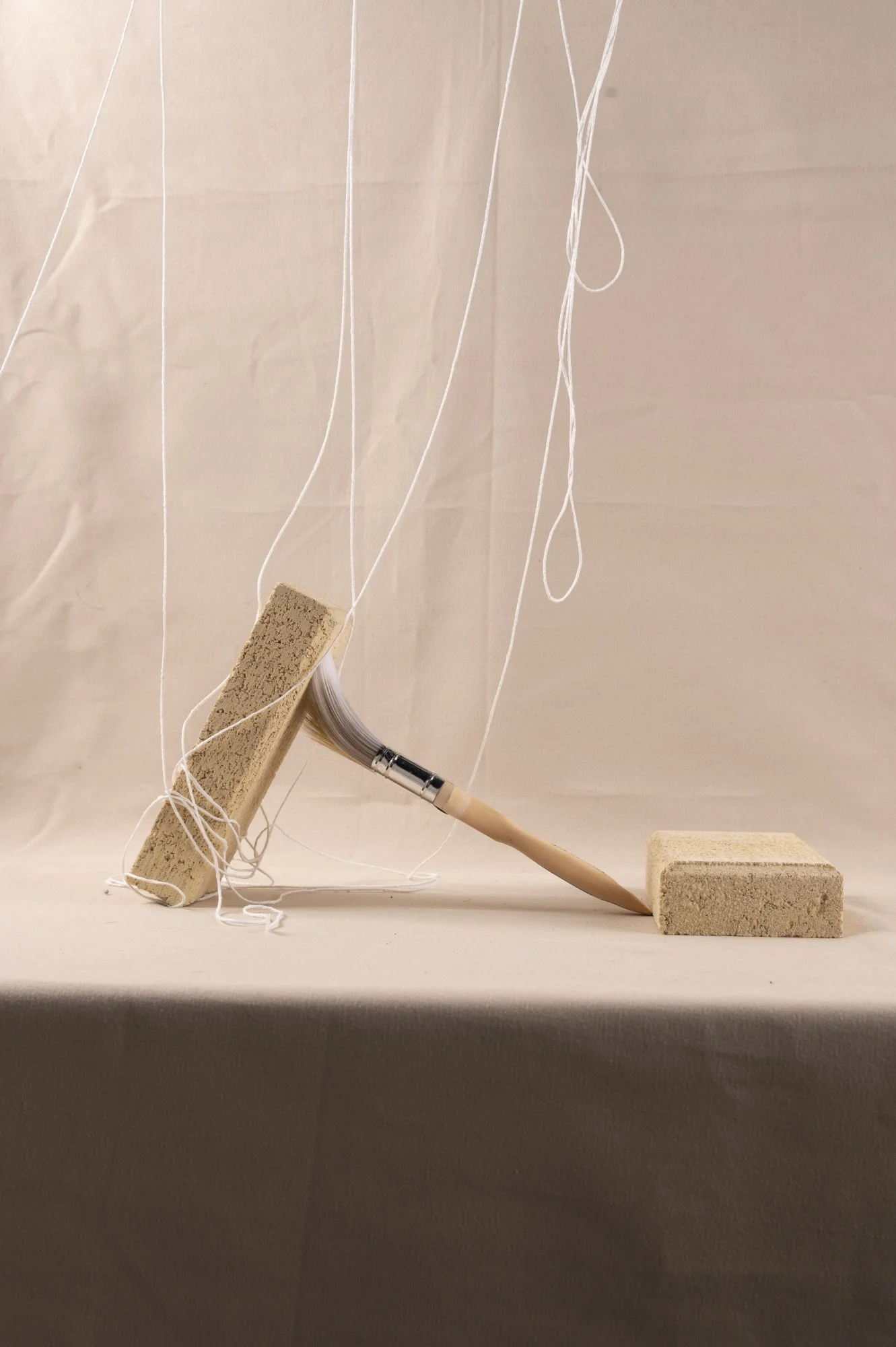
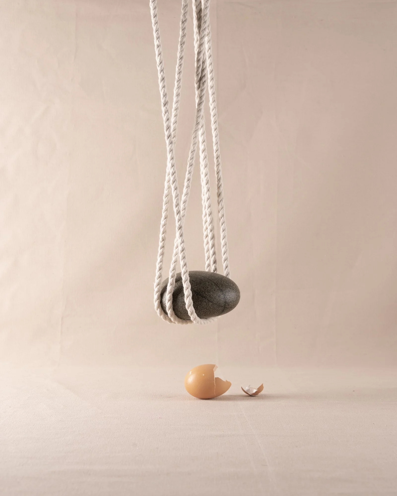
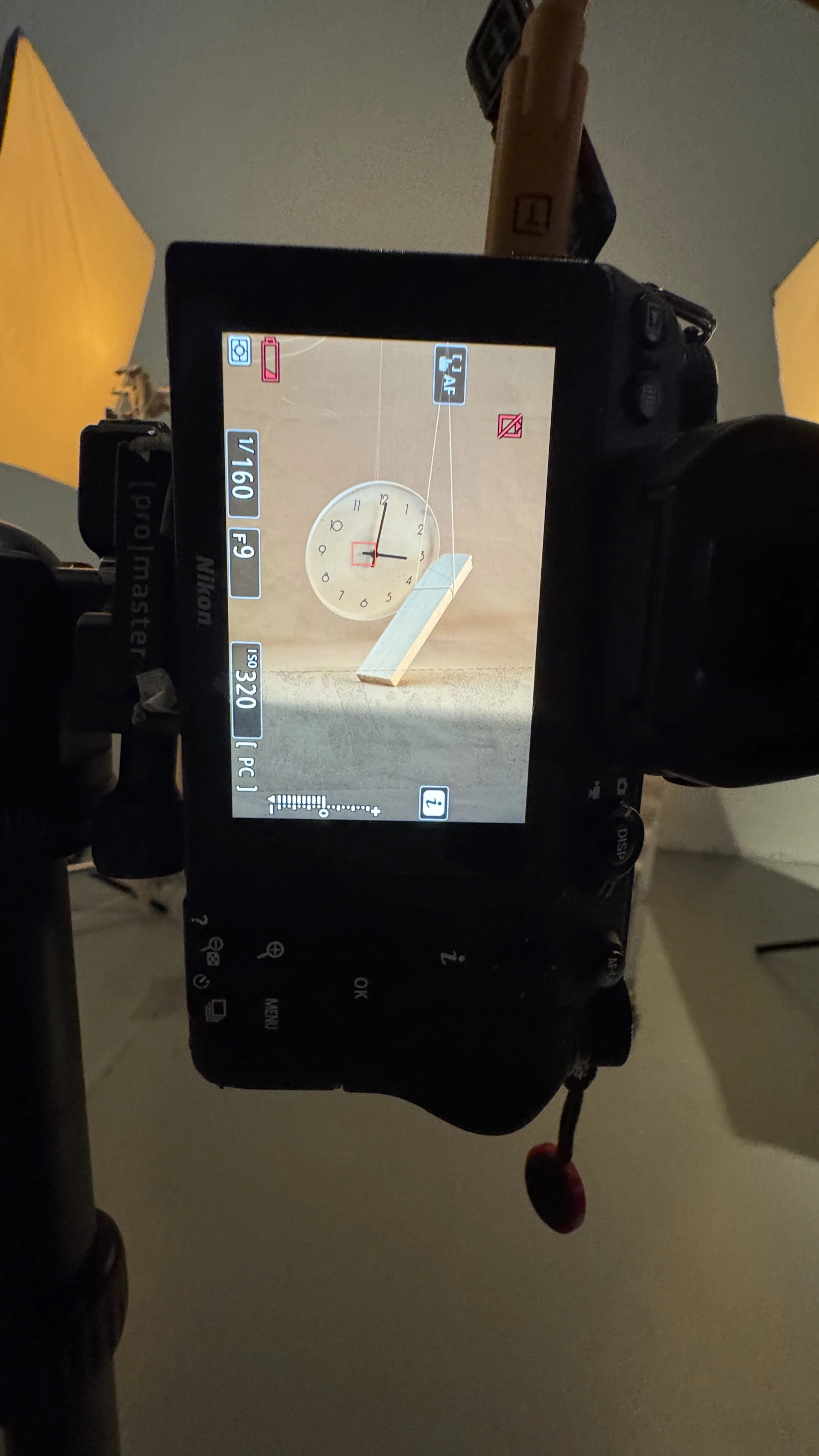
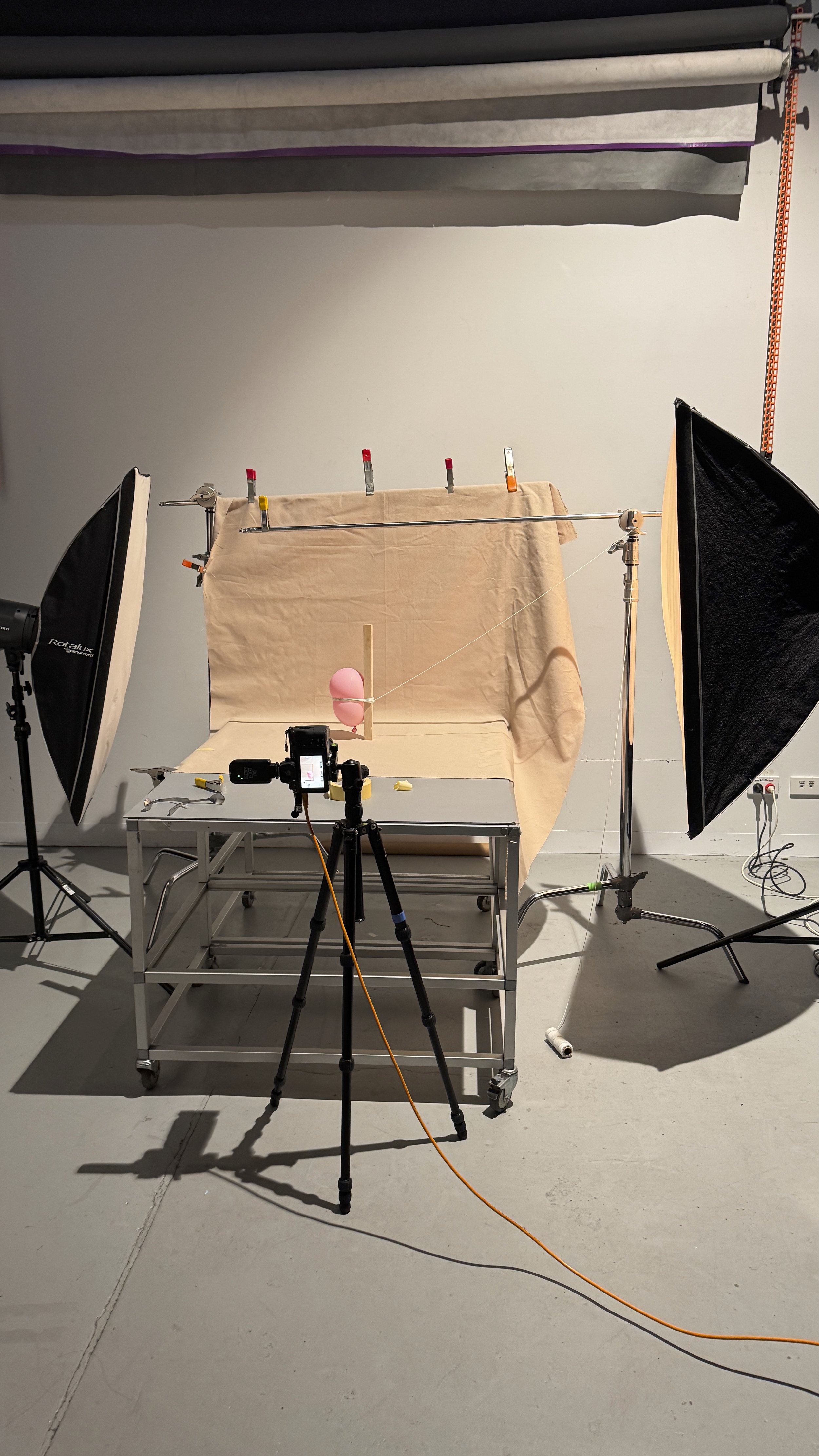
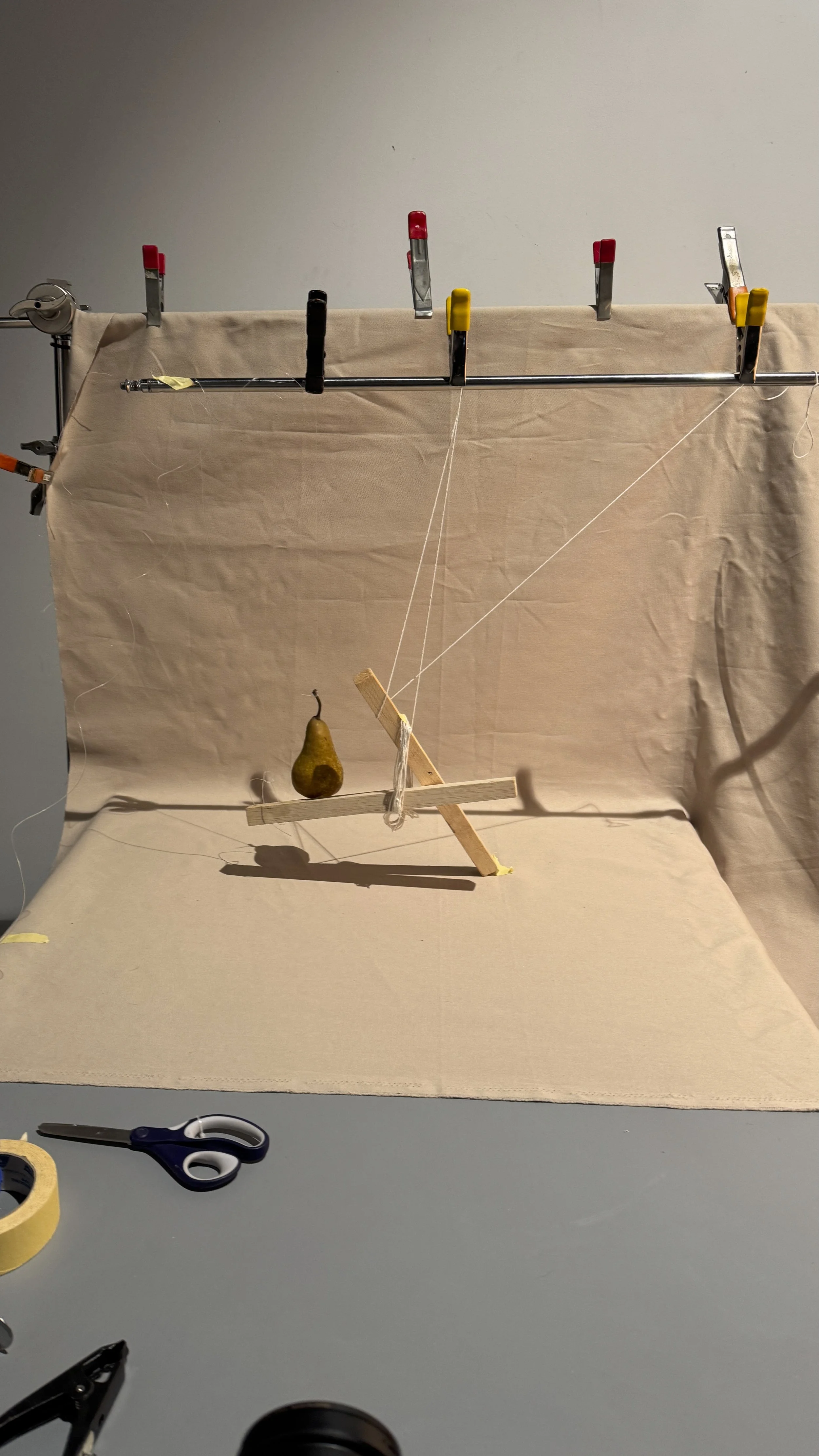
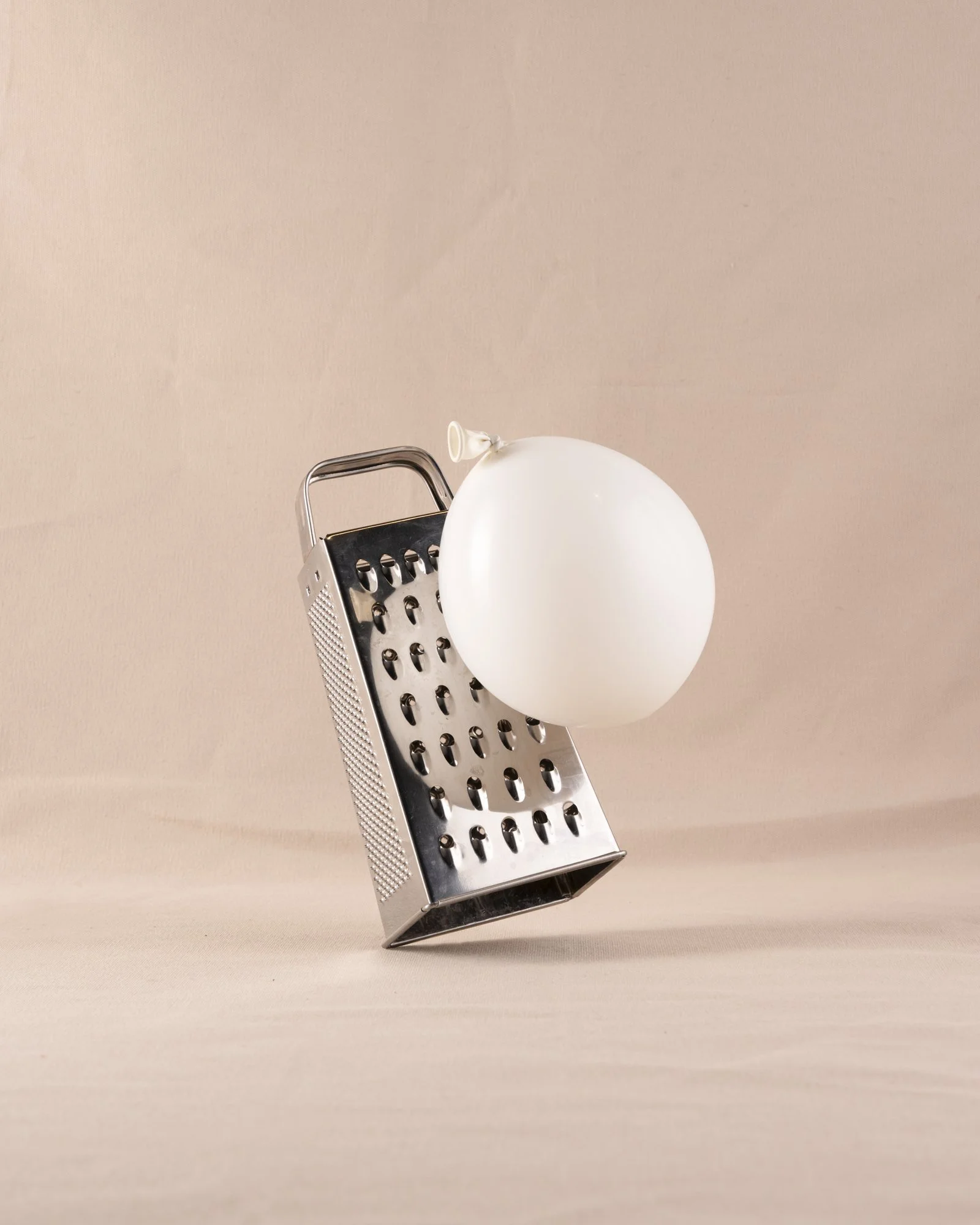
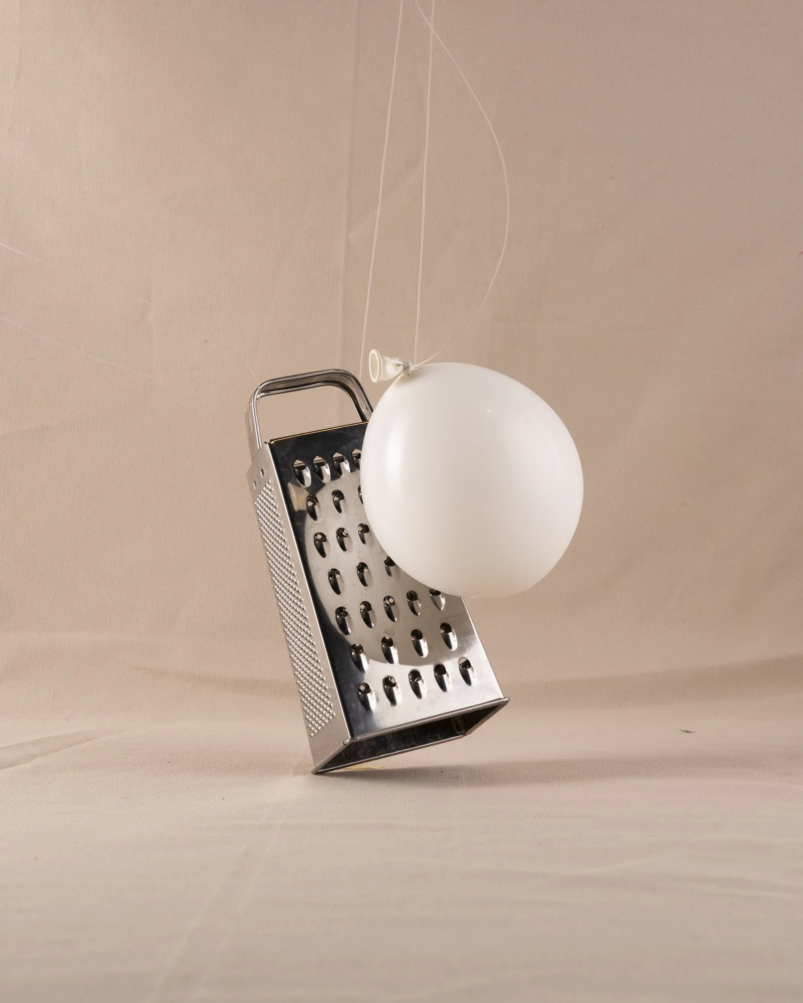
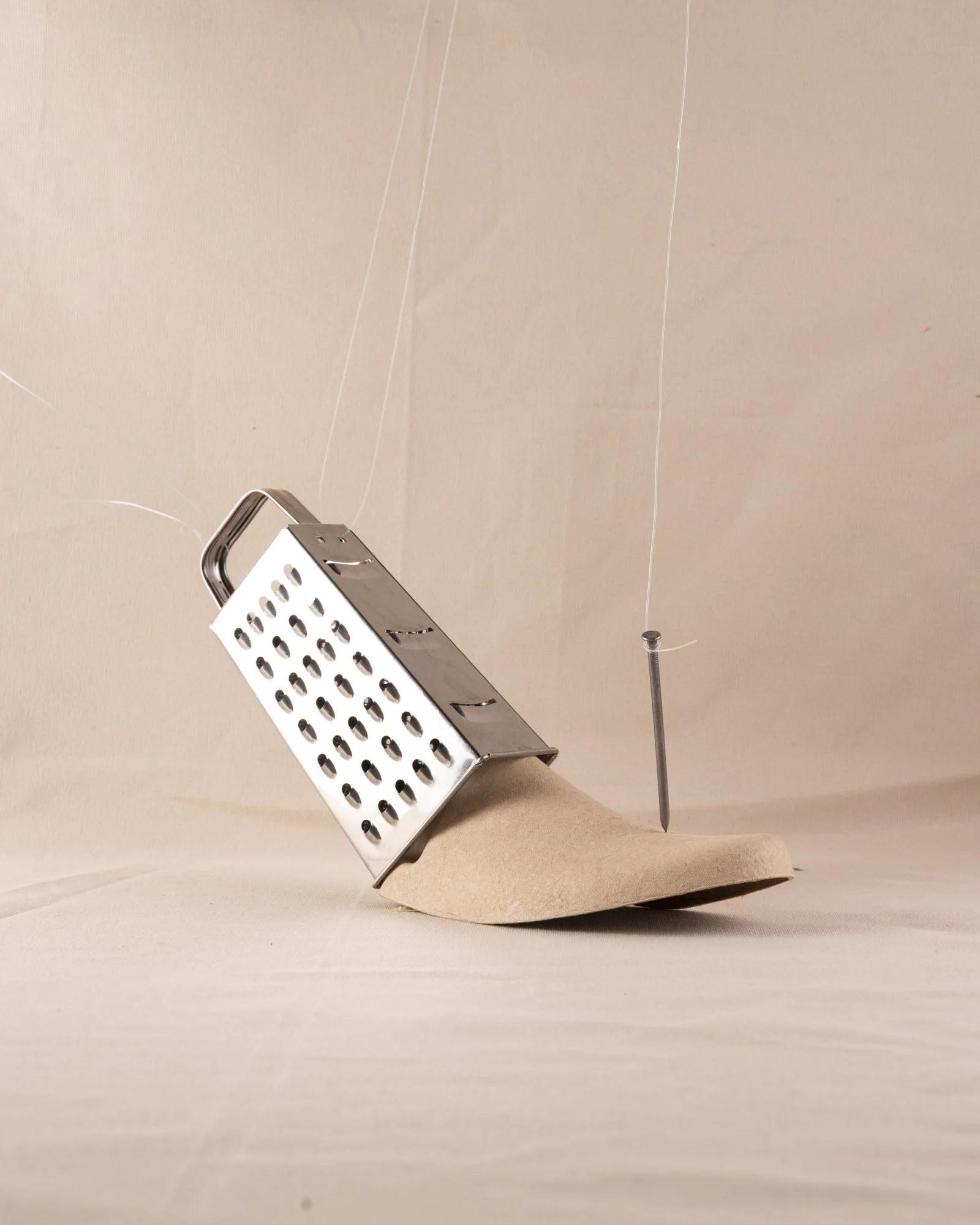
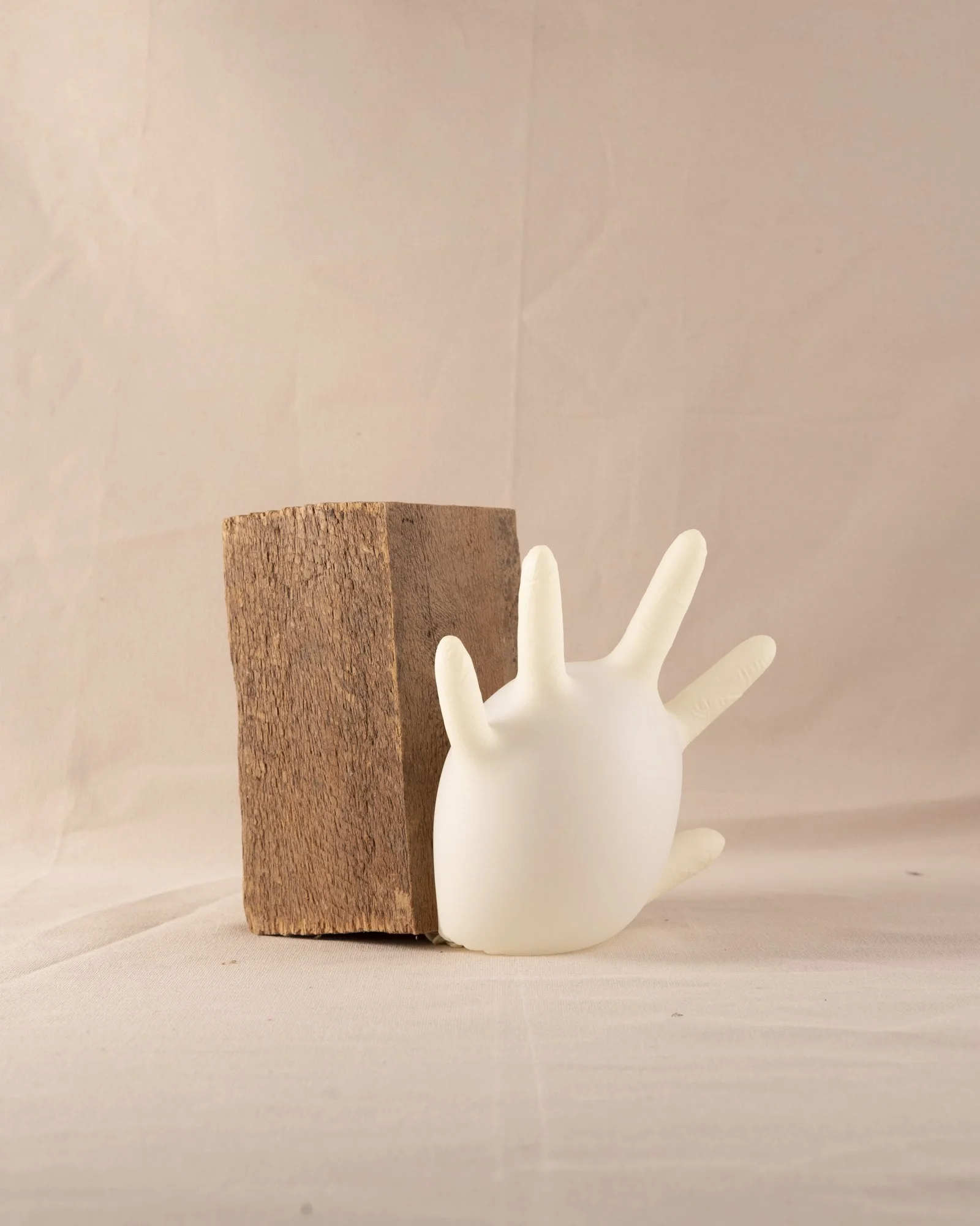
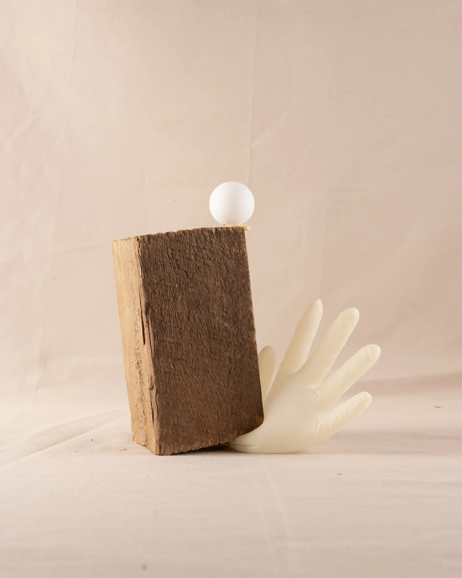
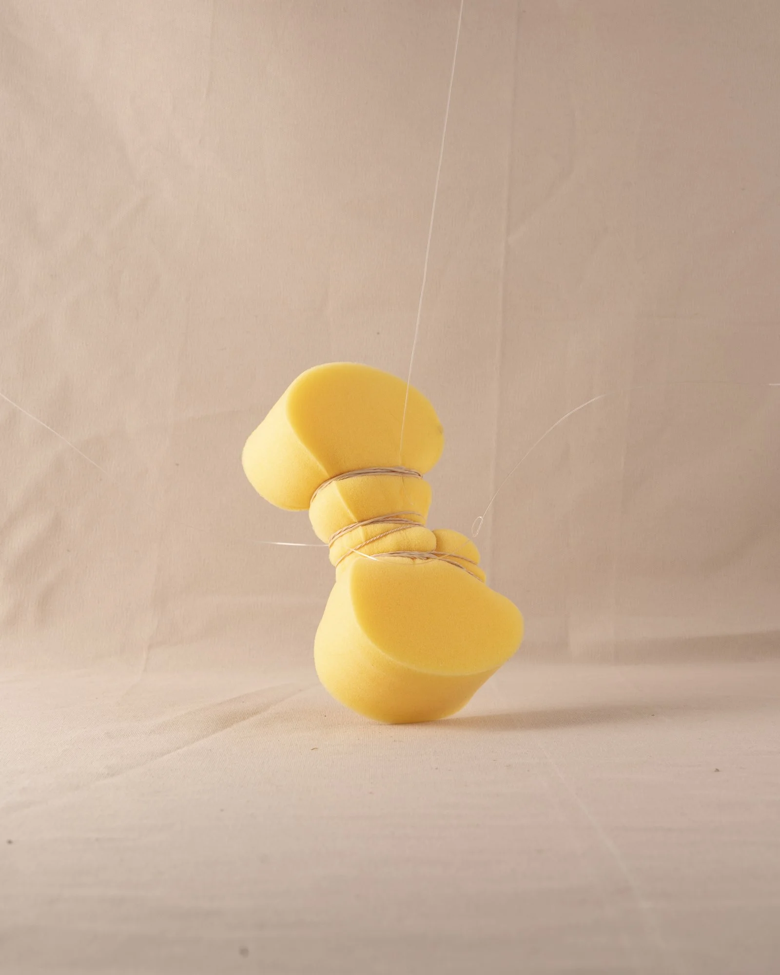
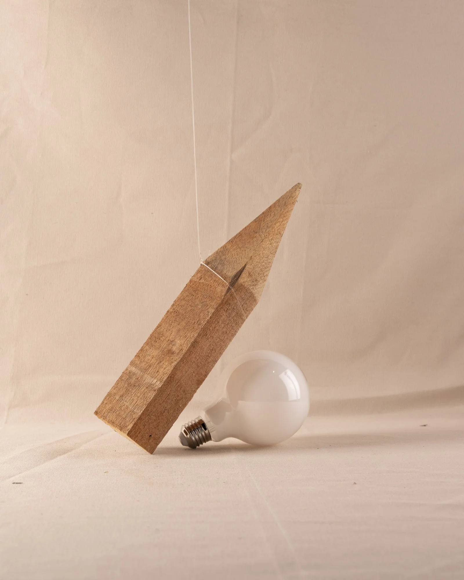
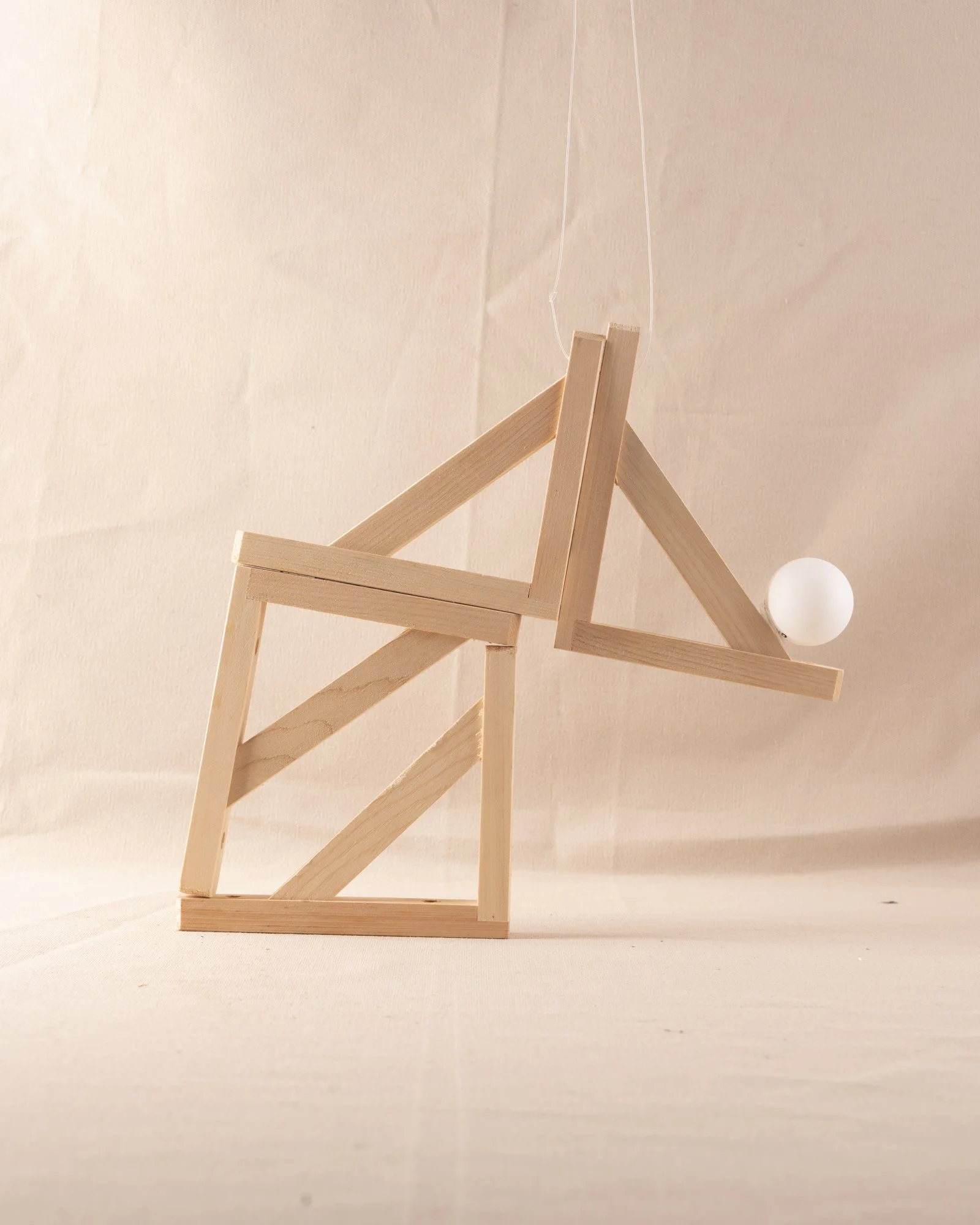
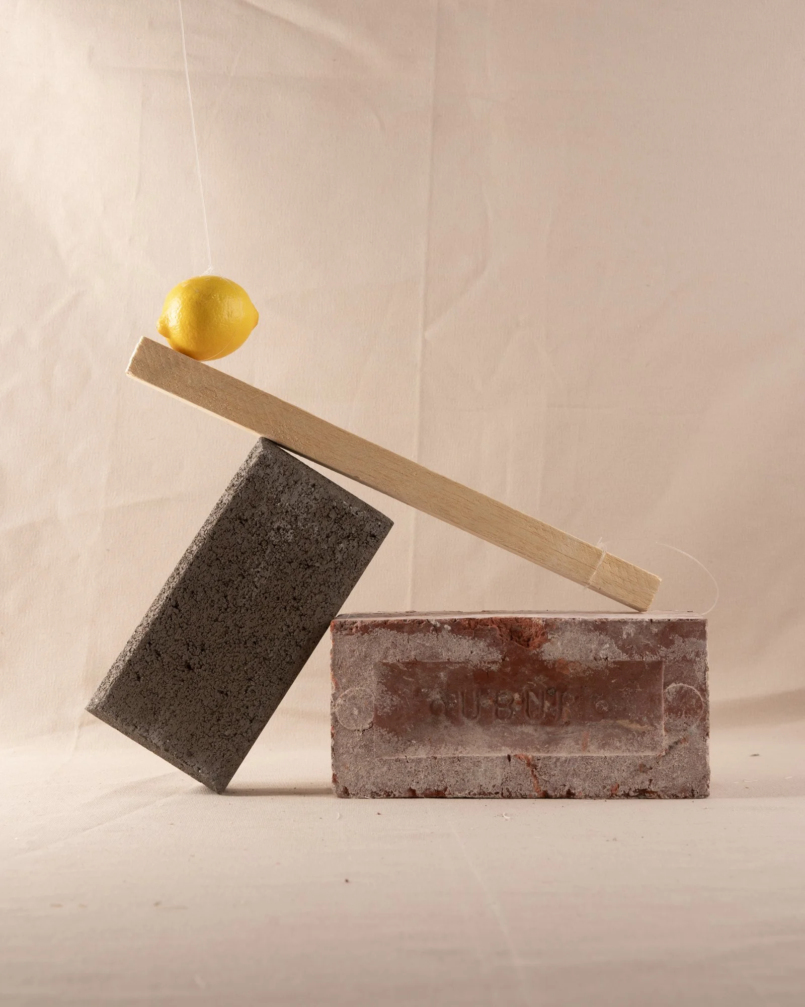
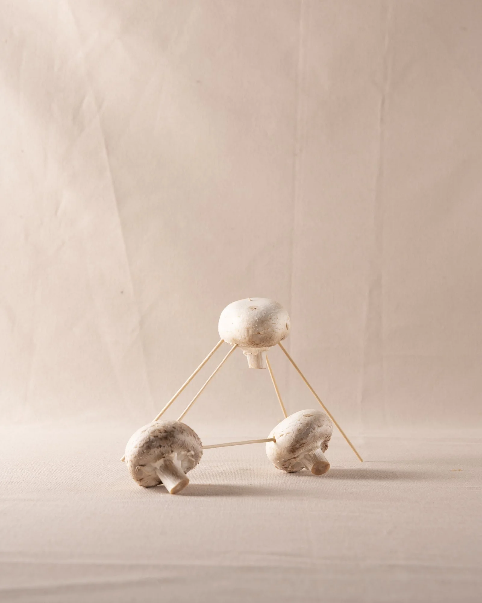
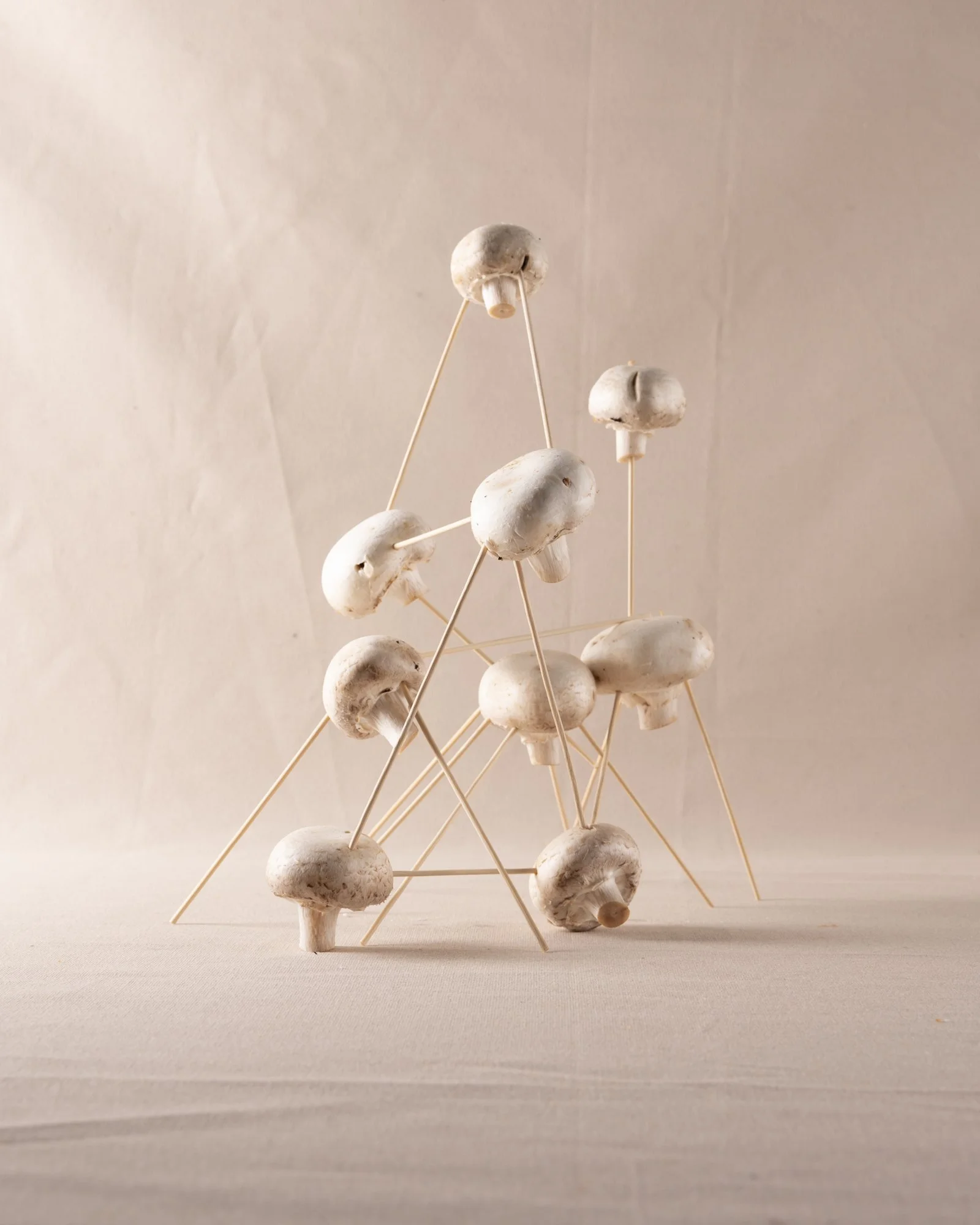
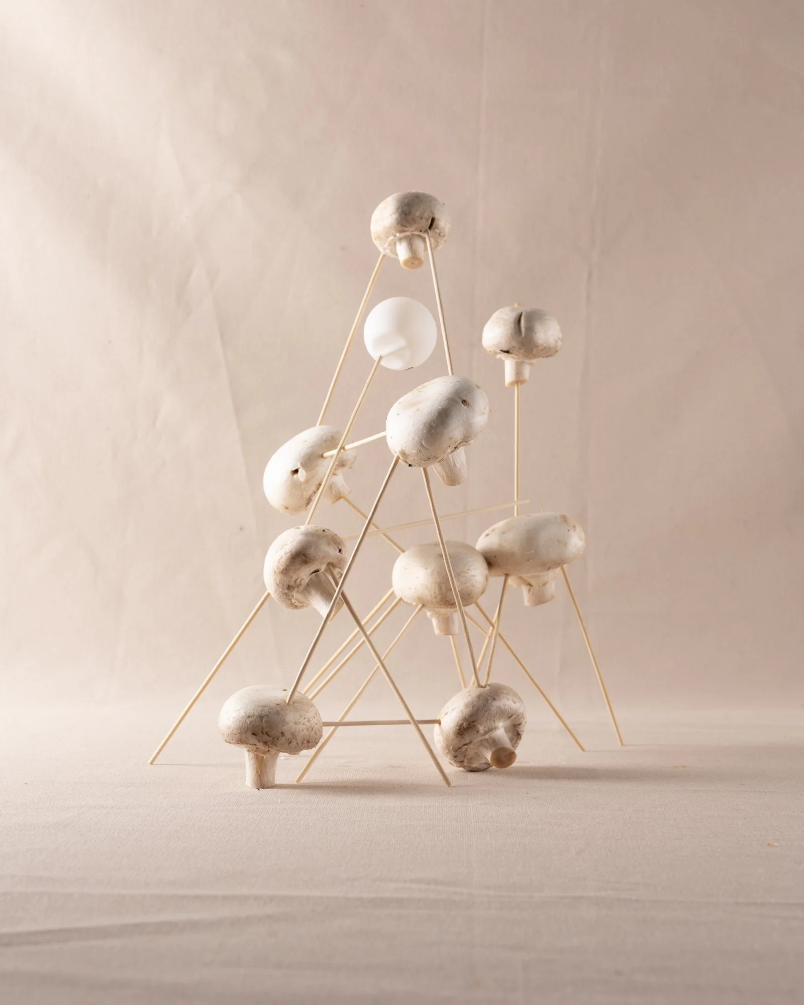
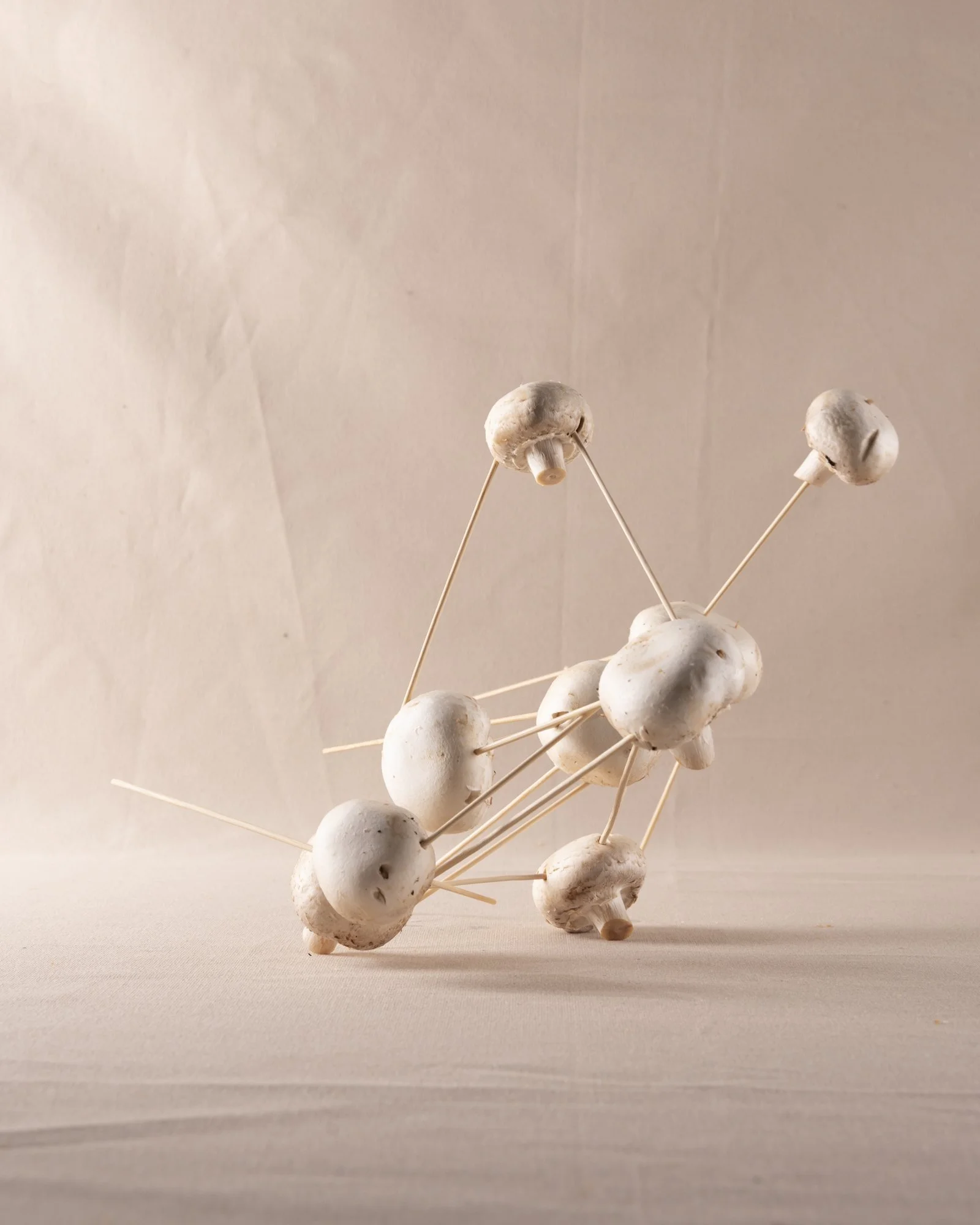
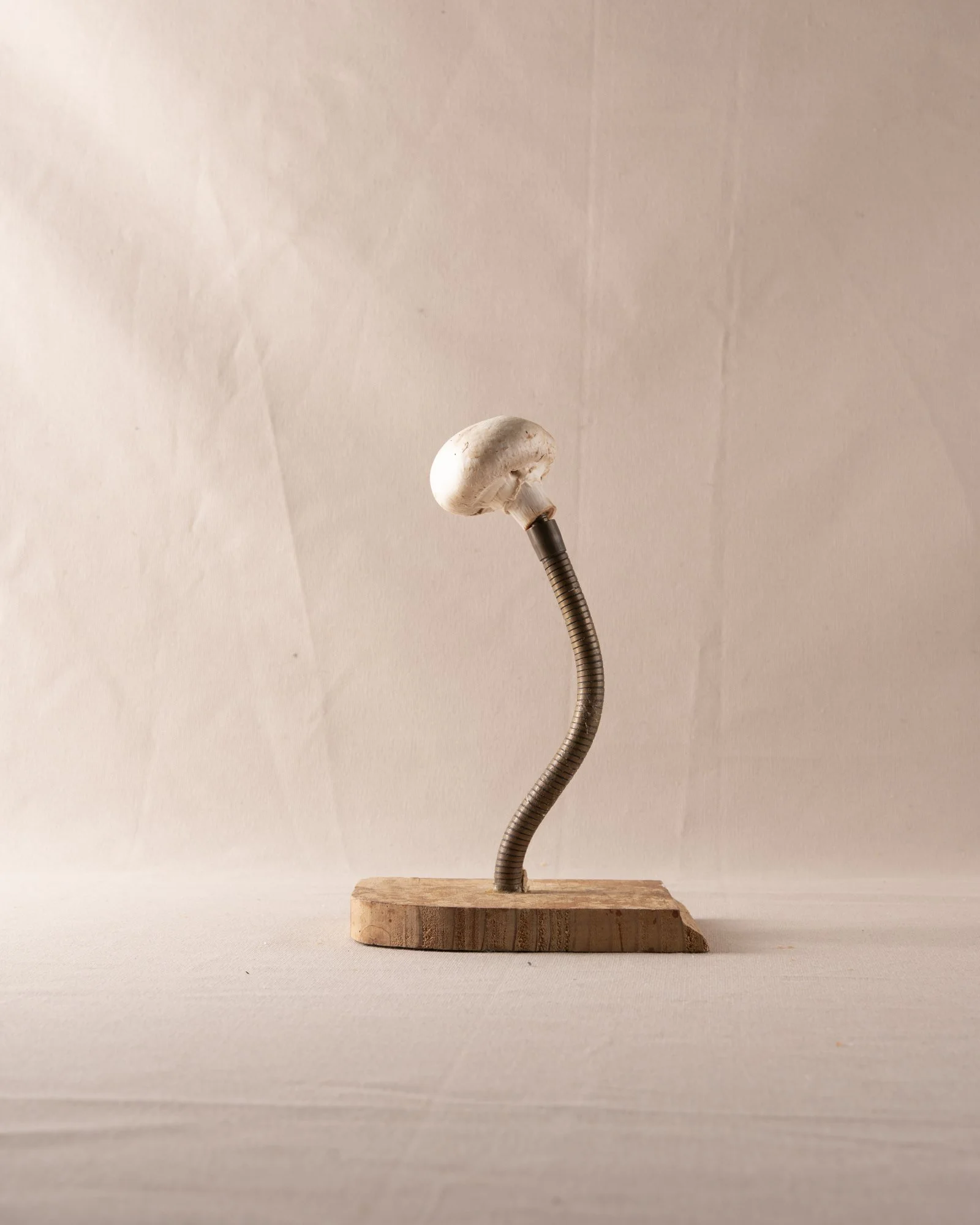
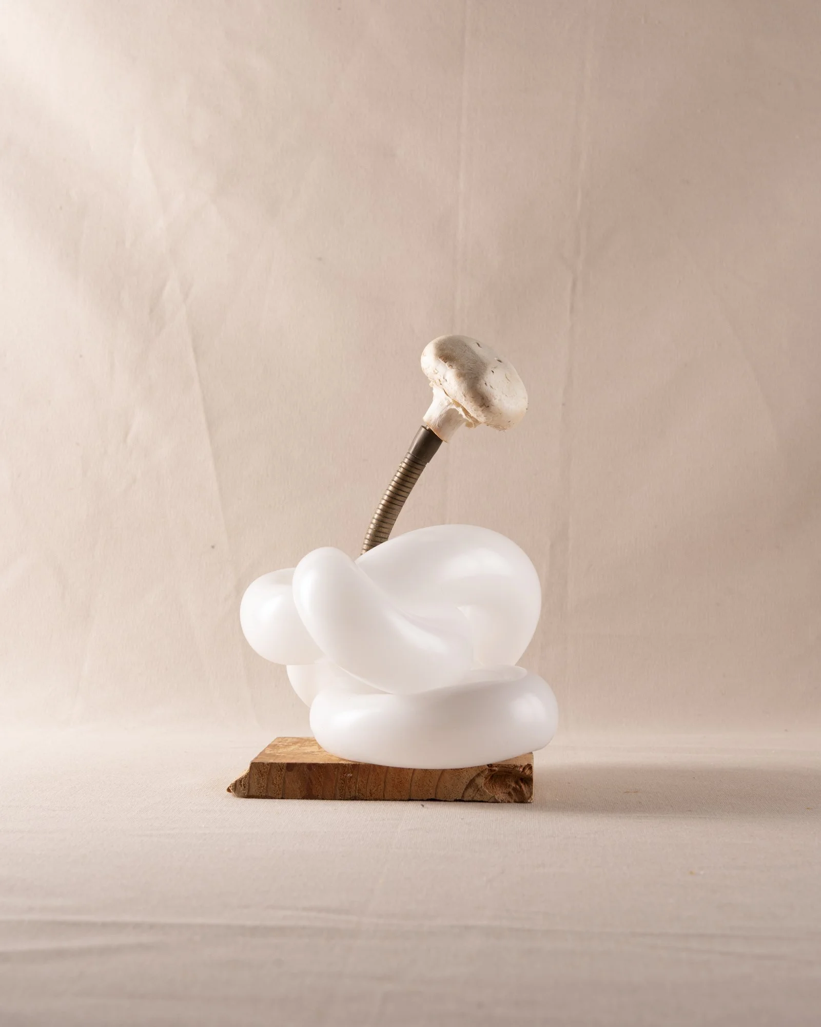
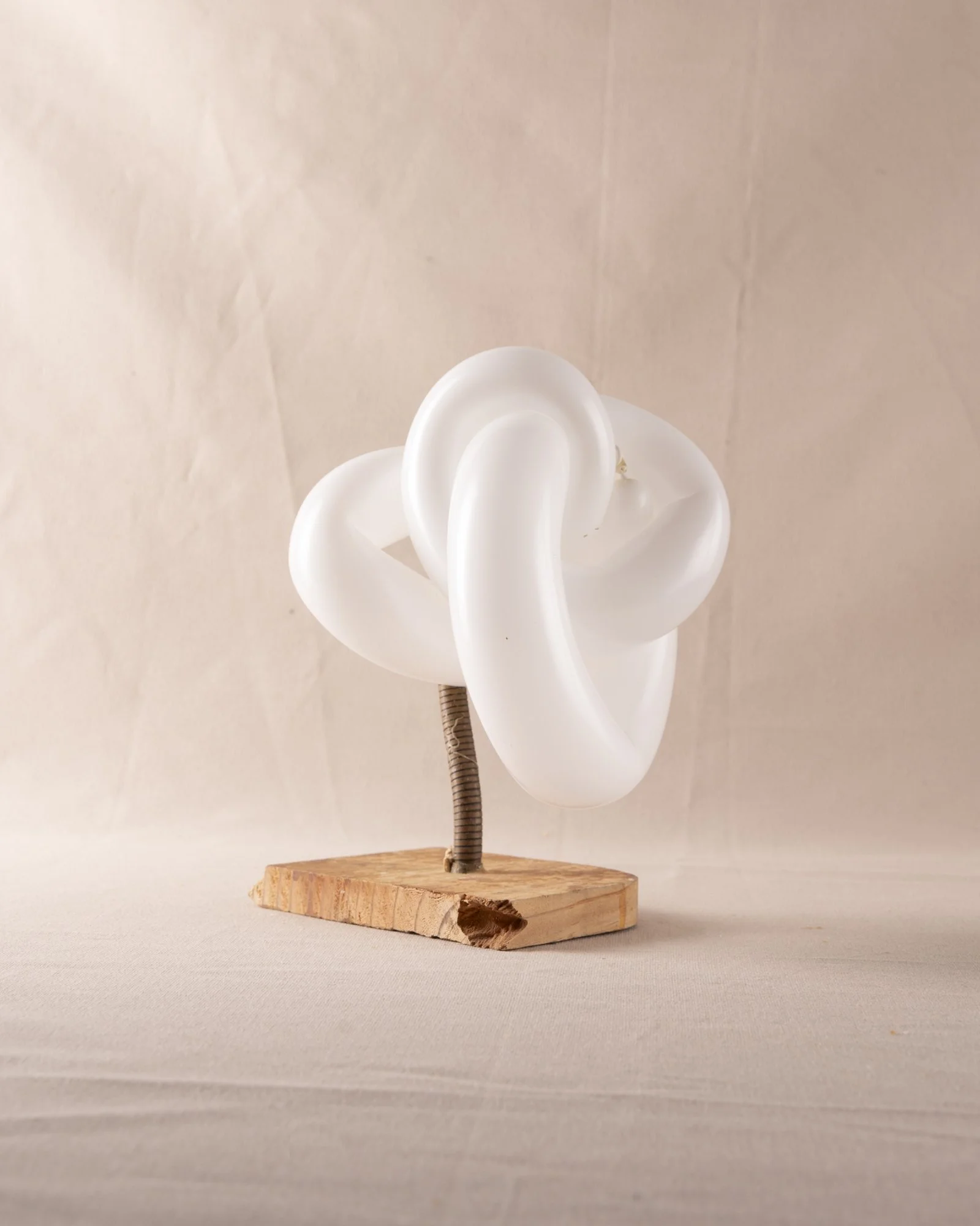
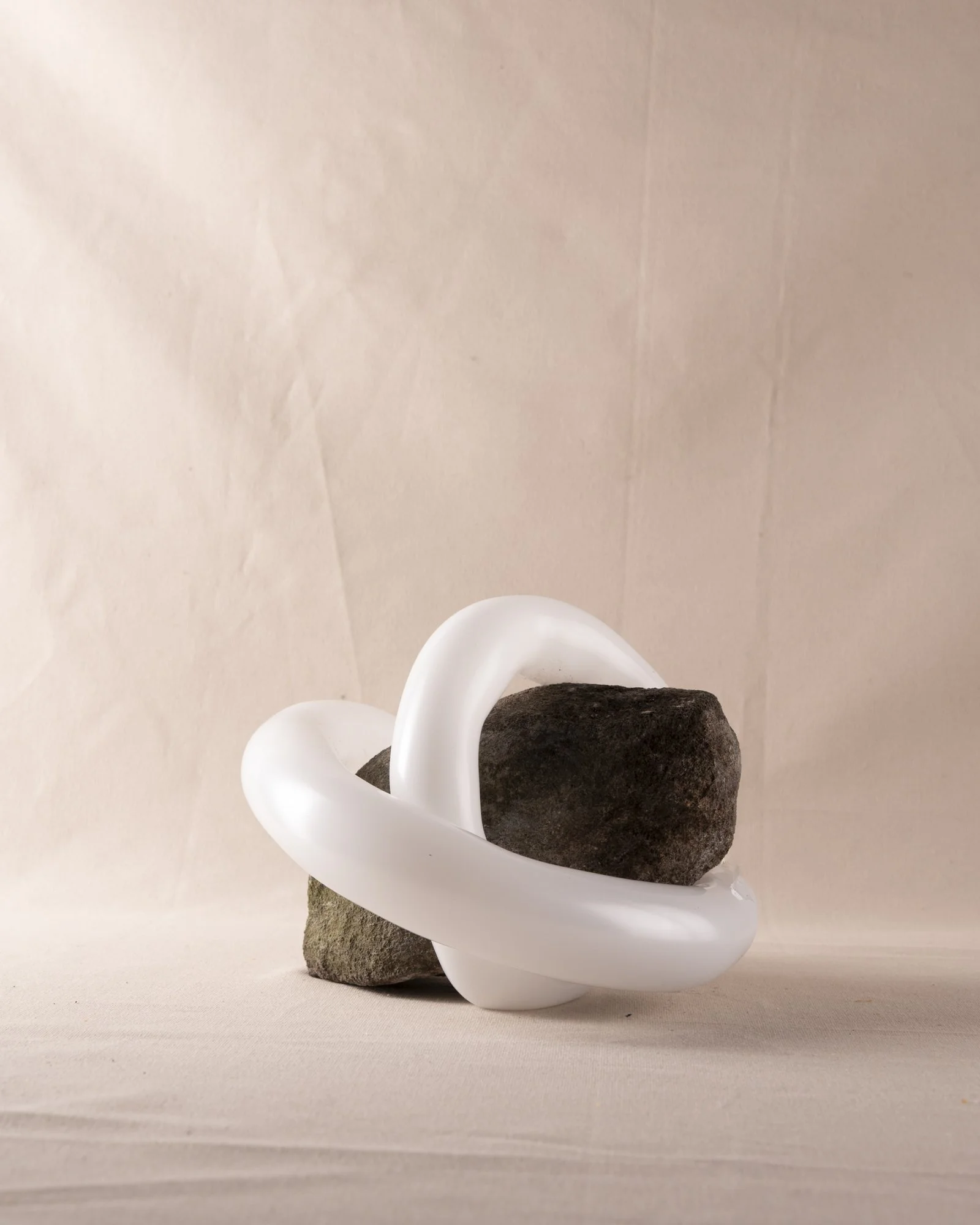
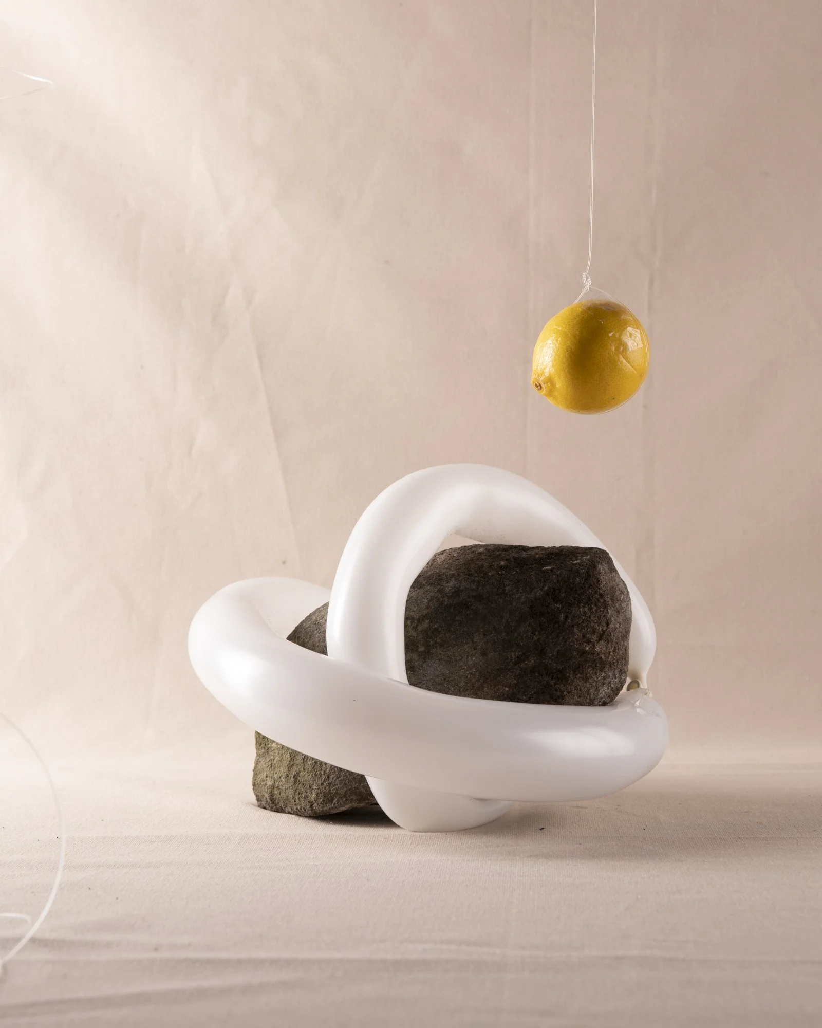
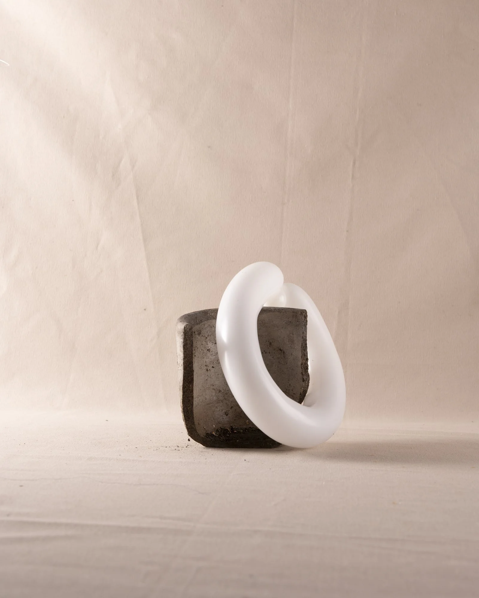
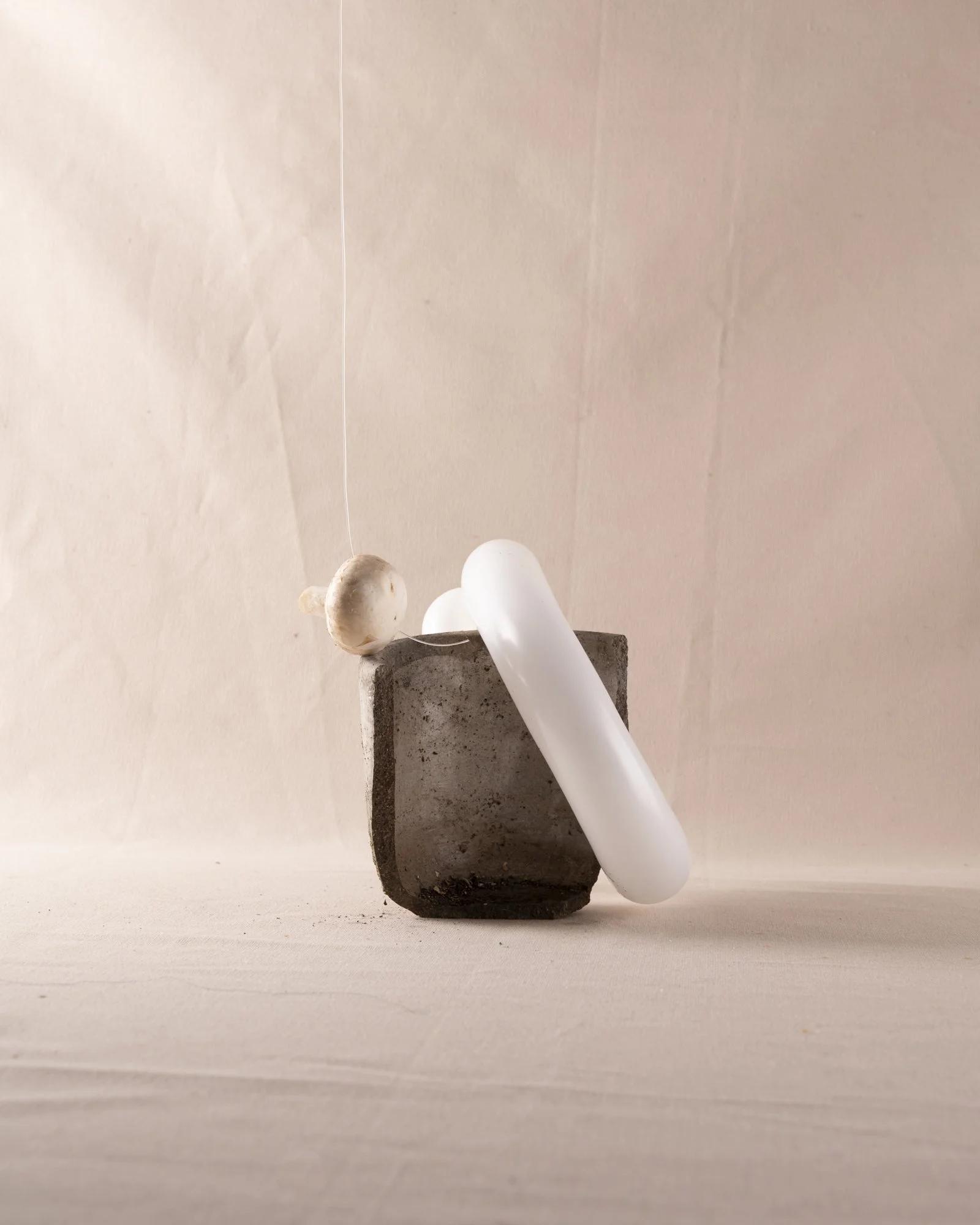
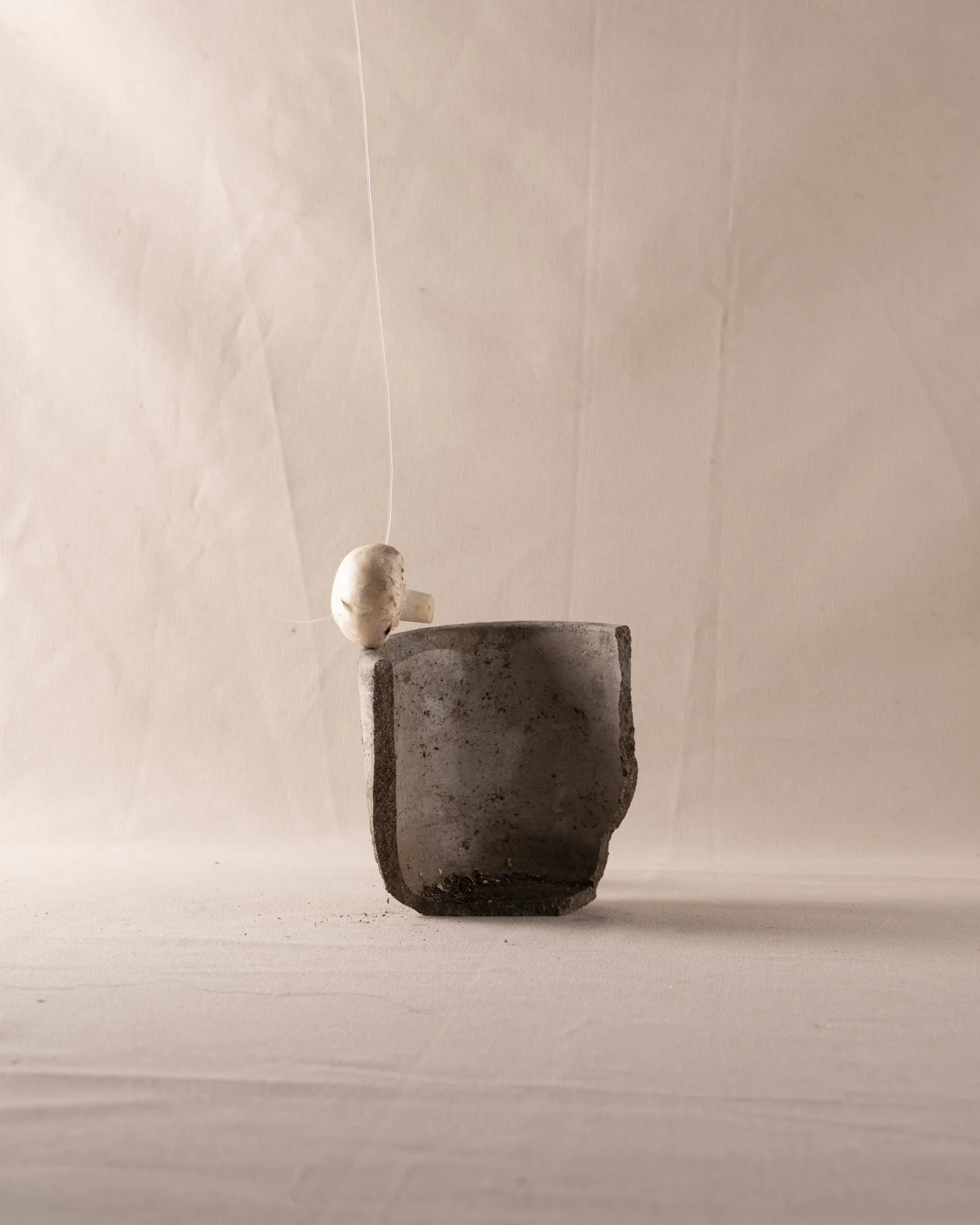
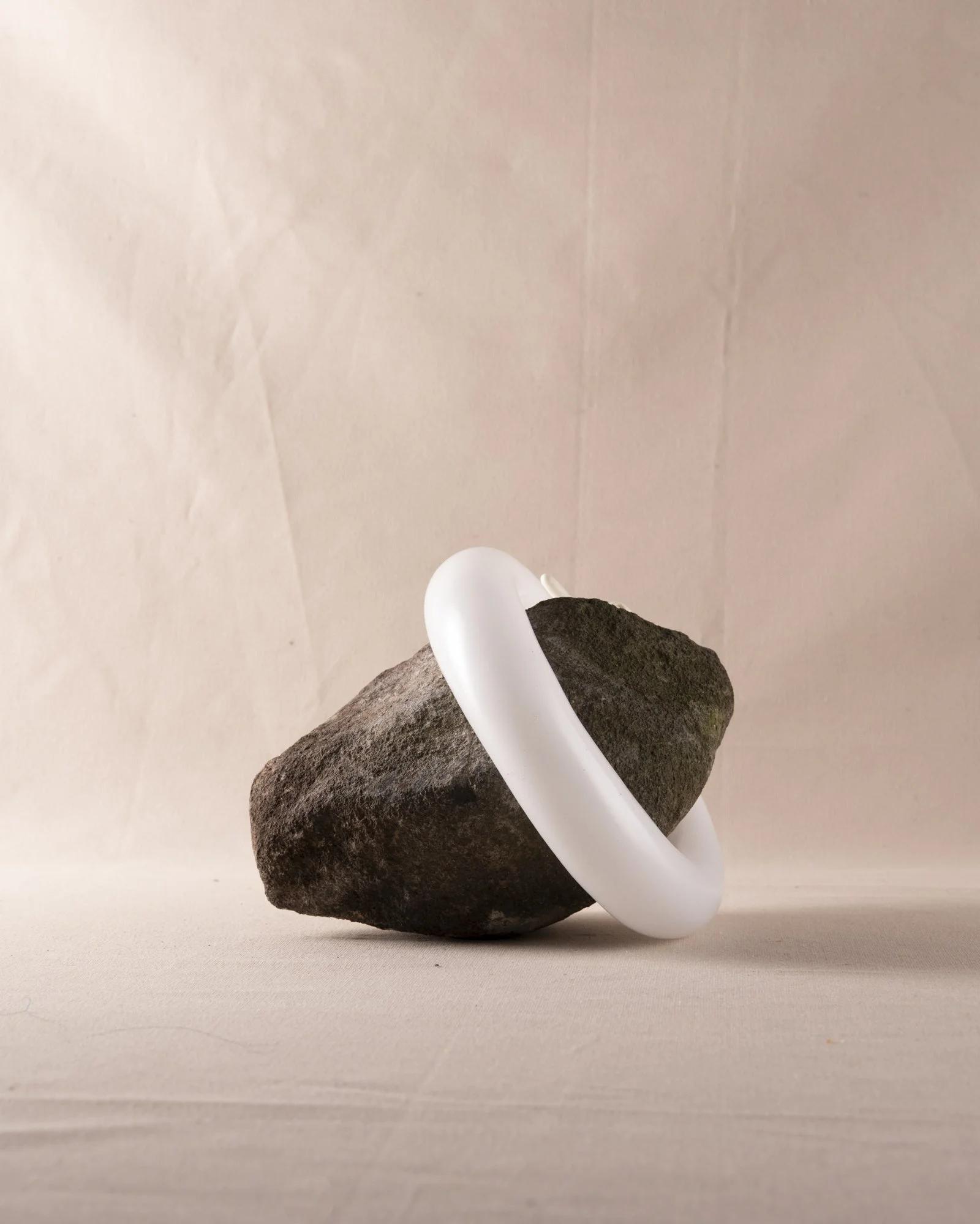
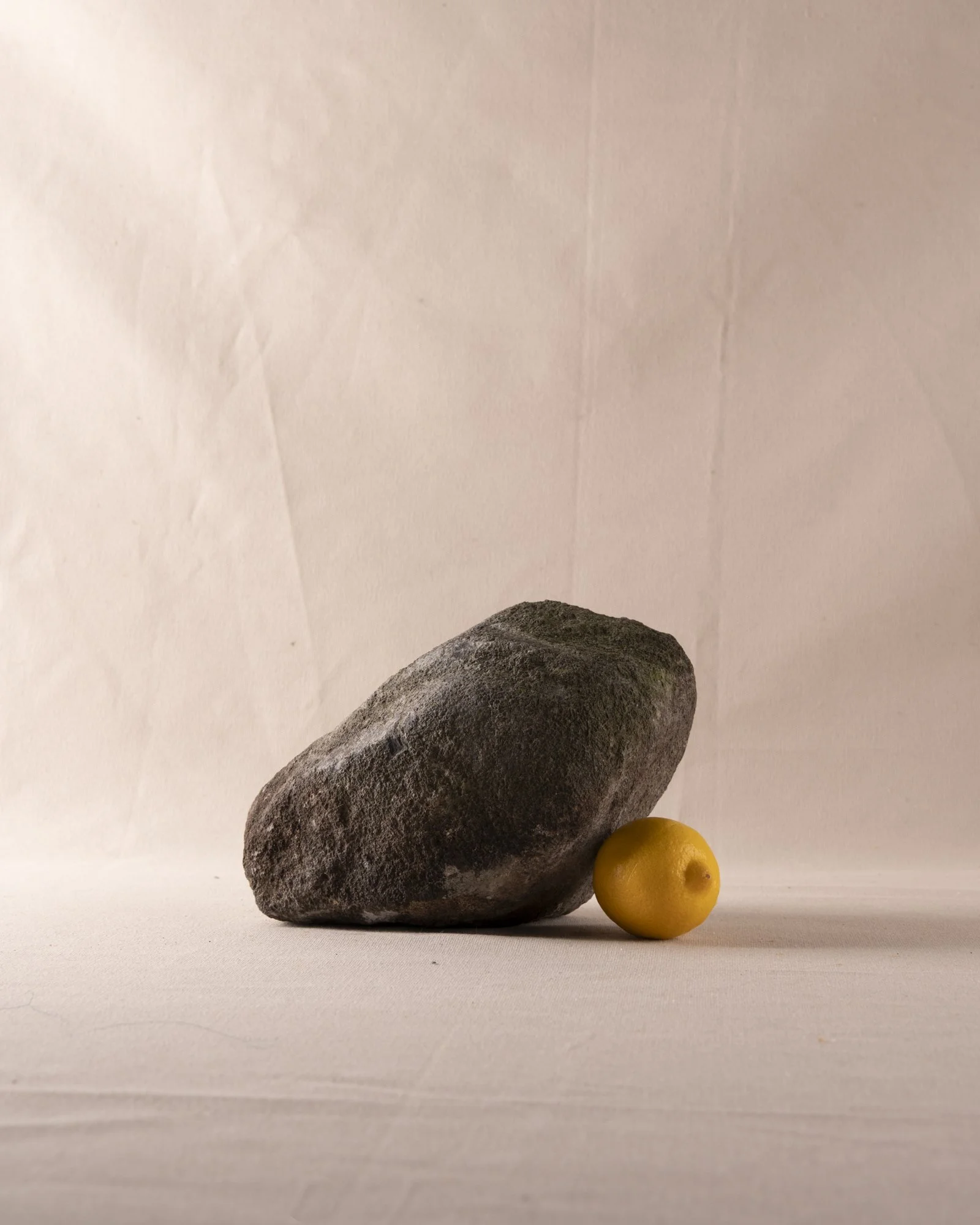
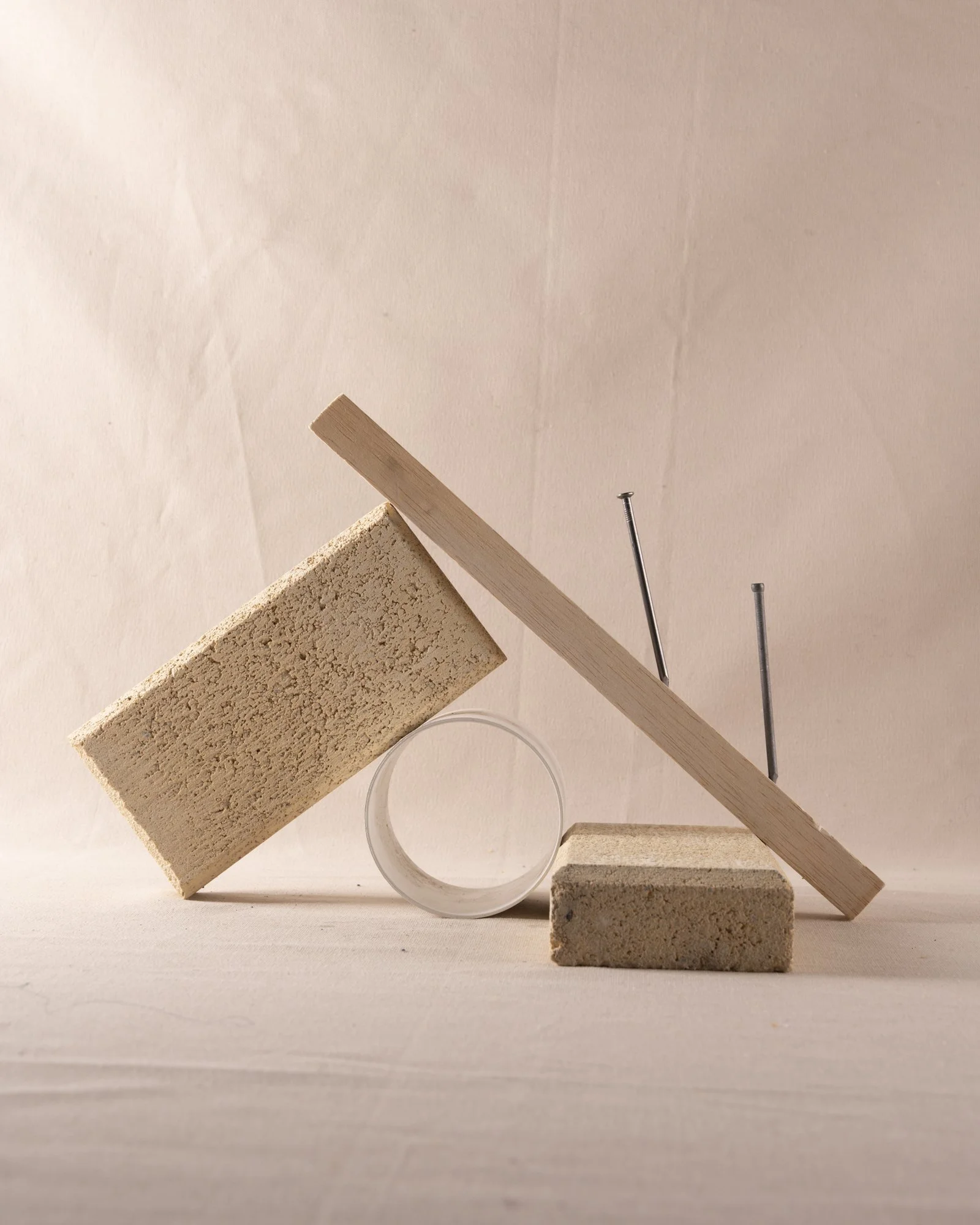
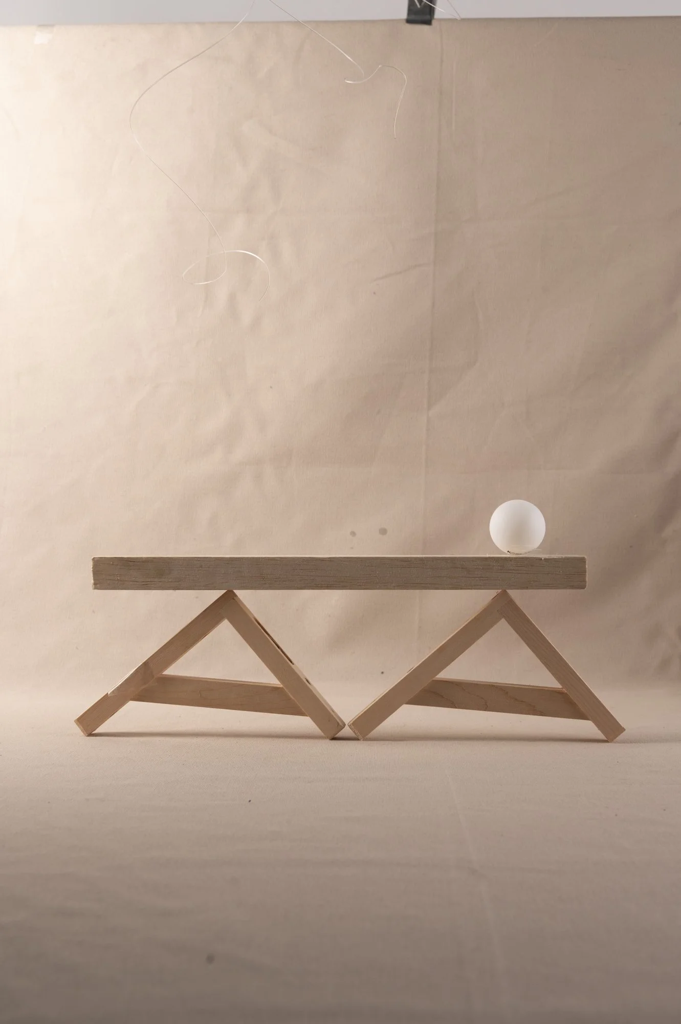
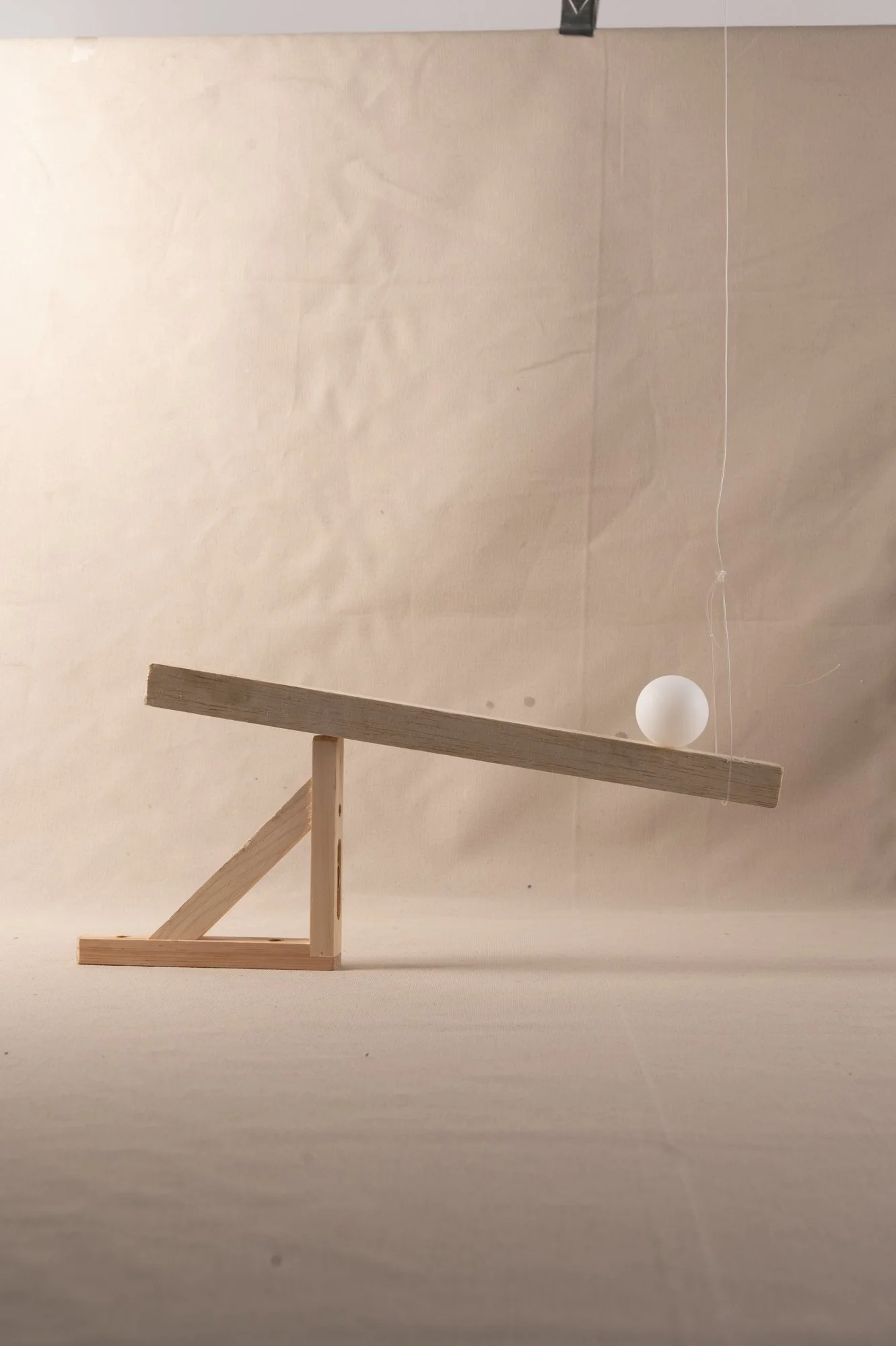
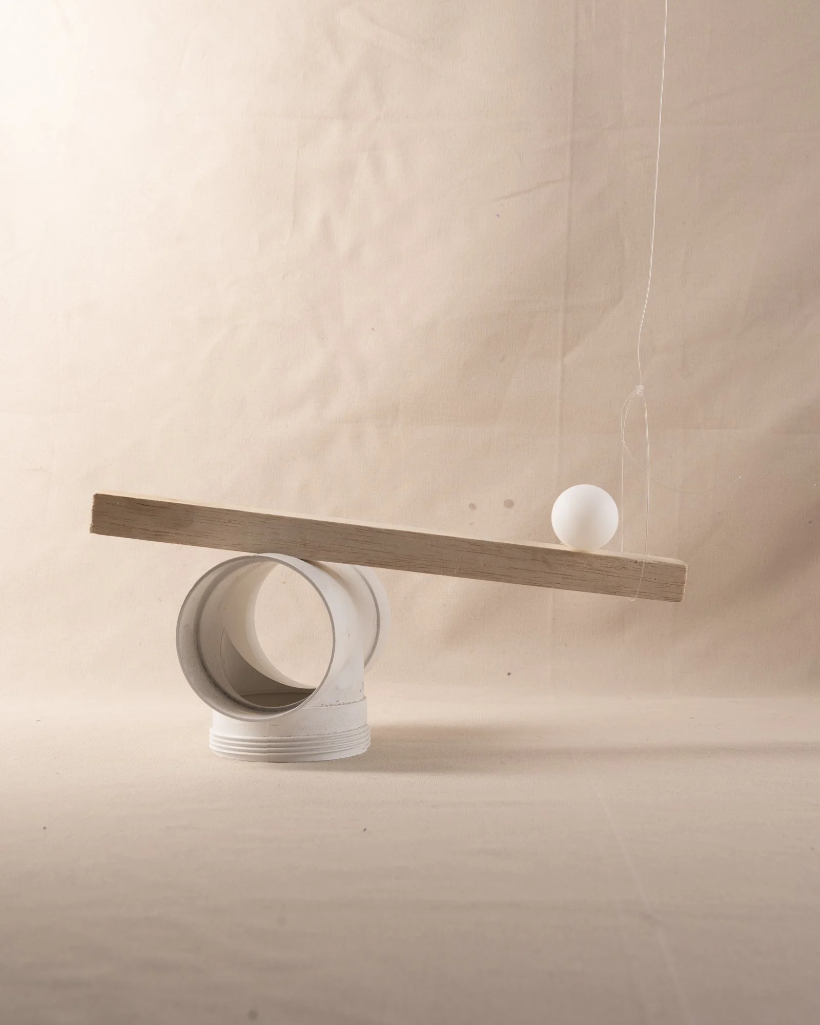
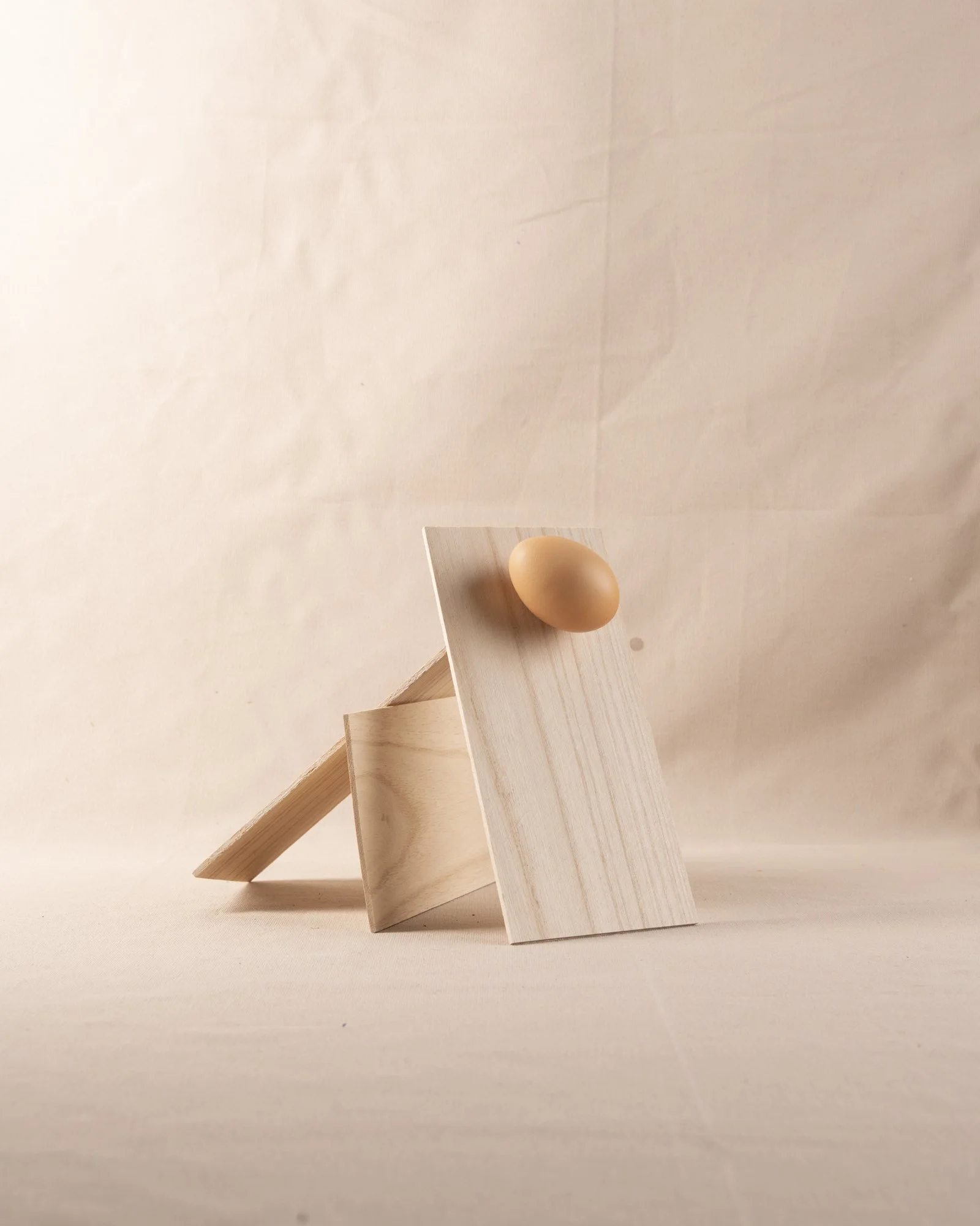
WOrk in progress Shoots 1 & 2


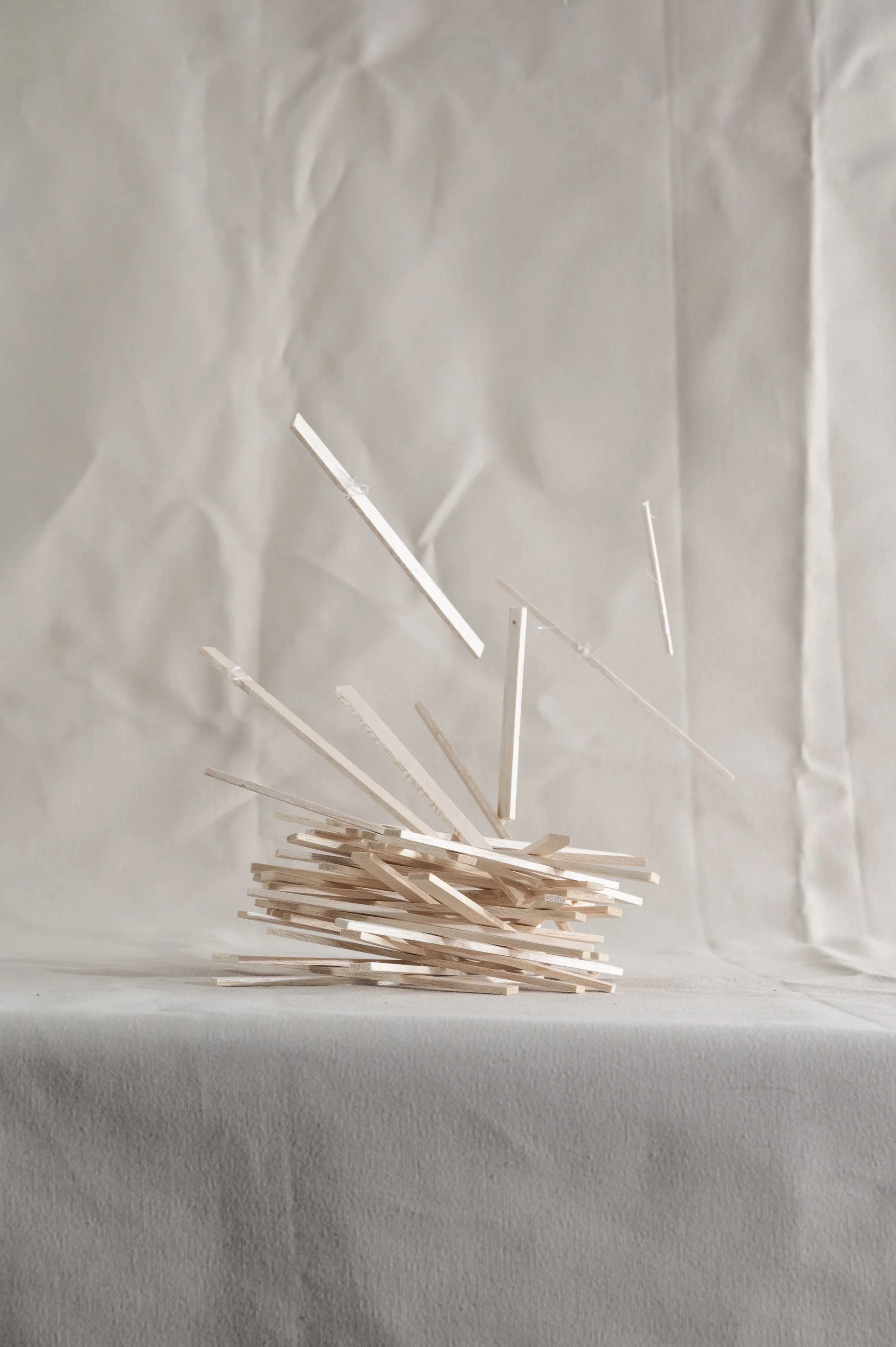


“Anything is breakable if it falls from high enough” - Steph 2025
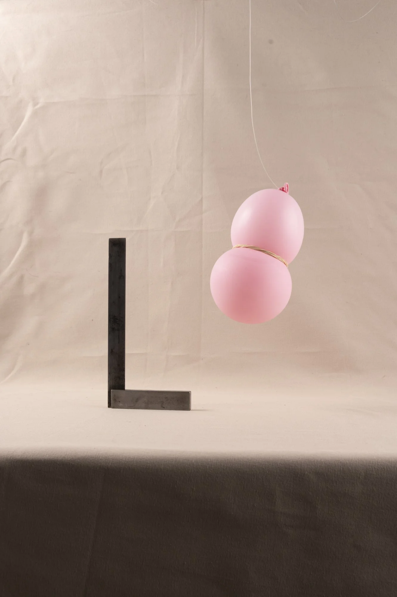
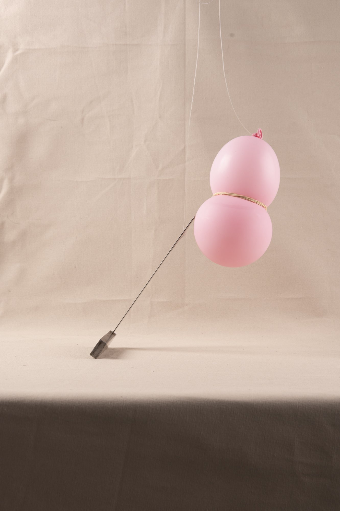
The next steps from this shoot would be to explore other objects but focussing in on making compositions that portray and build tension and anxiety. Making ones that are more precarious. The balloon with the rubber band is a good example of this vibe.
My thoughts:
I worry about the inconsistencies regarding the lighting. It has been challenging to illuminate the front of the table without leaving shadows on the background or distracting highlights on my objects.
Feedback: 17/6/25
Research: Sian Bonnell
Reconsidered shooting the falling action of the compositions, instead allowing the viewers imagination and anxiety to build around their obviously precarious nature.
Don’t need to iron out the backdrop, the roughness and texture adds to the emotions and feeling behind the works.
Find more objects to explore.
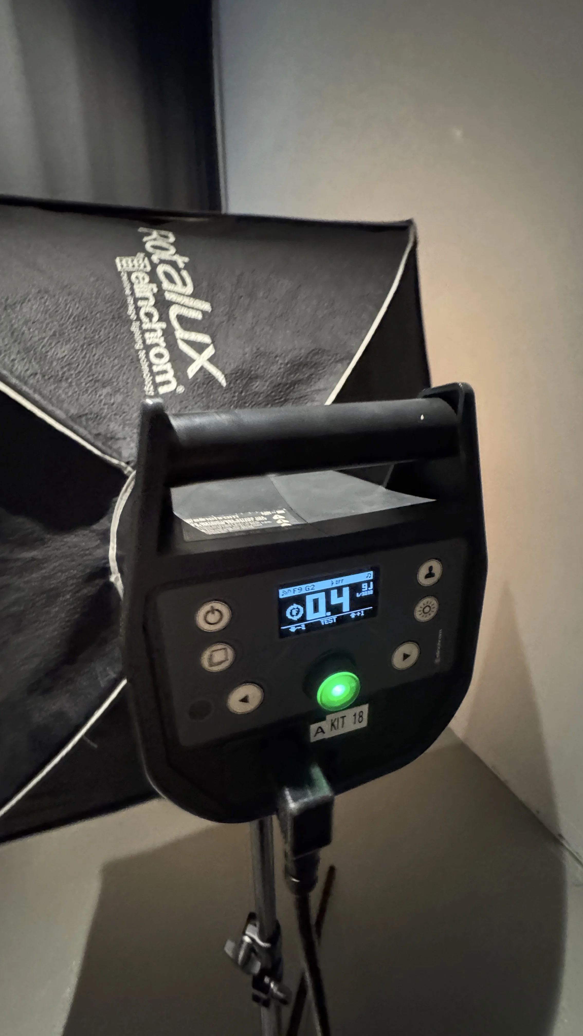
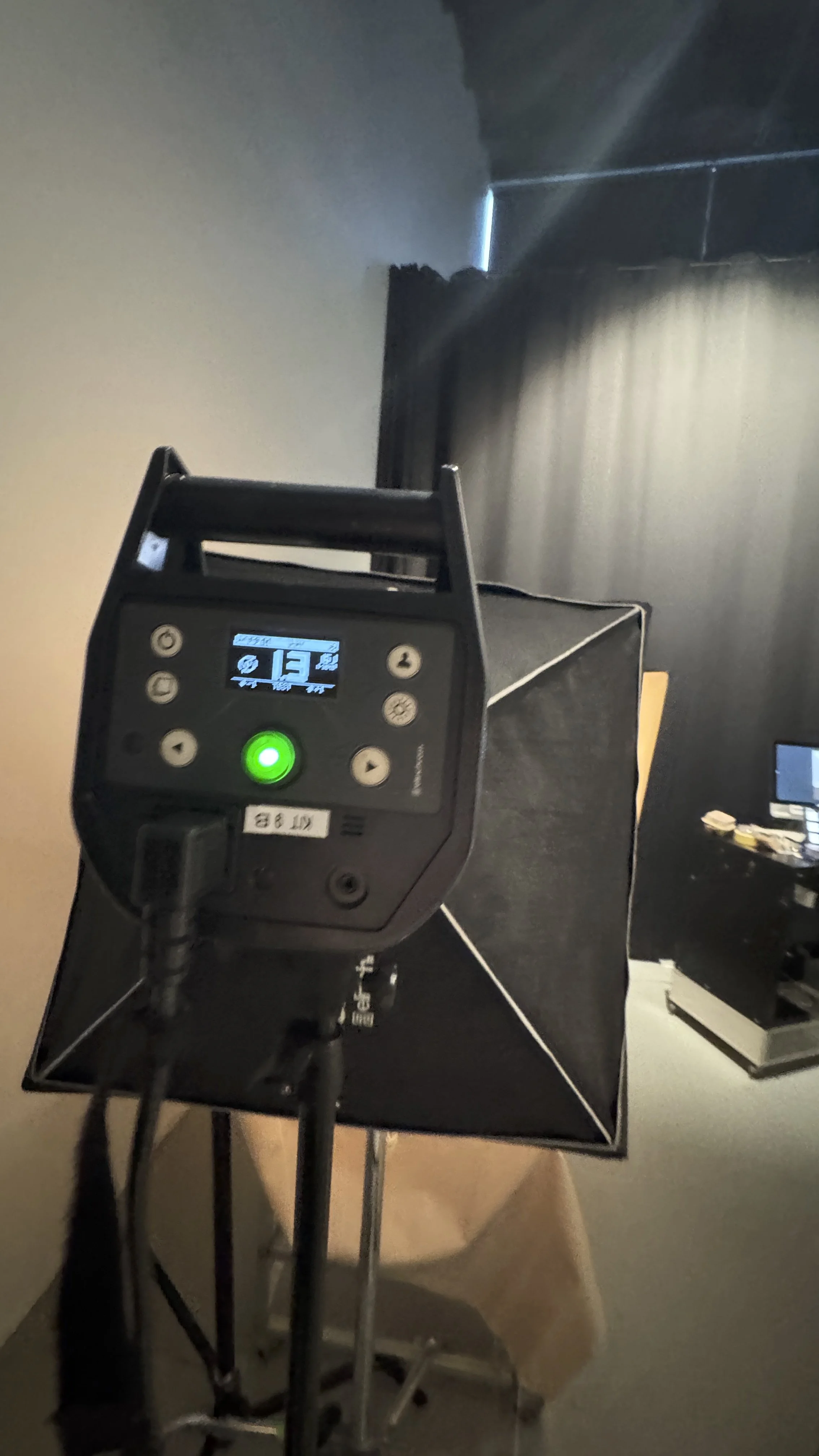
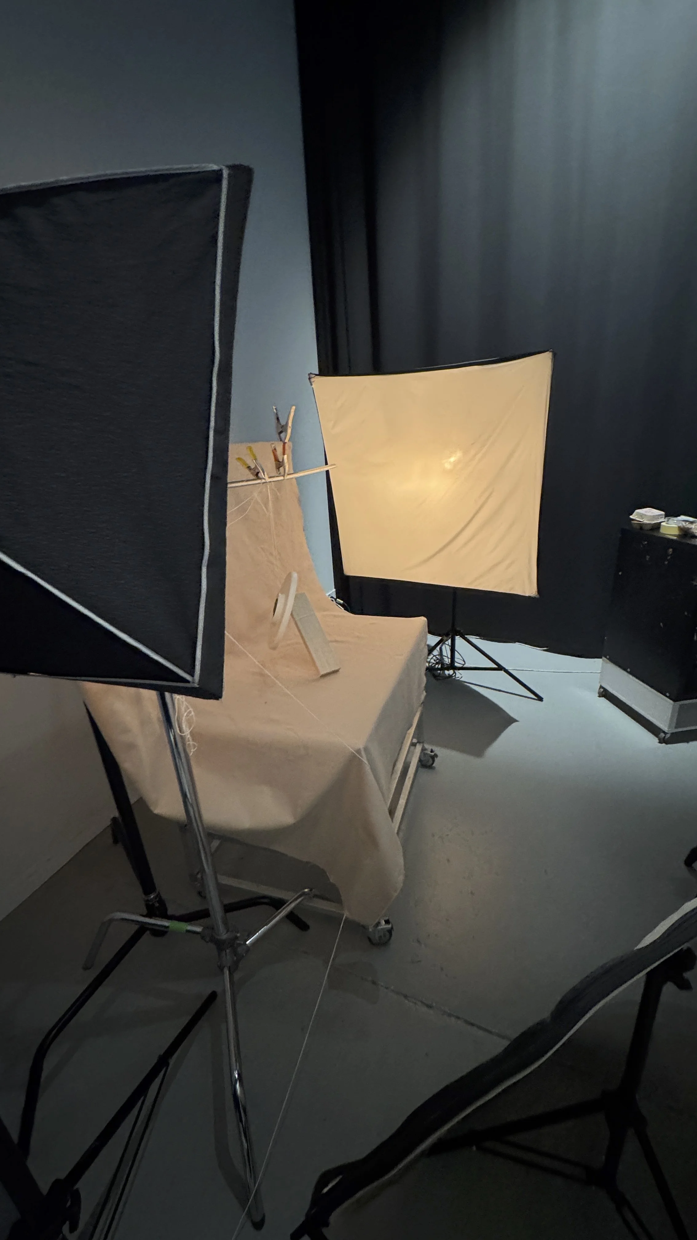
LIGHTING SETUP
Strip box = Flood the background and fill shadows
Octagonal SoftBox = Key Light
Speed Light = Fill the front of the table
(The shadows here were a big problem)
BOOK COVER RESEARCH
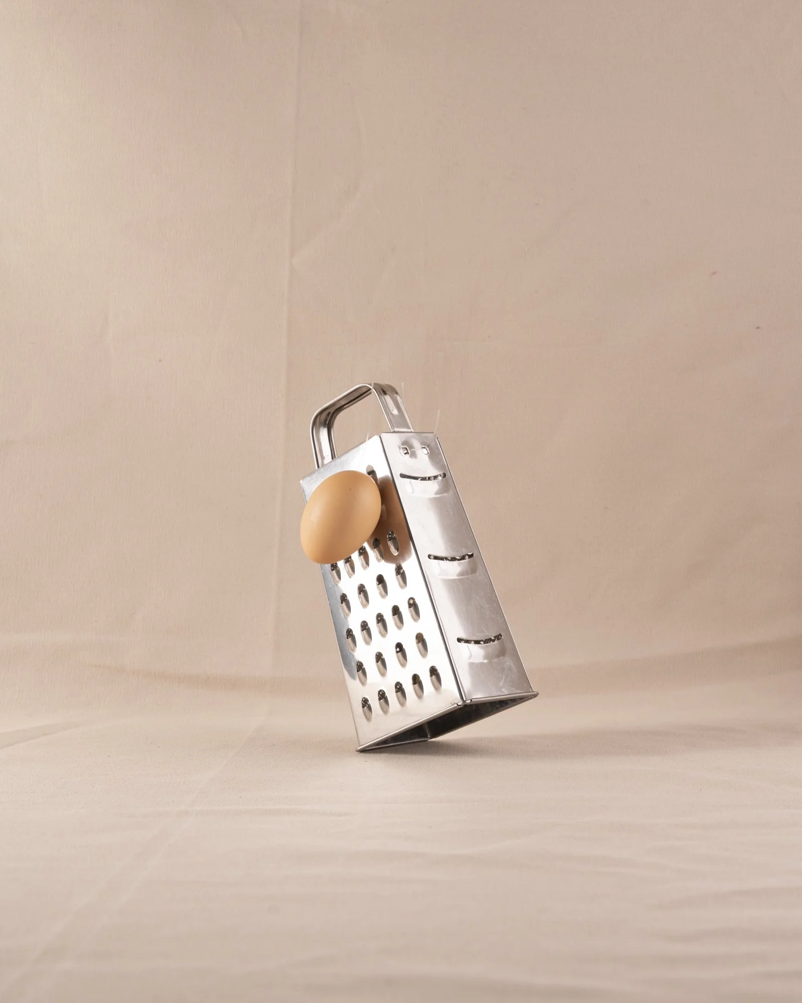
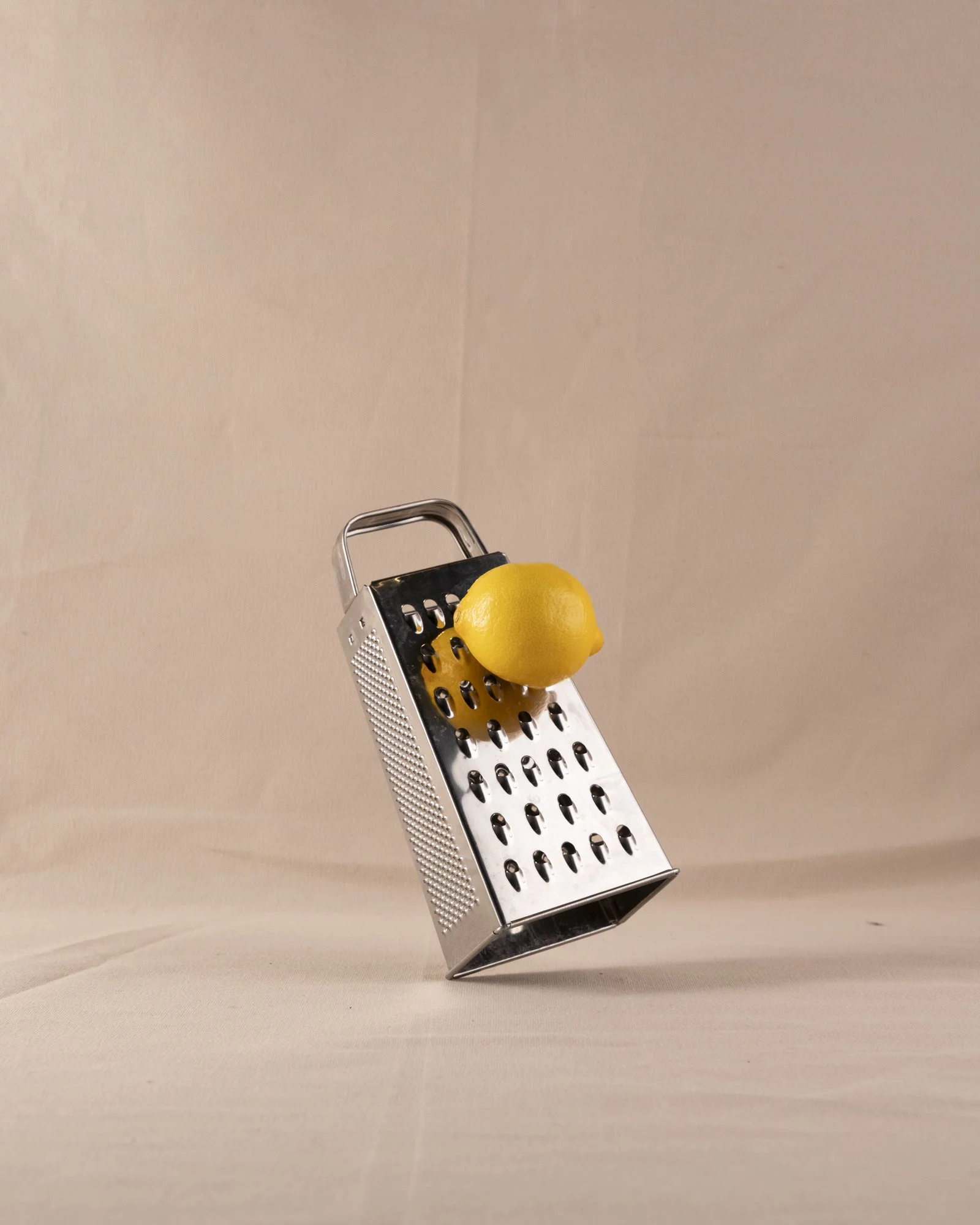
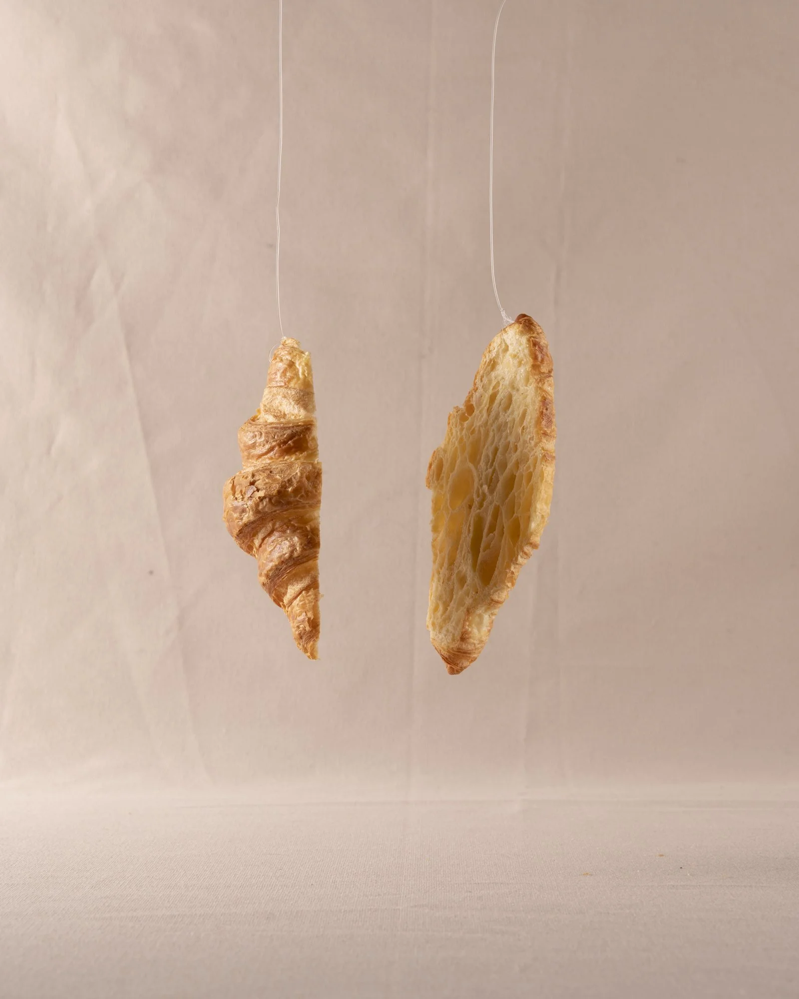
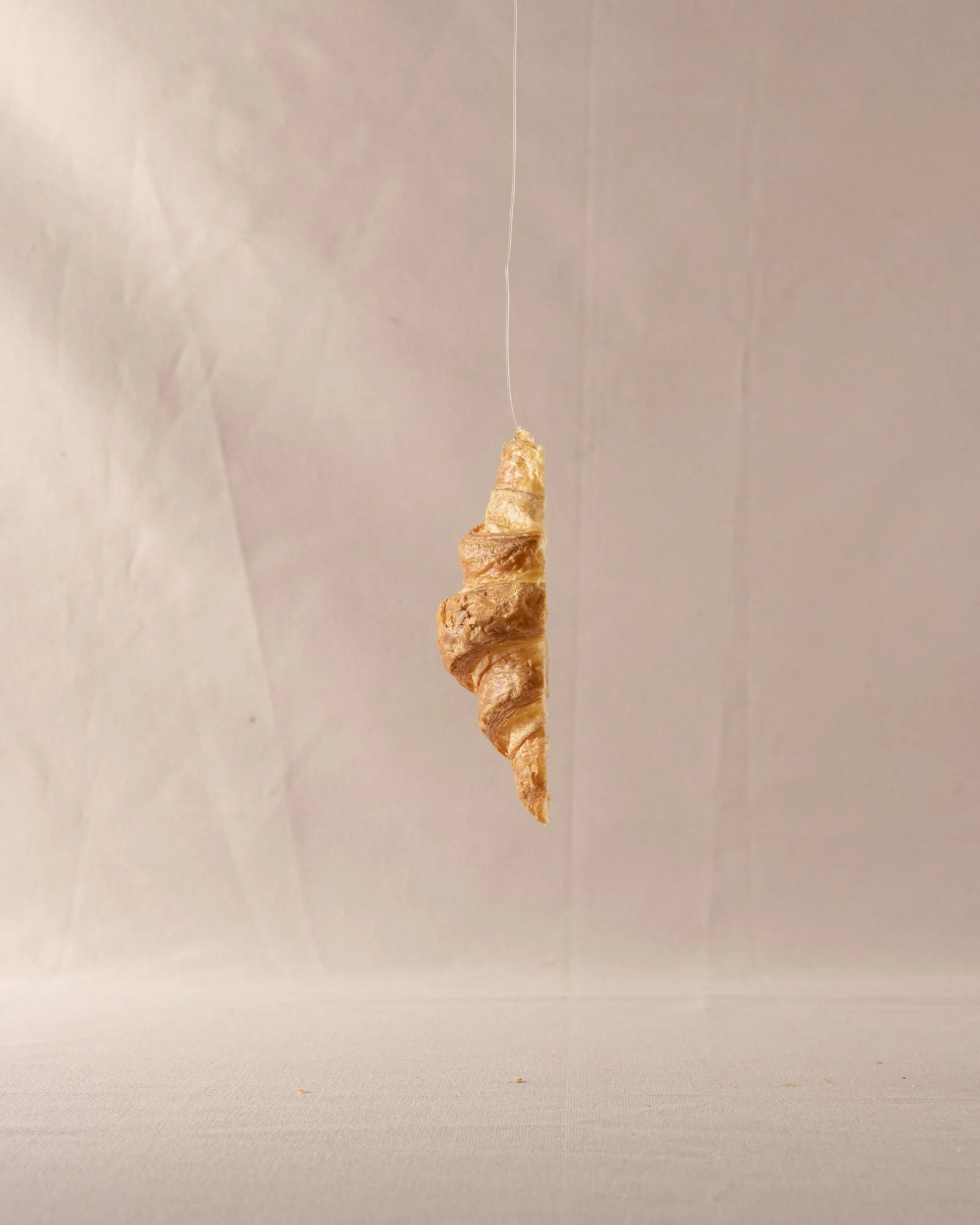
WOrk in progress 3 - Studio shoot


Next steps from here are to find a happy medium between the two shoots, and shoot all of the following images in the same lighting for consistency.
My thoughts:
These images have a more dramatic, and cinematic appearance which differs a lot from the original, more ‘rustic’ and organic shoot. The image’s colour temperatures are also significantly warmer, feeling less clinical to the others. I am undecided as to whether these are good things or not.
Feedback: 1/7/25
Investigate the idea of including the sketches within the book.
Decide which location to shoot in, and do so consistently.
This outcome has a more refined look to it.
Potentially experiment with photographing the sculptures in different states. So take a variety of photos of each re-arranging things slightly between.
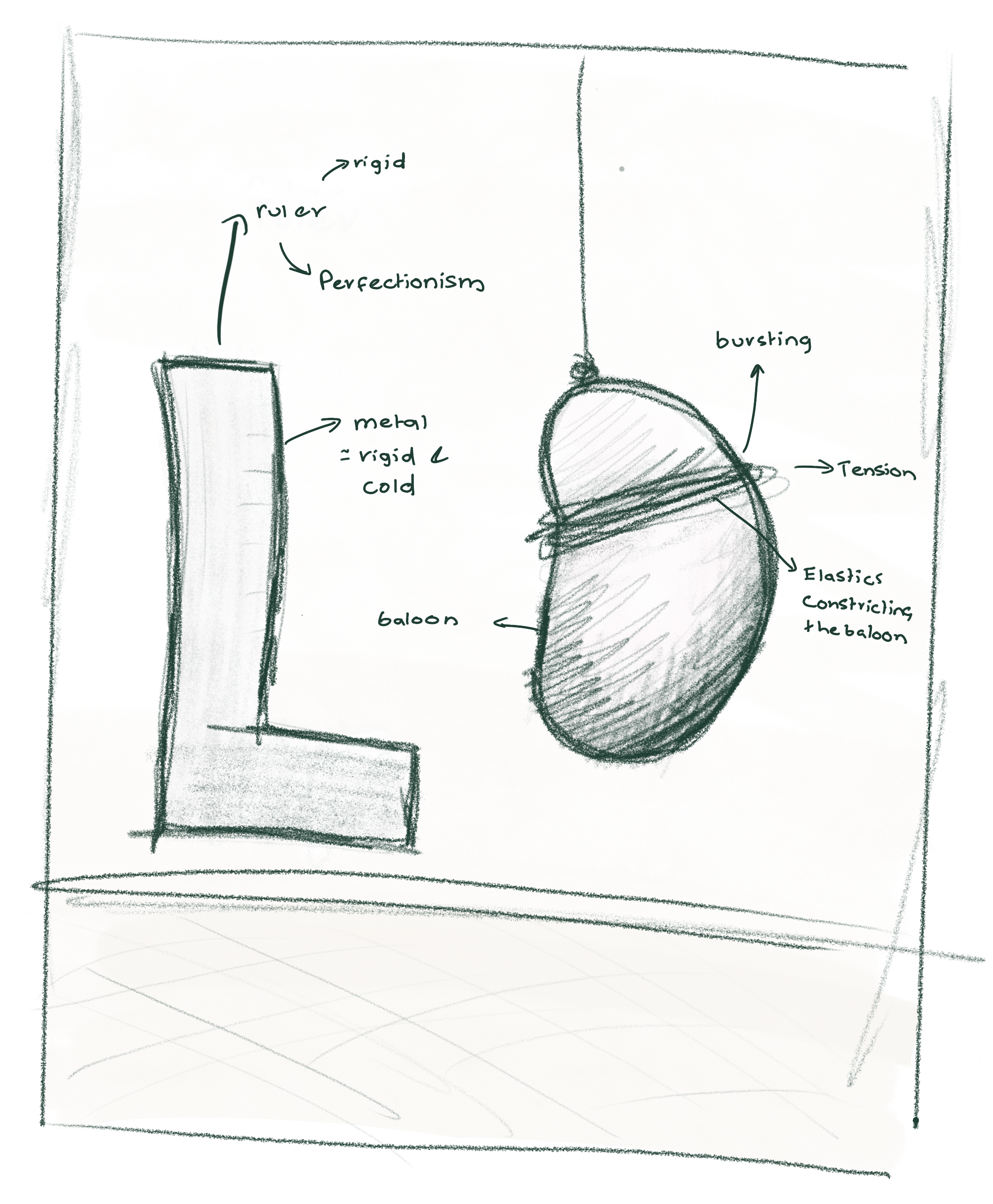
Idea generation


White Balance trialling


Lighting comparison
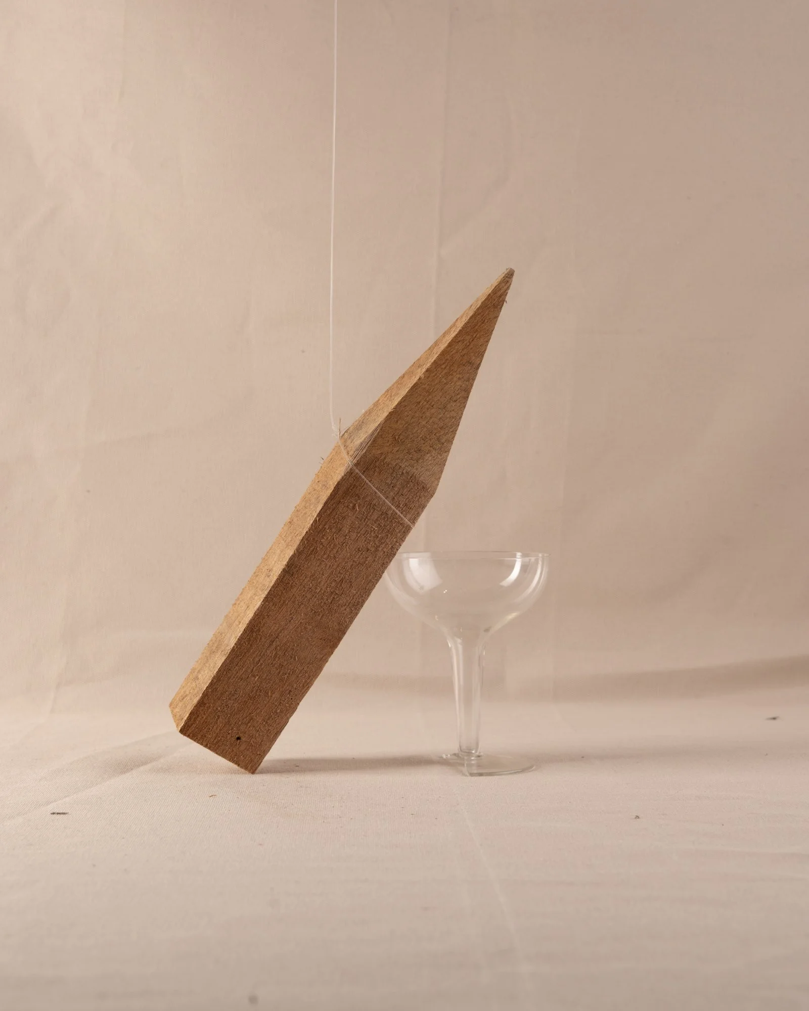
WOrk in progress 4 - Studio shoot


Next steps from here are to use the same lighting setup as this shoot and build upon the number of images as well as try to reshoot previously successful ideas taken in other lighting setups for consistency.
My thoughts:
This lighting is far more successful than the previous 2 rounds. I am happy with the balance between the wrinkles and folds on the fabric and the smoothness.
Feedback: 1/7/25
Experiment with the idea of removing the foreground - removing it as a distraction from the image.
Look at different aspect ratios. Maybe 4x5
Foreground analysis
WOrk in progress 5 - Studio shoot


Next steps from here are to continue shooting and reshoot some of the images shot with the previous background setup.
My thoughts:
Despite using the same exact camera settings, the white balance of these photos is slightly pinker, which will need adjusting. Using the same camera setup and lighting equipment worked well though in terms of the consistency in light across the backdrop and subject matter though.
Feedback:
Shoot some images without including any pink to try and get some variation into the series as a whole.
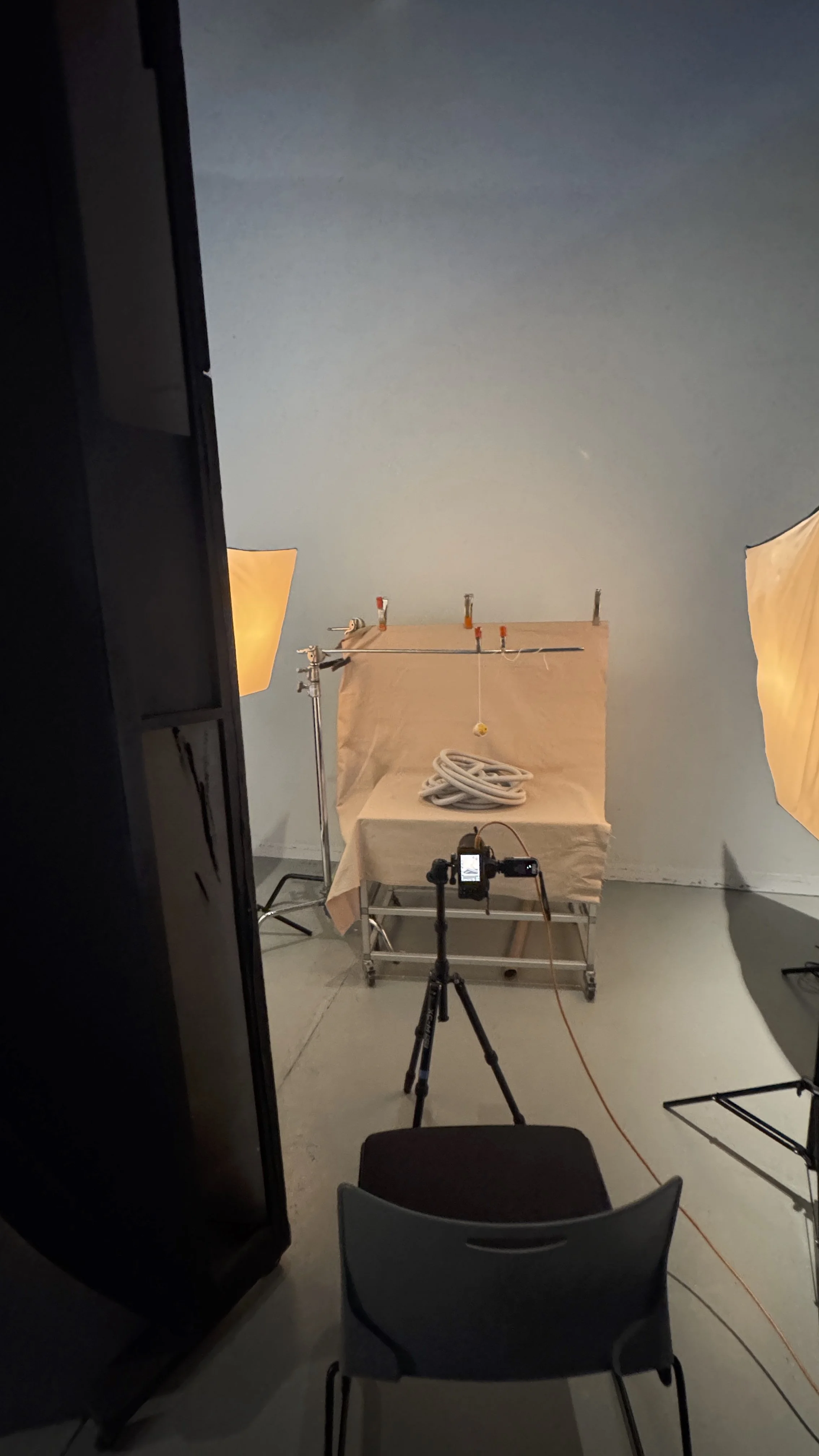
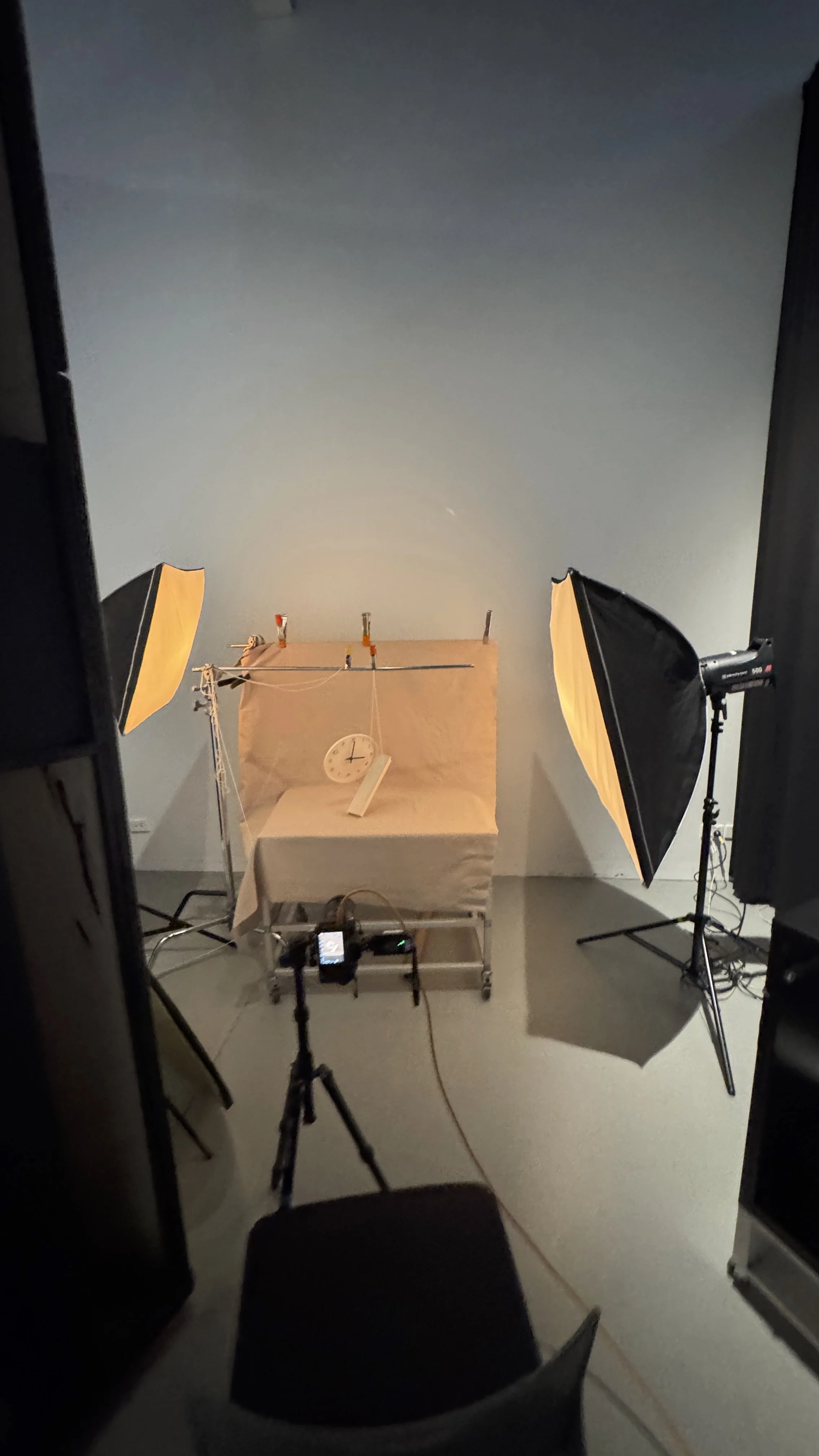
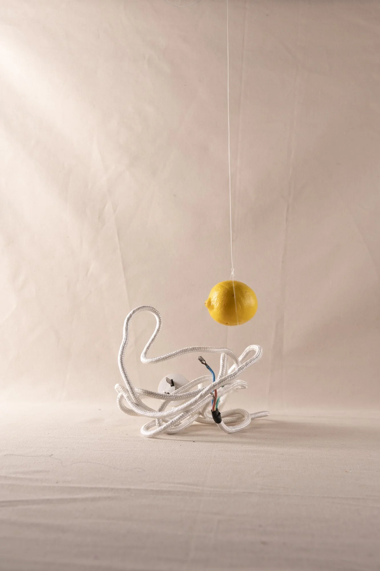
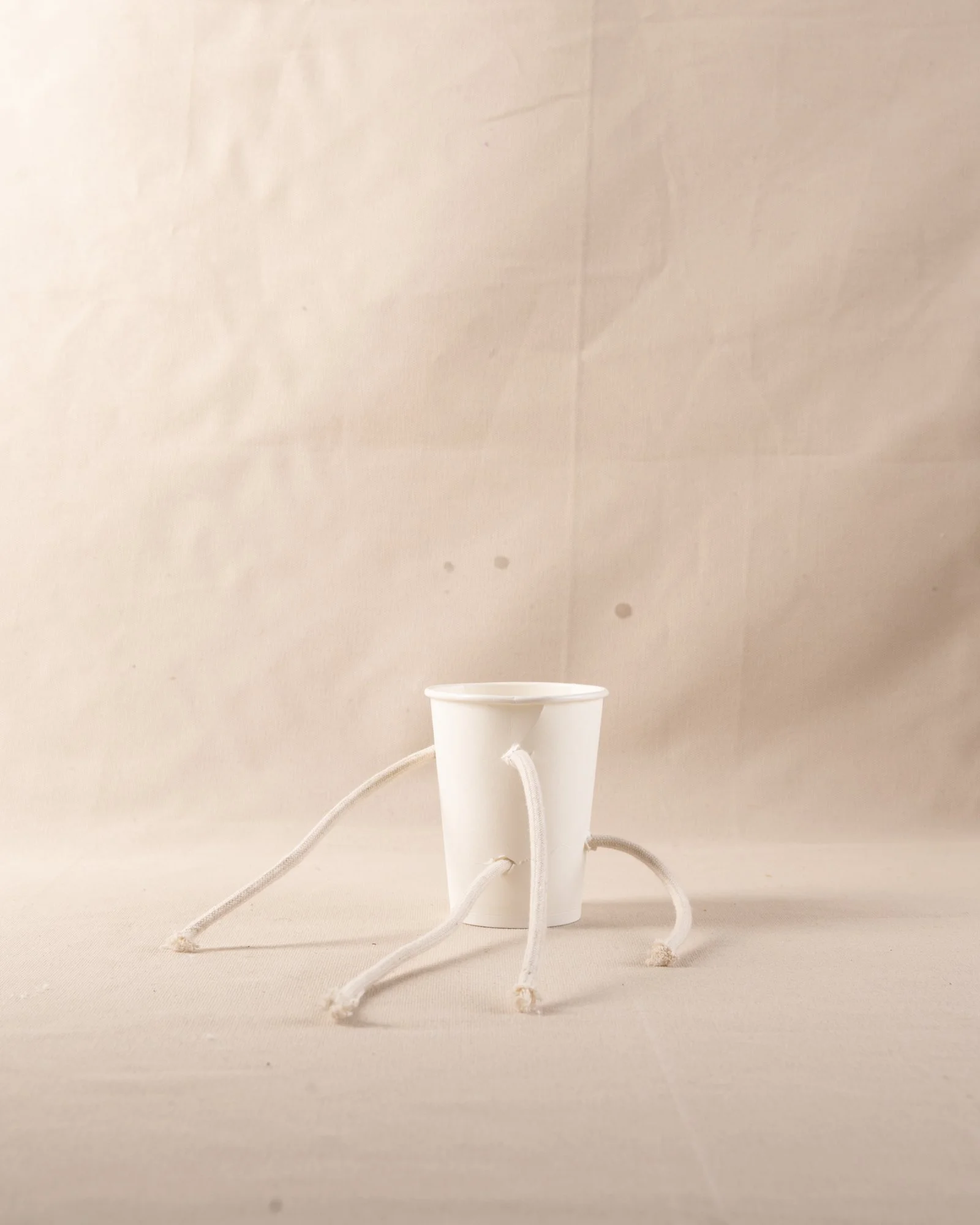
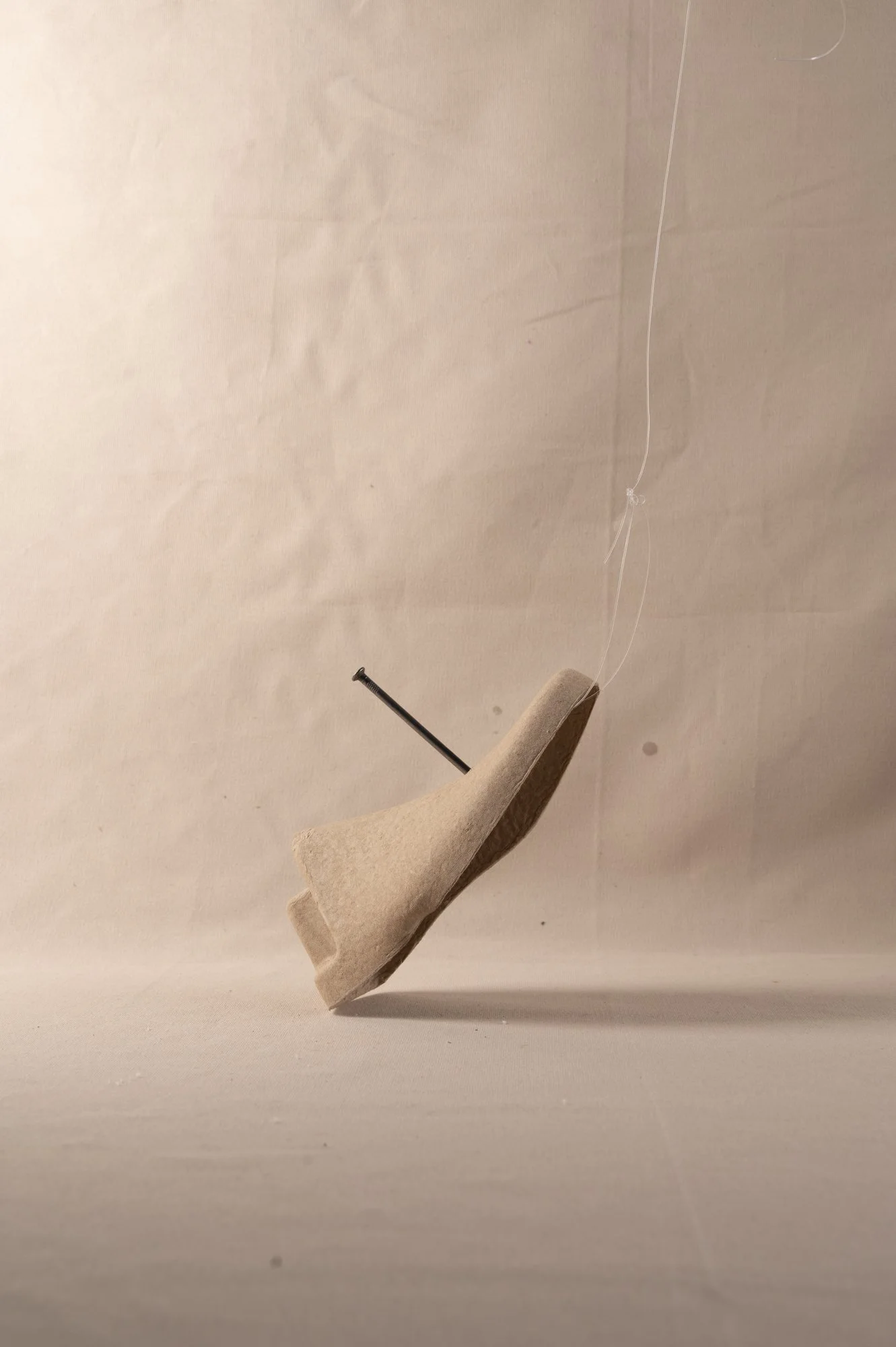
Behind the scenes
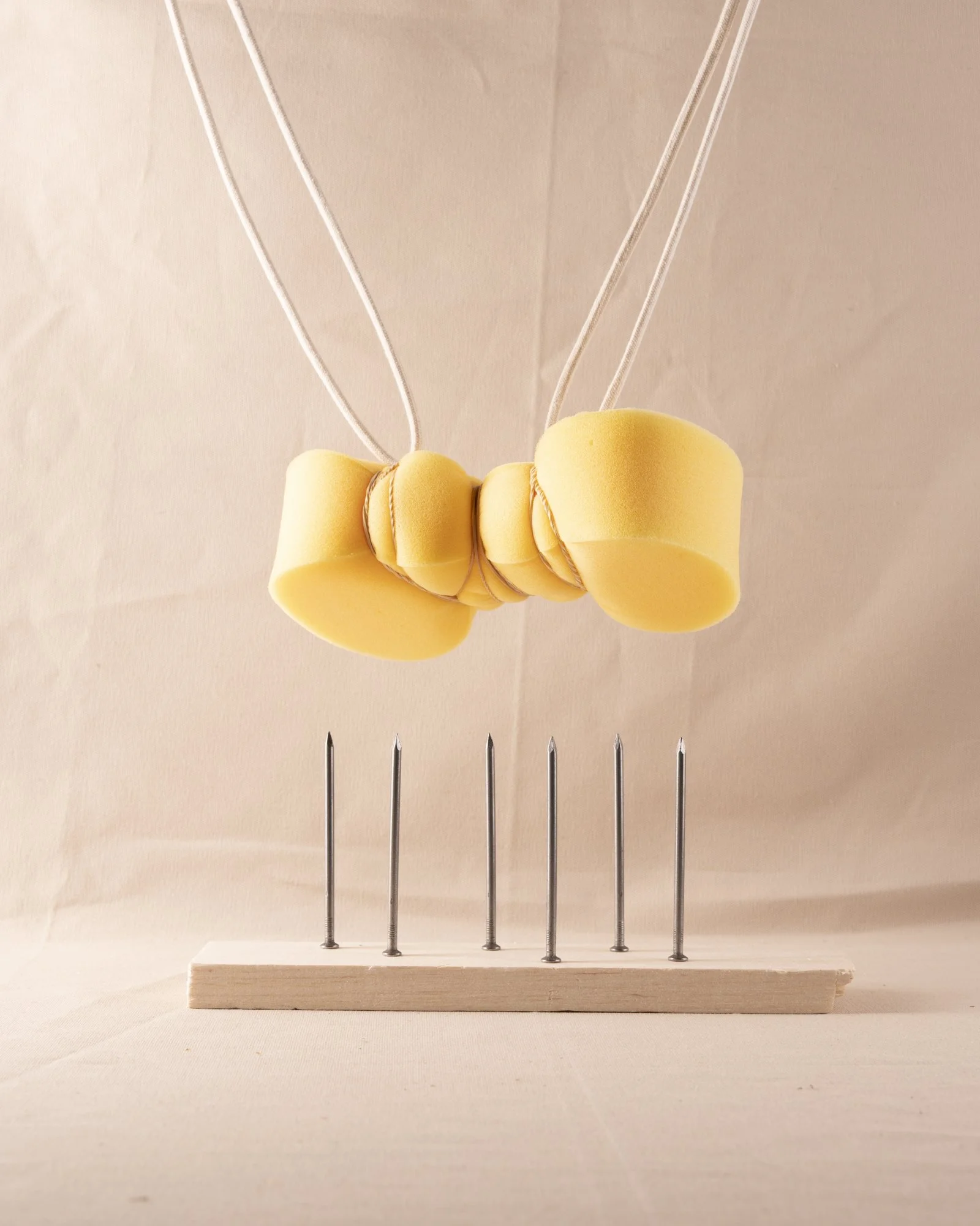
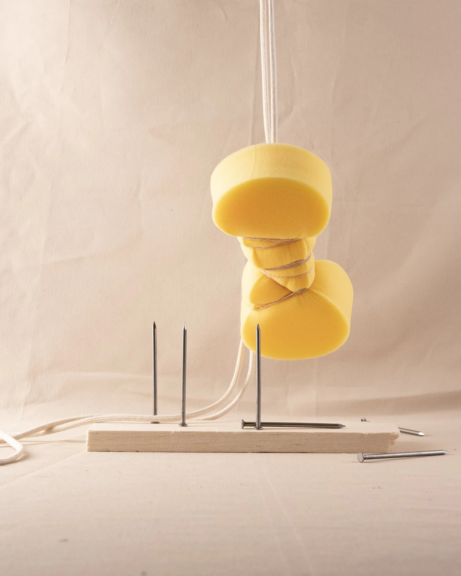
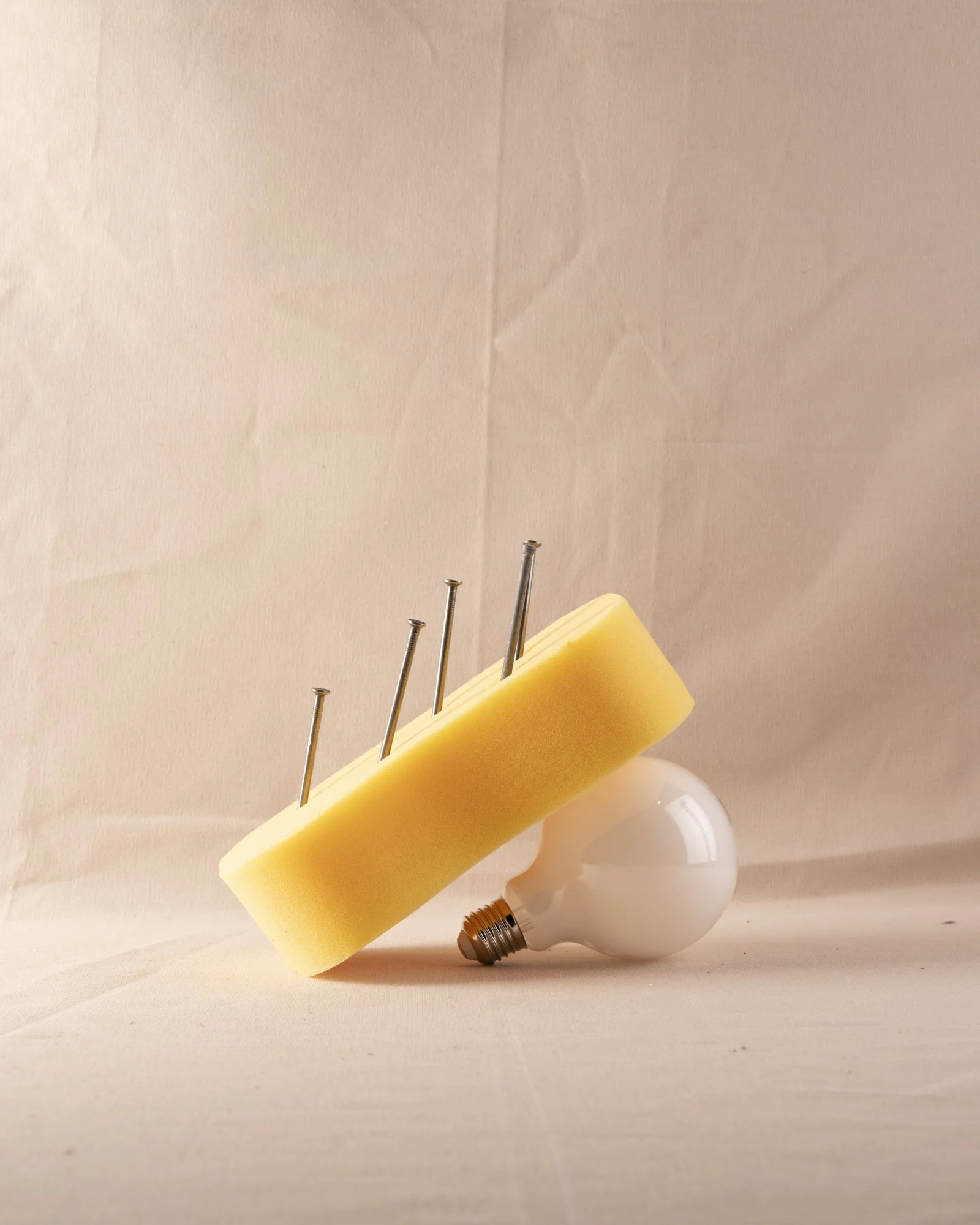
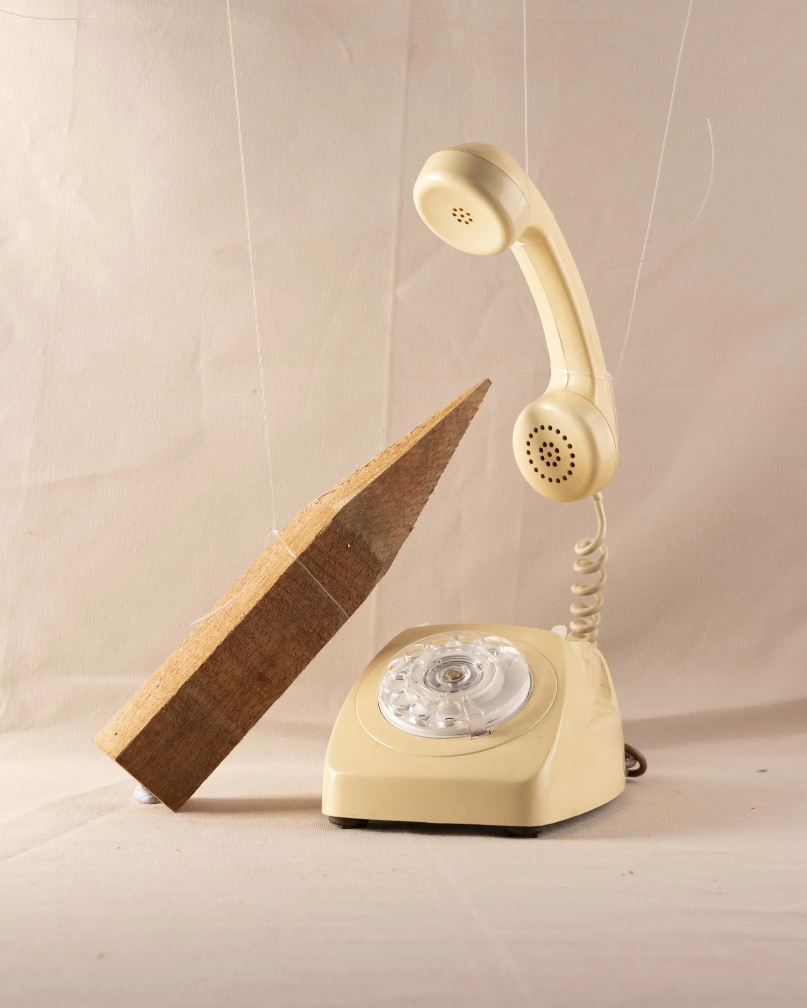
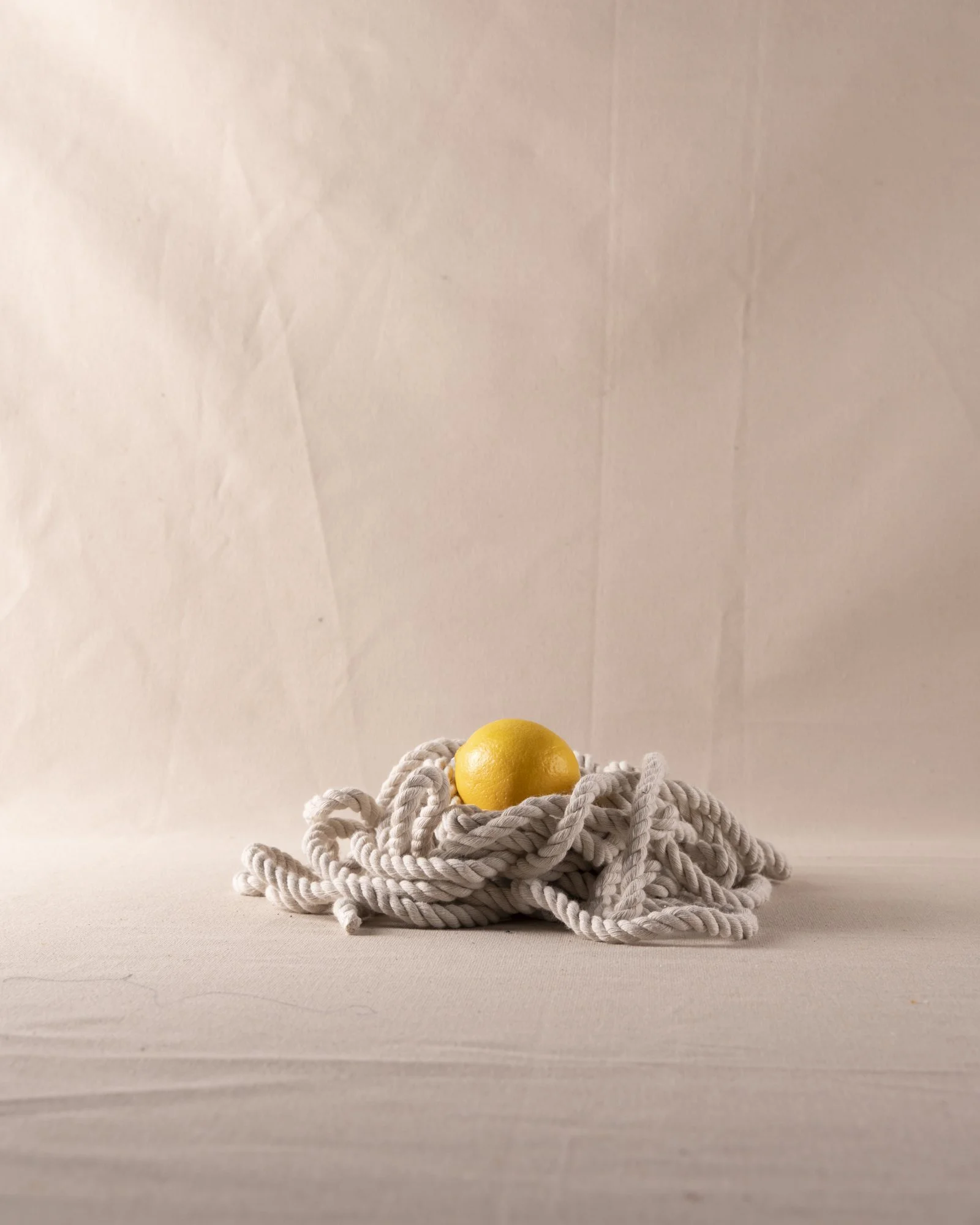
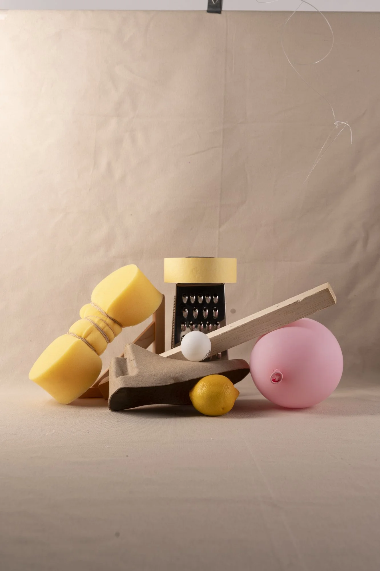
WOrk in progress 6 - Studio shoot
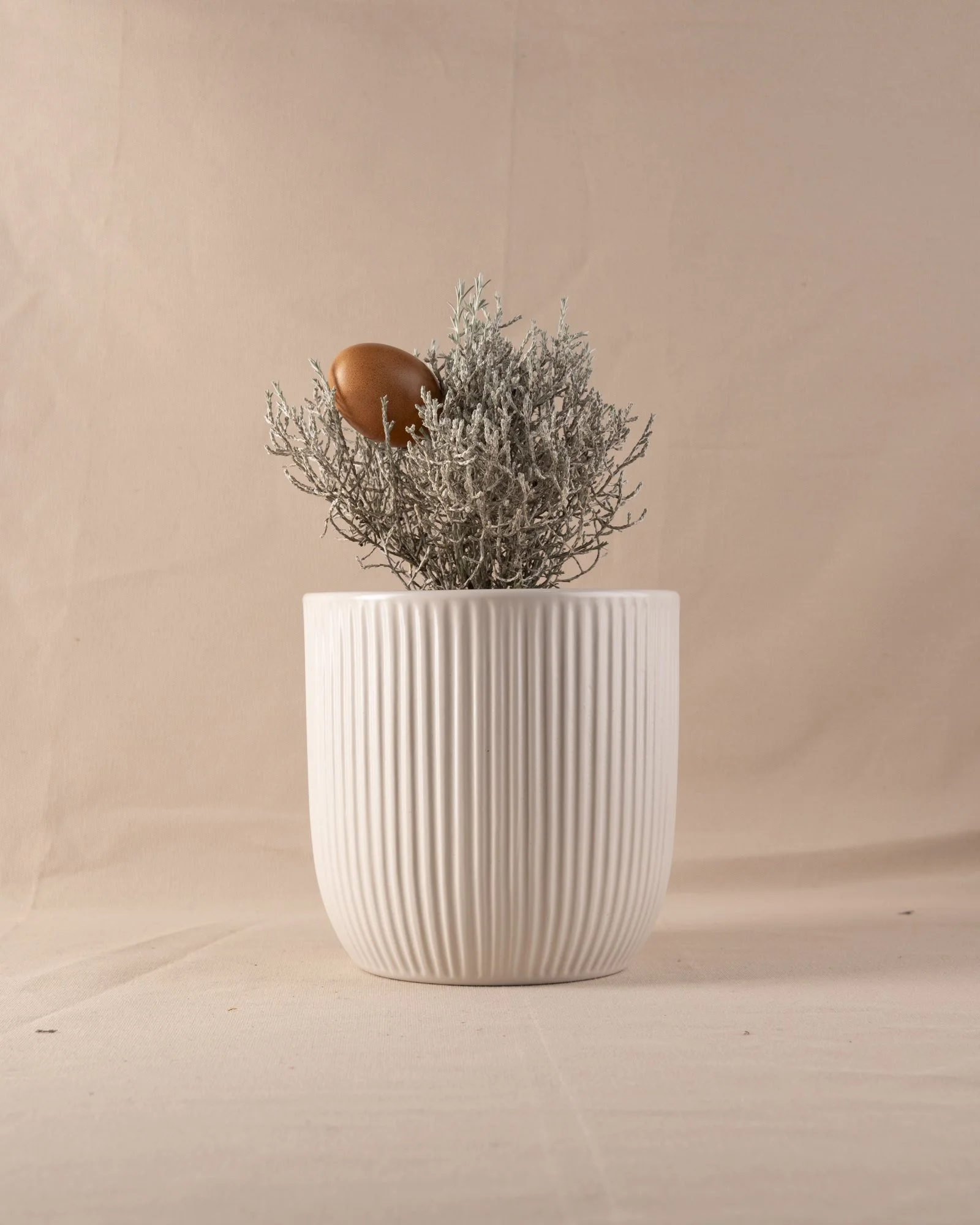

Next steps from here I need to continue shooting with a wider variety of objects. It would be good to build some more variation within the work.
My thoughts:
In this shoot I wanted to focus more on the more physical side of the work, not the mental health side. So. most of these images represent a physical sensation or symptom I experience.
I am particularly happy with the images of the sponges I feel like these all have a really strong emotional weight to them. They have a tangible feeling.
The photograph’s with the light bulbs are also quite effective.
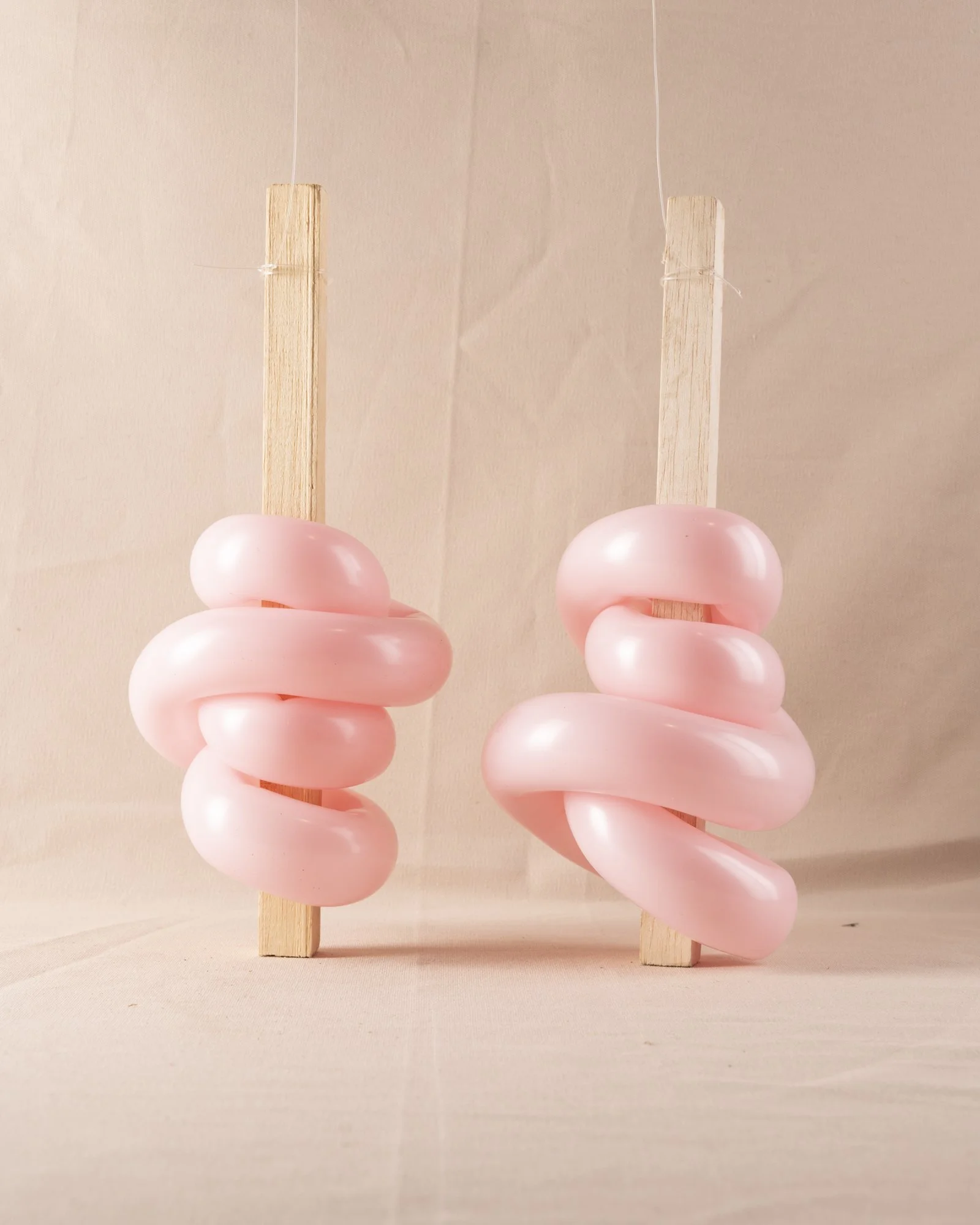
Feedback:
Continue working with new materials and try to avoid using the pink balloons.
The images of the bricks will need the shadow’s lifted in post.
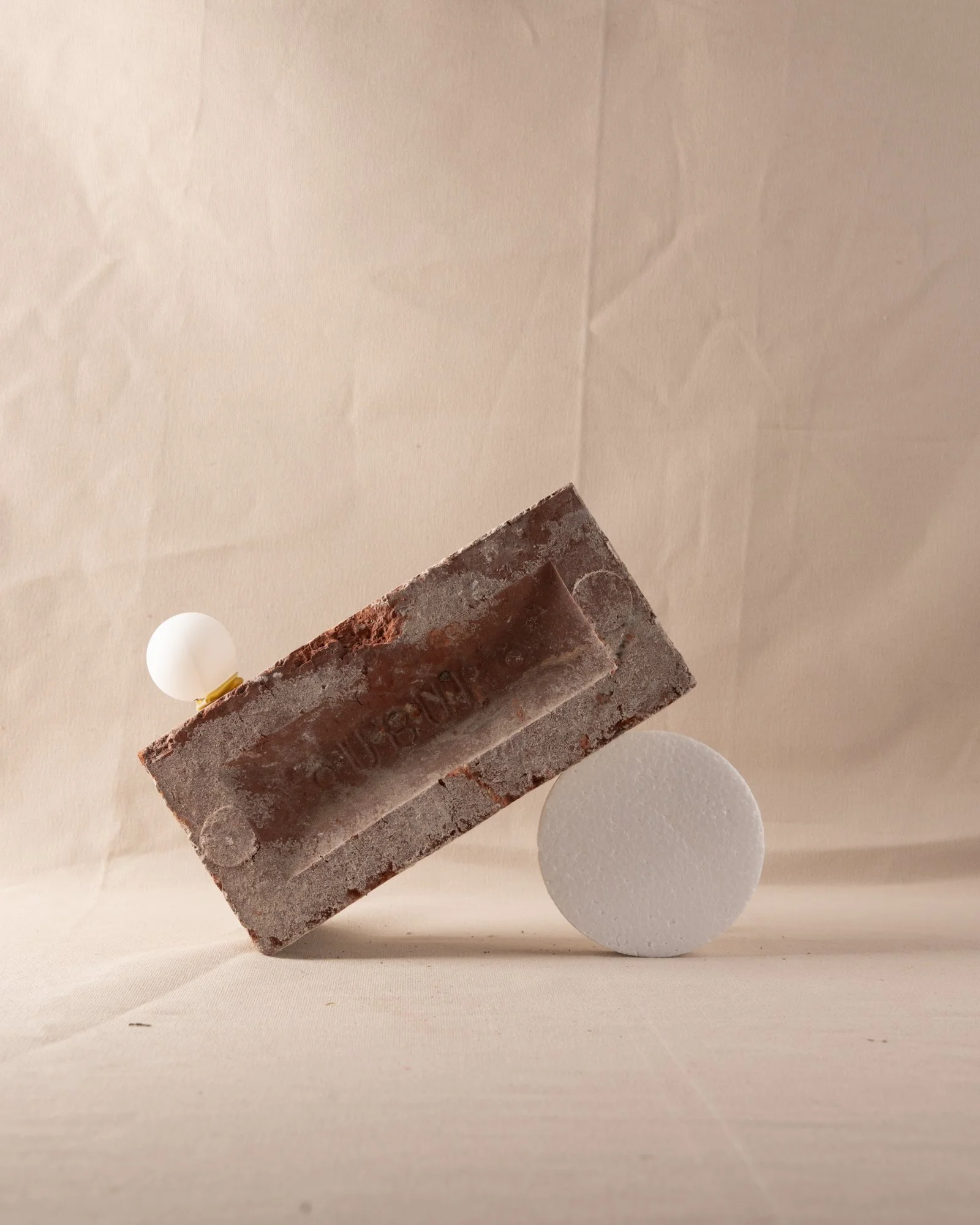
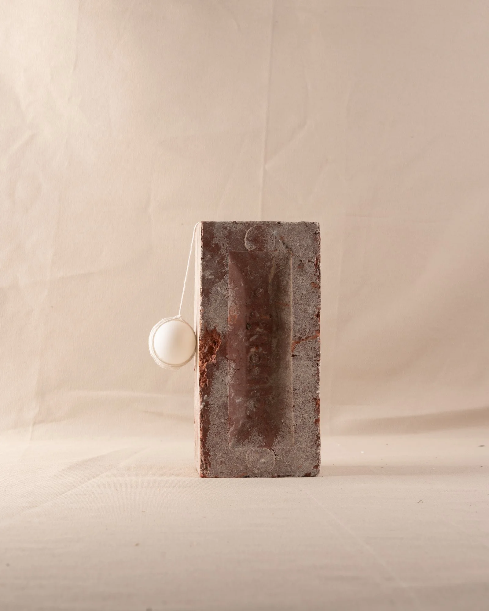
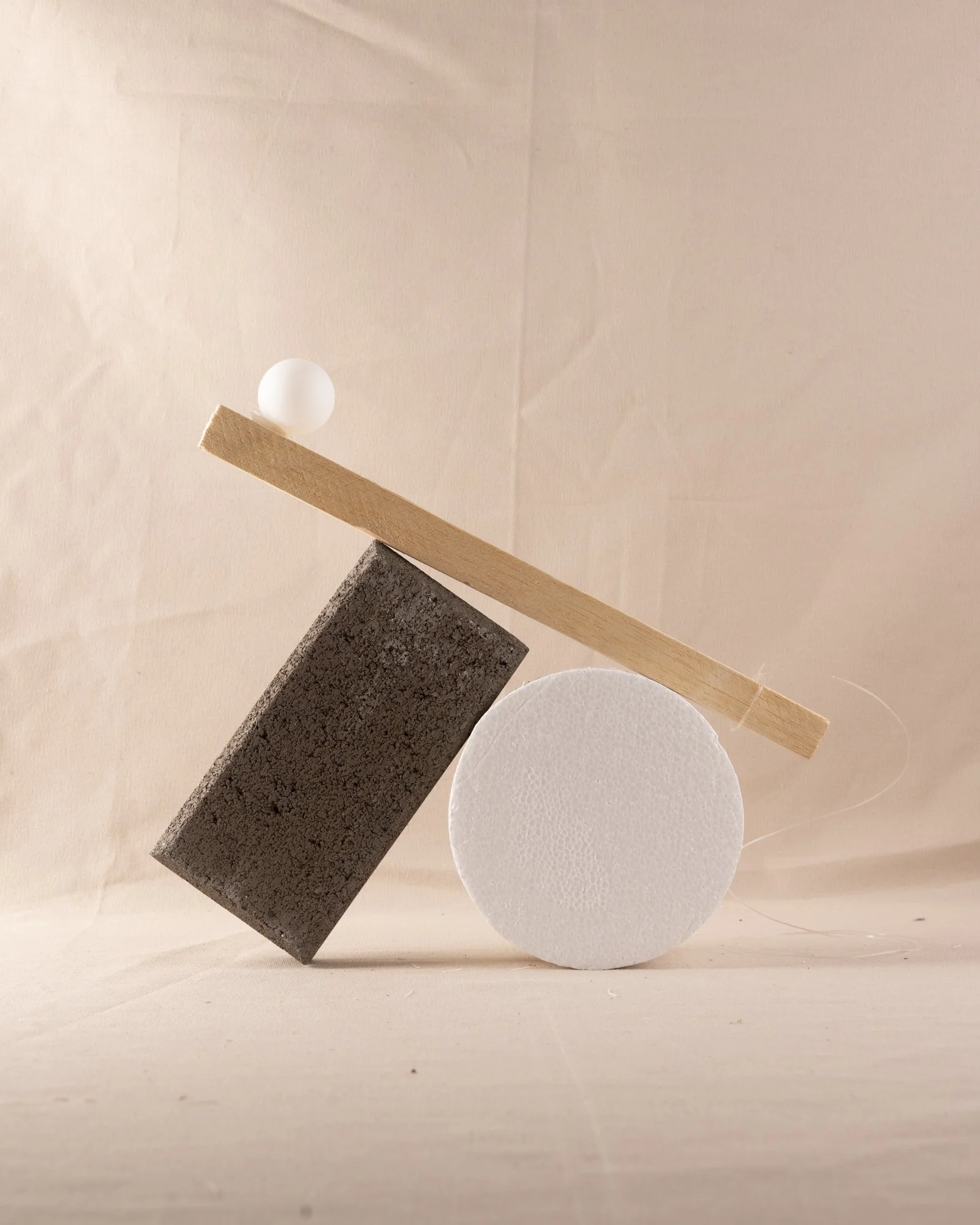
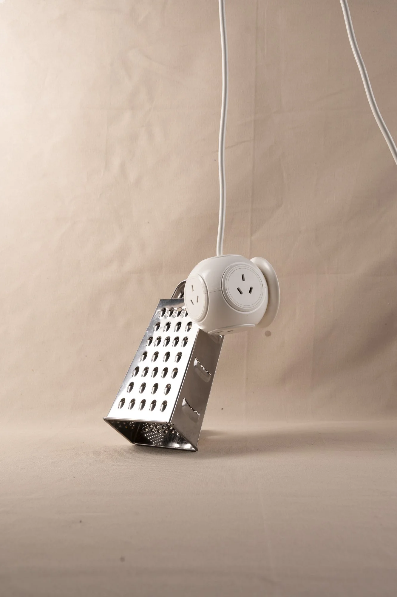
WOrk in progress 7 - Studio shoot
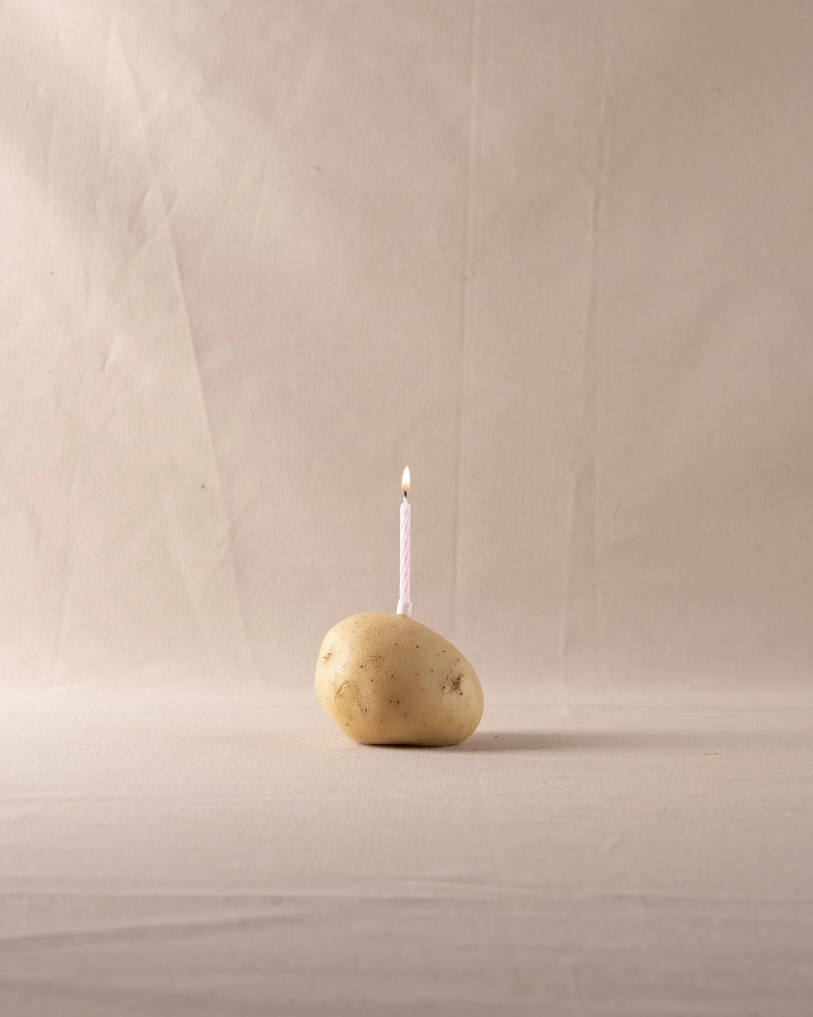
Next steps from here I would like to complete a final shoot focussing on creating images that foster a sense of discomfort from viewers.
My thoughts:
The rock work’s well as it projects’ a sense of heaviness. A weight on things.
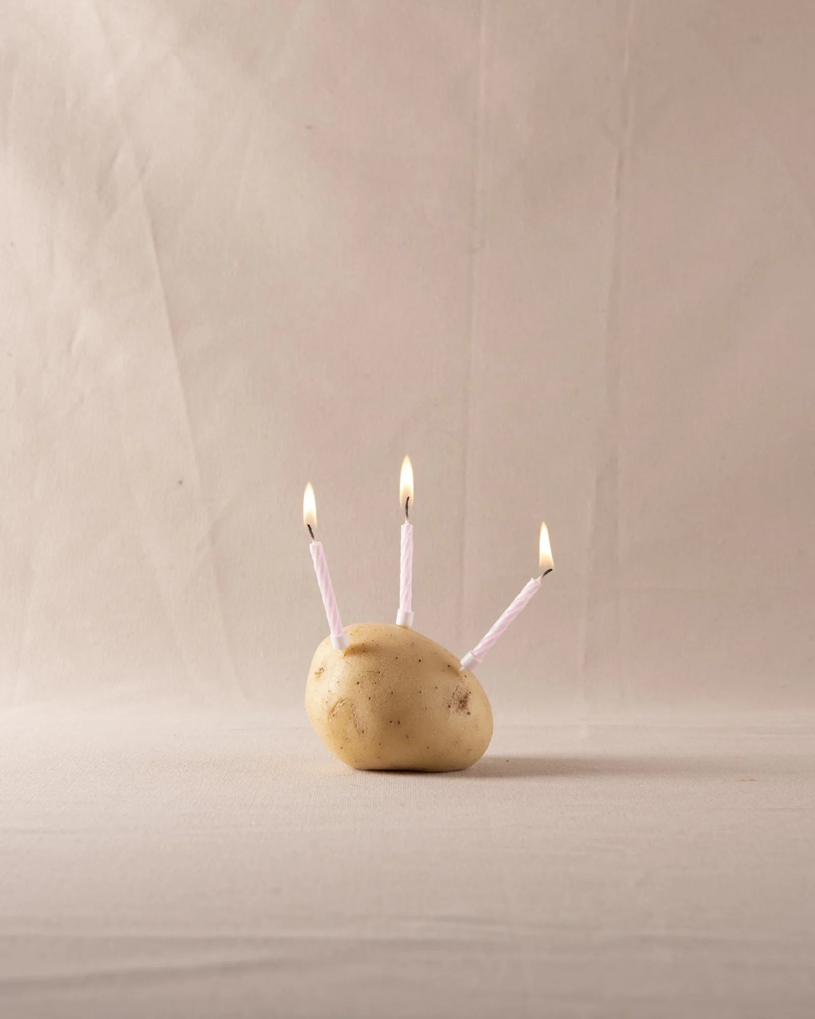
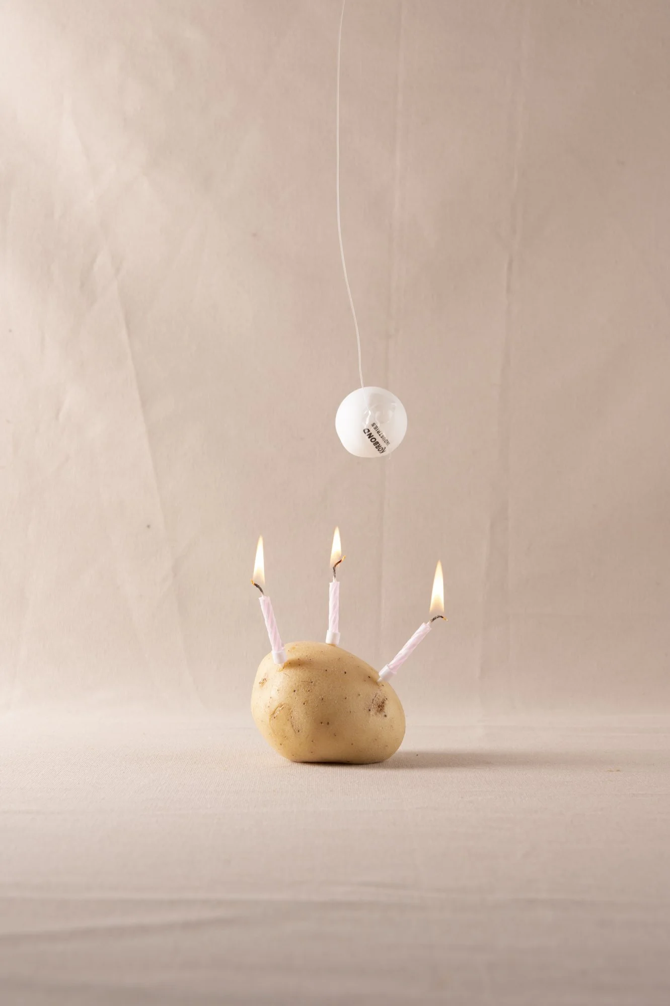
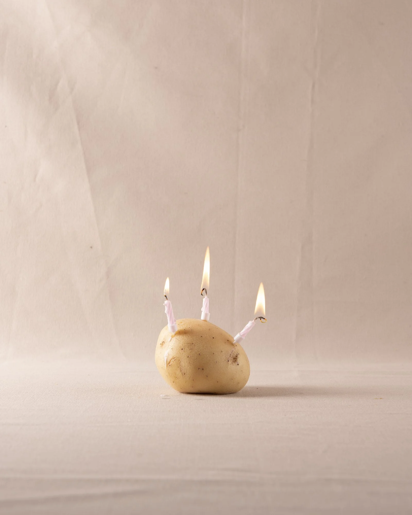
The potato also works well. The candles just have his sense of despondency and loss somehow that work really well.
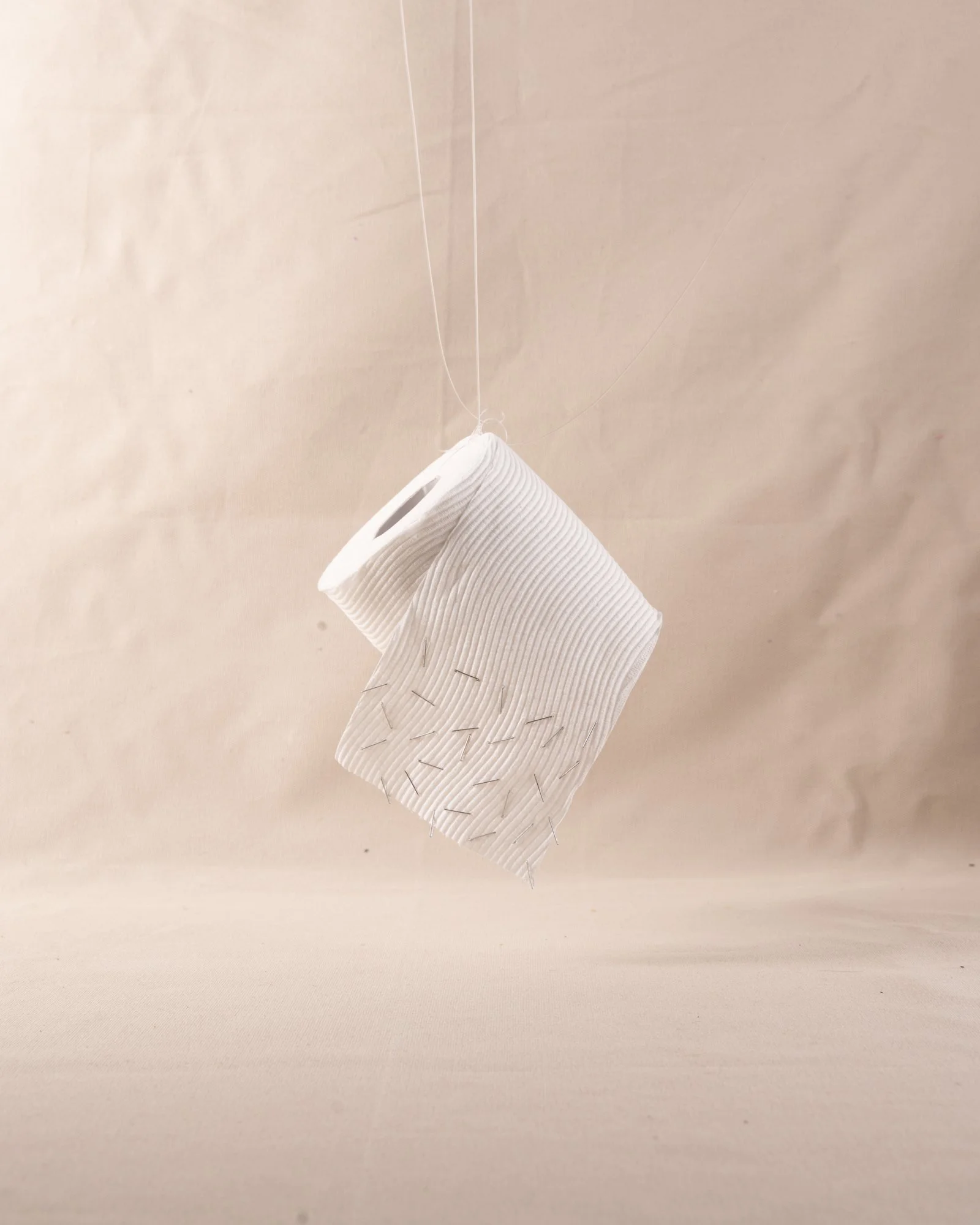
WOrk in progress 7 - Studio shoot
Next steps From here I need to refine the edit and narrow down the photos to use within the book.
My thoughts:
The goal for this shoot was to create images that foster a sense of discomfort from viewers. The toilet paper with staples in it is a good example of this.
Sequencing and layout


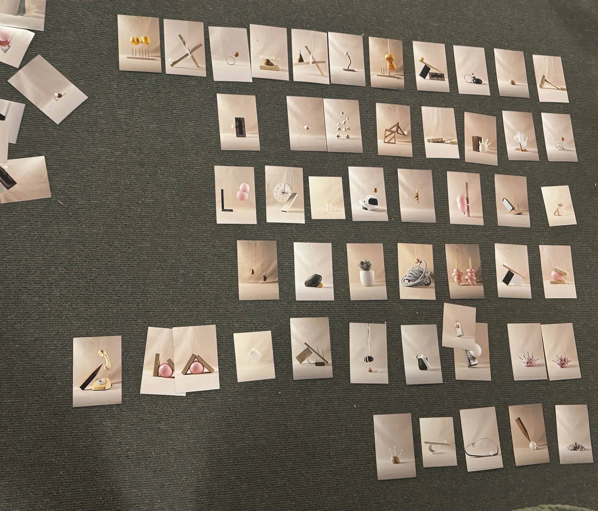
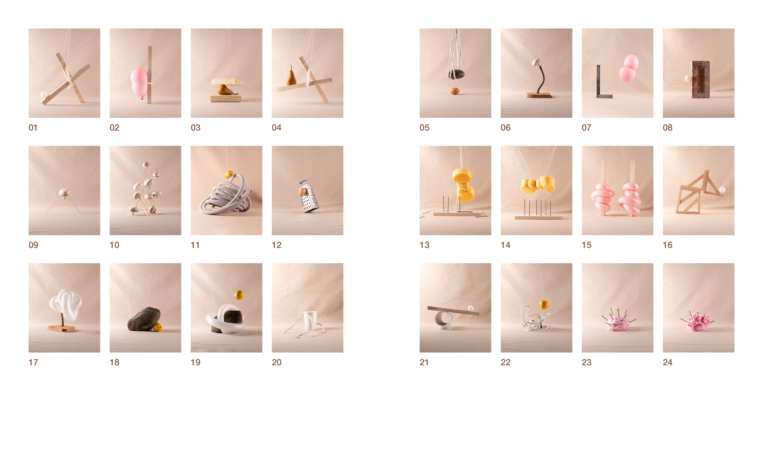
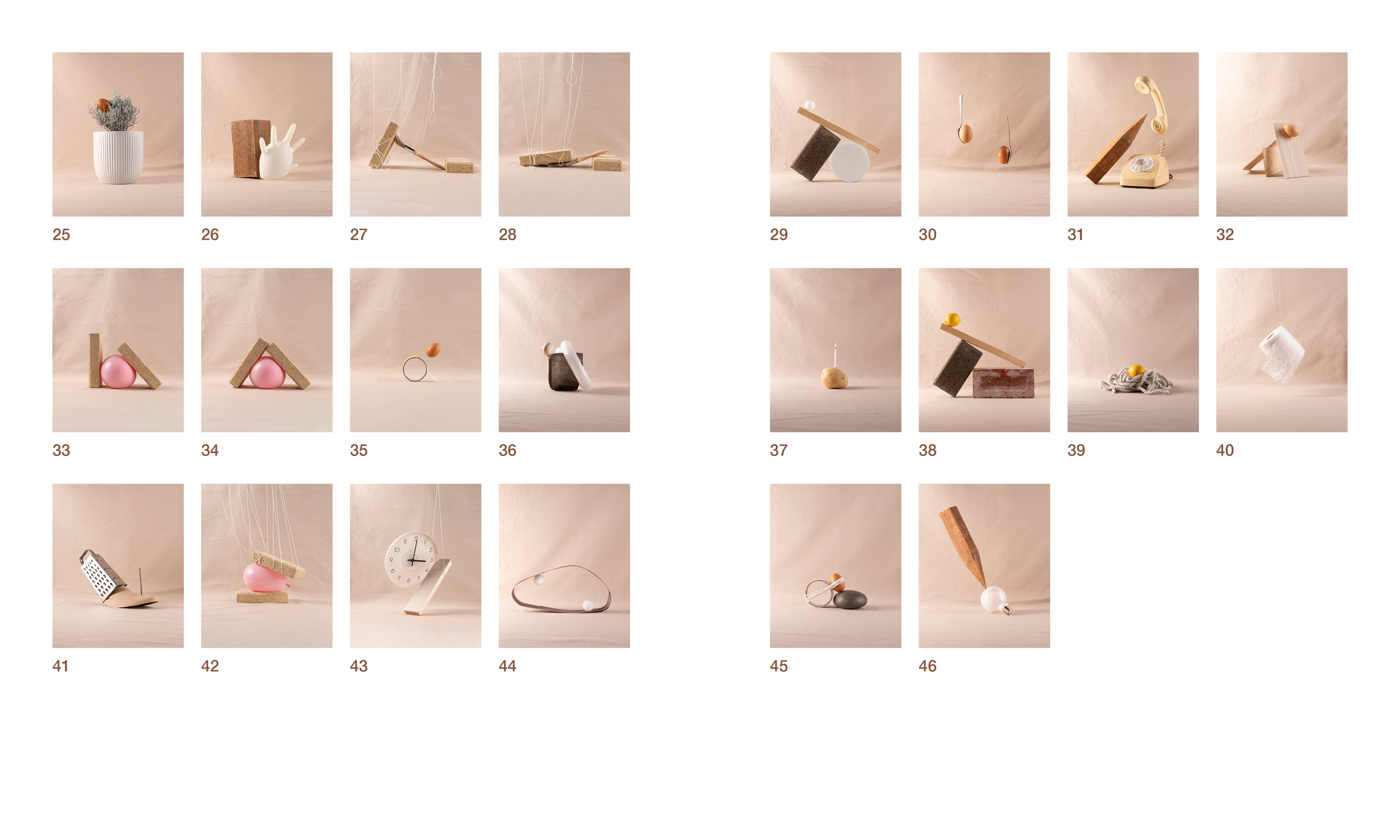
My process for sequencing involved initially sorting the photographs based on their attributes. Balloons with balloons, bricks with bricks and so forth.
I then chose some images to begin and finish with and filled in the gaps between them matching photographs with attributes for a nice flow. For example, pages 8 and 9 are linked by the round white objects being the ping pong ball and mushrooms. 13 and 15 are linked by the curvaceous nature of the objects depicted (the sponge and party balloons.
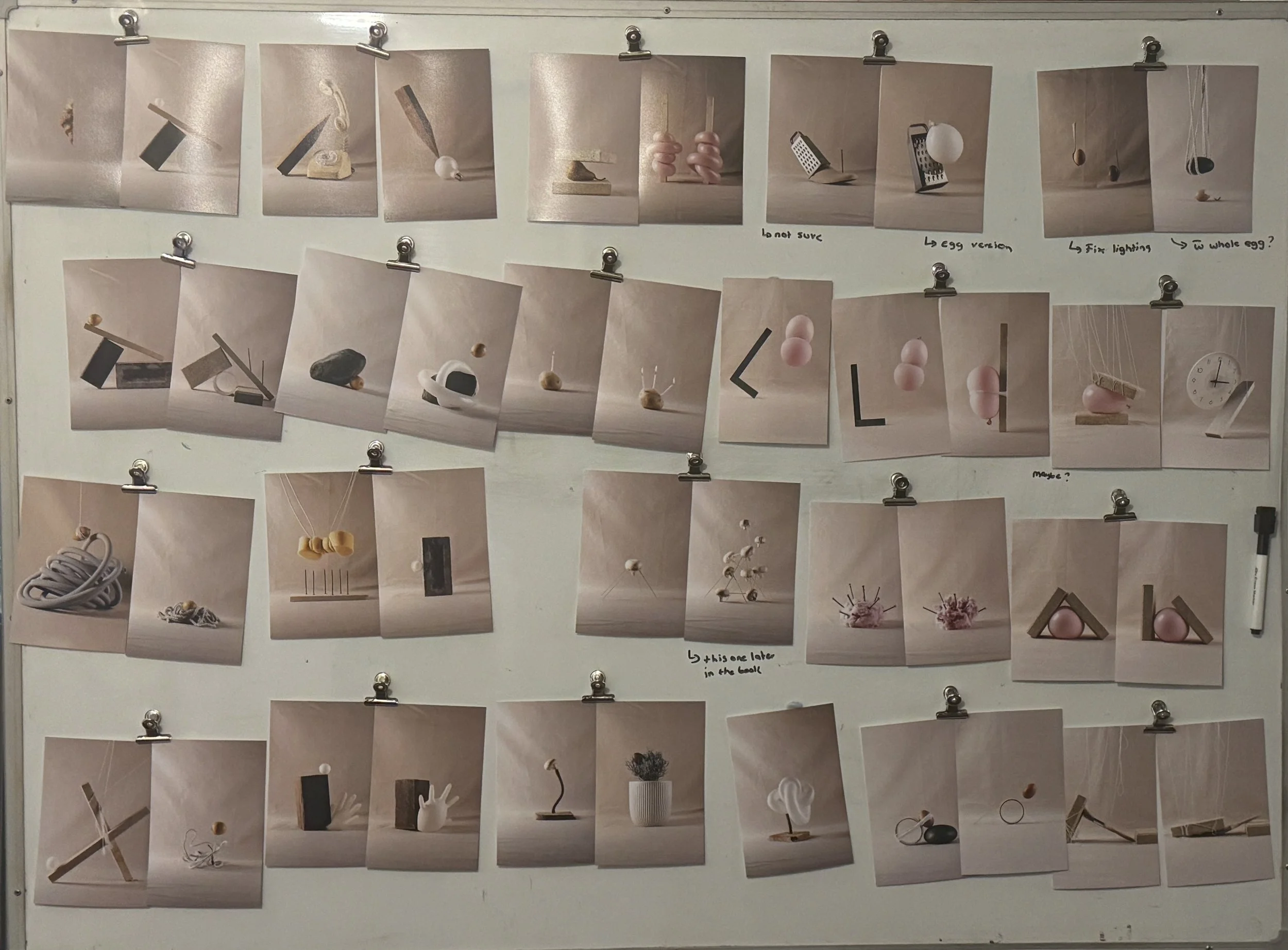
Grouping the images.
The first sequence option
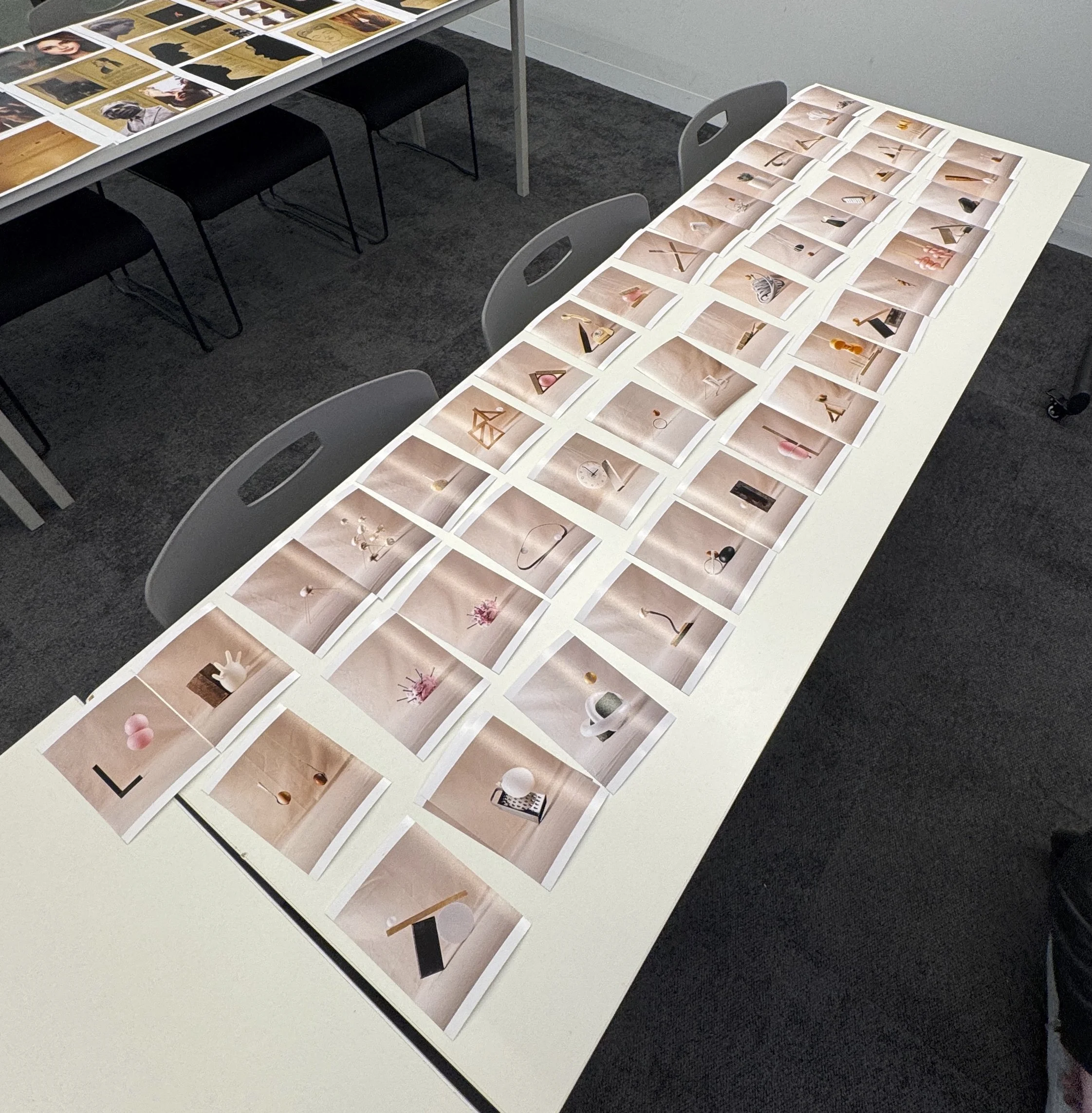
Second sequencing attempt
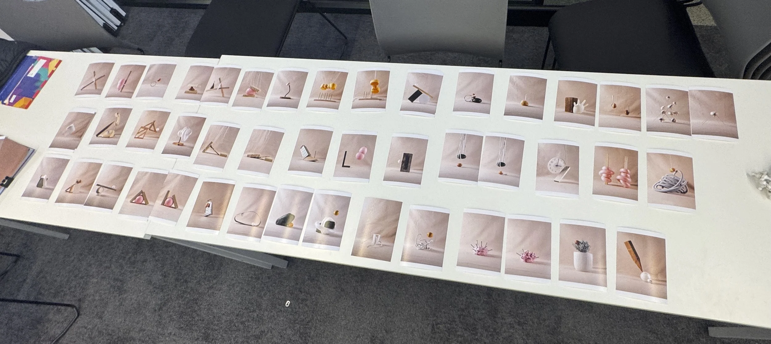
Third sequencing attempt
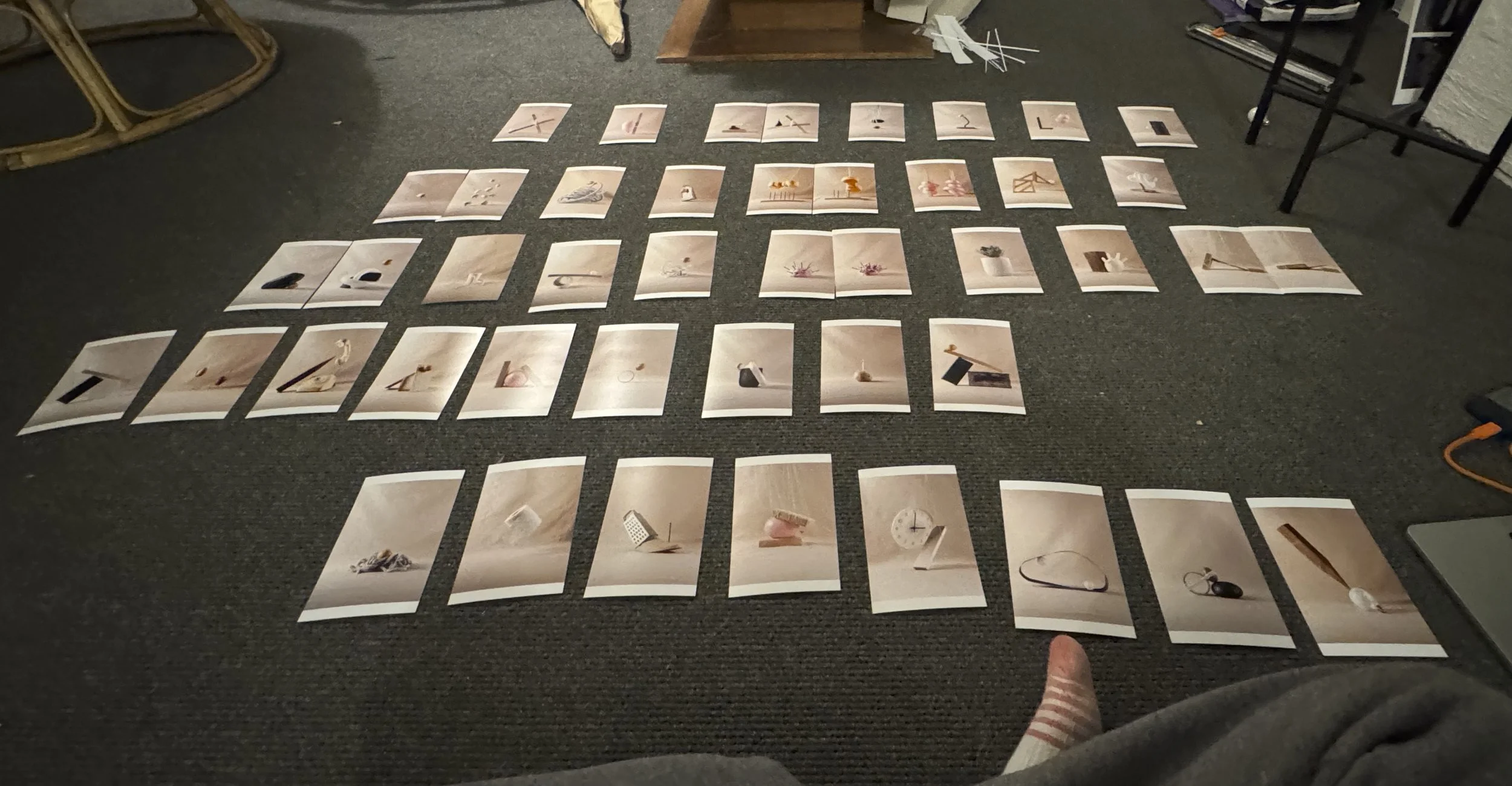
Final sequencing


Spreads and pairs.
The book includes some pairs which have deliberately been put over two separate pages. Having a page between these is deliberate as it allows the viewer to compare the two whilst viewing them independently. If they were on the same page, it would become too much of a spot the difference as they are quite similar.
Some pairs have been put on spreads so that the variations may be viewed together. These pairs are different enough to allow this.
In creating these deliberate pairs and spreads I made sure to include several of each in order to keep it consistent and not have a random spread here and there. I made sure to spread these out throughout the book as well.
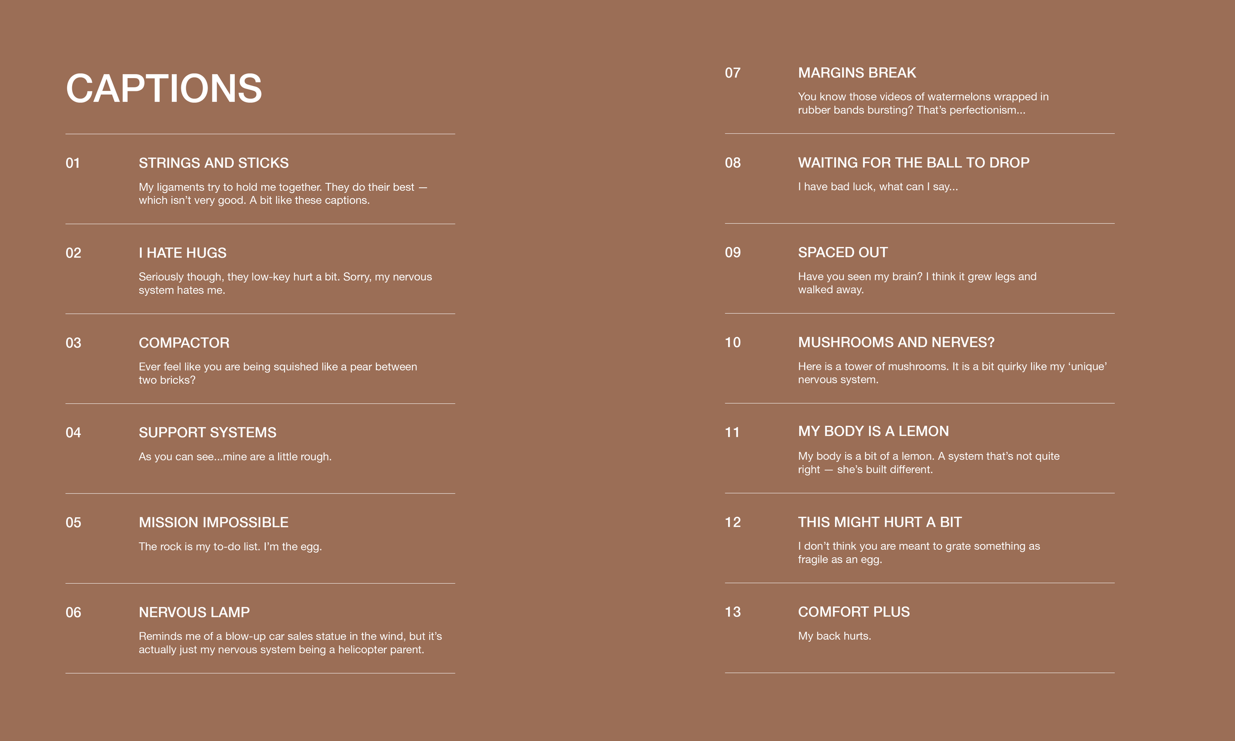
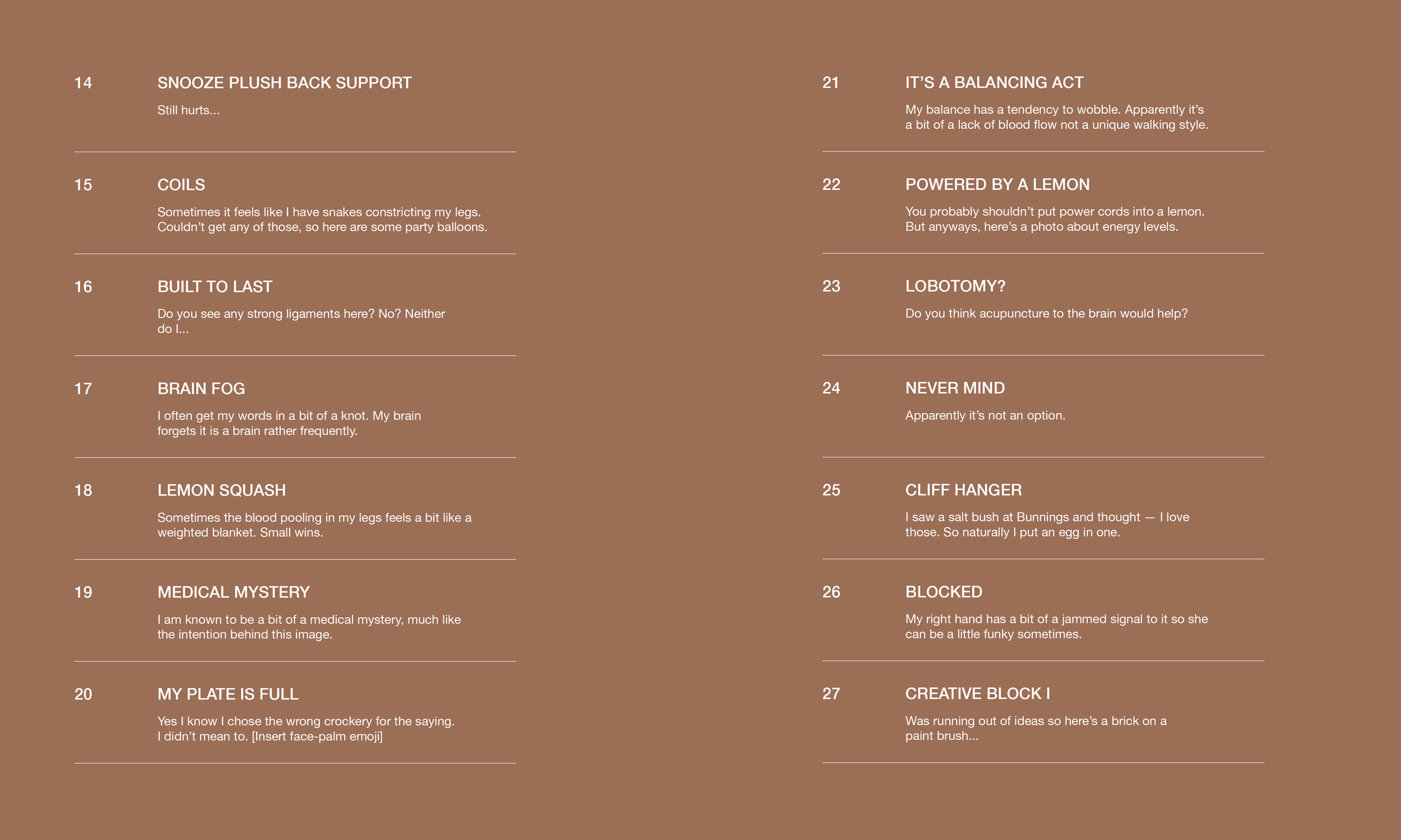
Captioning
Project evaluation
What surprised me about this project was how much I fell in love with working in the studio. There was something quite meditative about playing with my materials and figuring out the puzzle that was translating my feelings and thoughts into still lifes. I enjoyed the control I had over every element. With no subject waiting on me I was able to take the time to truly perfect each image to the standard I wanted it to be (if I had patience that day). It made me consider how I can use my fine art skills and conceptual brain in a practical sense.
I also loved the process of creating a book. This project allowed me to combine my love for graphic design with my photographic skills in a really cohesive way. I love having a physical copy of my work beyond just prints on the wall. The whole process of sequencing, captioning and designing the book as an artwork in its own right was really interesting to me. The curatorial side of things was really enjoyable and something I will definitely do again.
I feel like this project let me express myself in a vulnerable way whilst retaining a more comfortable aesthetic which is a nice change from my previous works along similar themes.
There are things I would change or add to the book, and potentially will in future print runs (if there are any) but overall I am actually quite happy with the resulting book (a rare occurance for me).