Refuge book cover, Perimeter Editions, 2024photobook analysis
Refuge
Photography by Lenard Smith
Text by Fritz Haeg
Published by Perimeter Editions, 2024
In the June of 2020, Lenard Smith arrived to Salmon Creek farm to partake in a 2-week residency there after one of the cabins on the Artist’s commune were advertised to BIPOC artists as a sanctuary space and refuge with no obligations or expectations from its resident. It was advertised as a “Quiet spot for those who might need it” (F, Haeg 2024) by Fritz Haeg, its founder following the previous months devastating events surrounding the murder of George Floyd. During Smith’s time in the cabin, he took photographs and documented his stay which this book records.

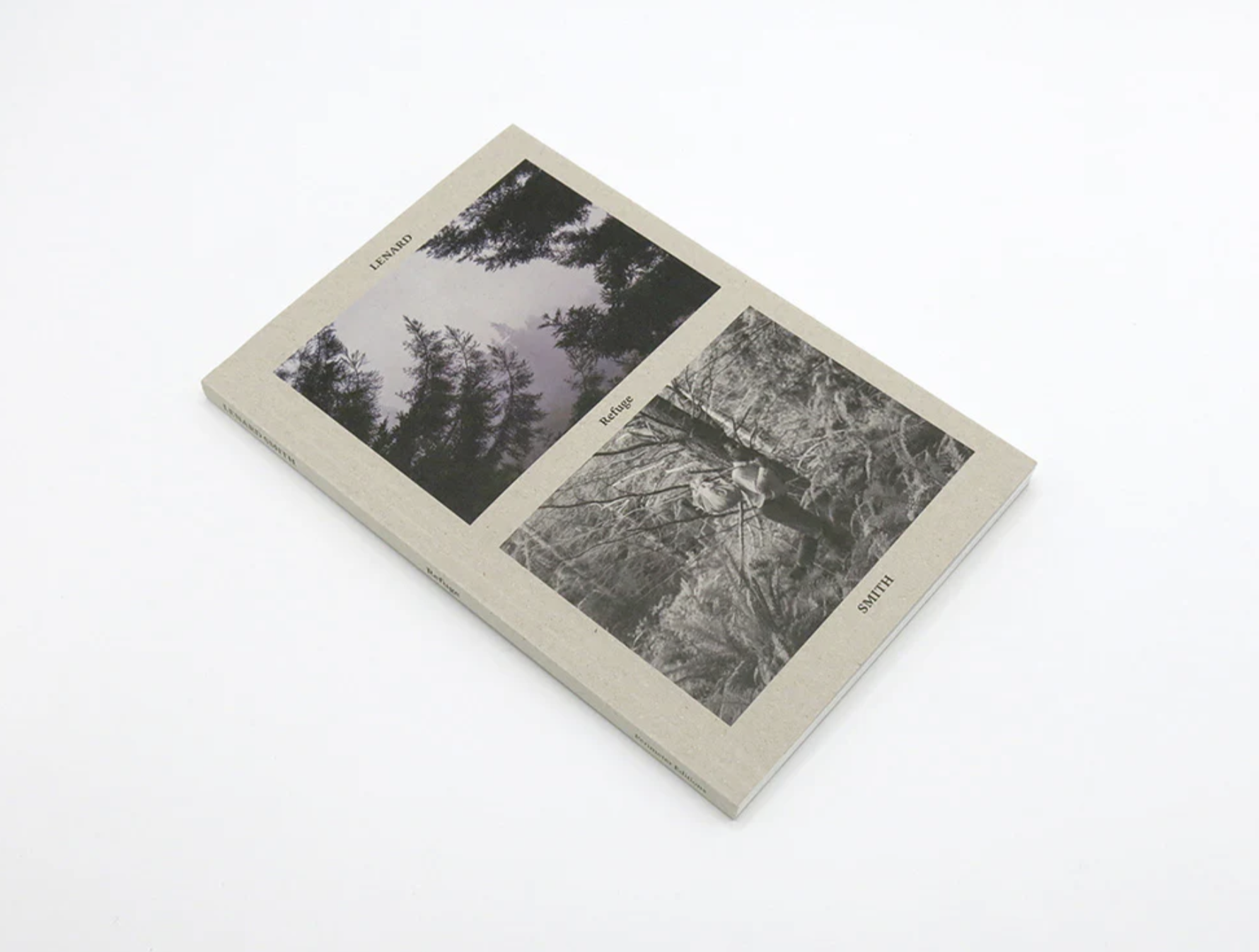
Refuge book cover, Perimeter Editions, 2024COVer design
What image has been used?
Almost blending into the greyish-brown, card cover 2 images appear on this book’s cover. The top image being a landscape peering through two pines into a scene largely obscured by mist. The second, a self-portrait of Smith depicting him trekking through a dense undergrowth on the forest floor, a stick and bag atop his shoulder. Not that we know it is a self-portrait on first inspection.
Has it been cropped?
The photos feel cropped, they are tighter in composition with limited expanse, even in the landscape. The two align well the trees branches in the upper image flowing nicely from the lower images cropped tree.
What is the impact of the design?
The two photos are separated by about a cm of blank cover as well as a small book title hovering between them.
His capitalised name is positioned above and below the two photos, first and last name separated. Almost like he guards these images, a sense of security coming through. The back cover maintains the same text layout but dismisses the images. A sense of absence is felt looking at that cover.
Overall, the cover suits the book well. It projects that sense of solitude that comes through the images and themes of the book.
Photography

Refuge Pg 24-25, Leonard Smith, 2024What style of photography?
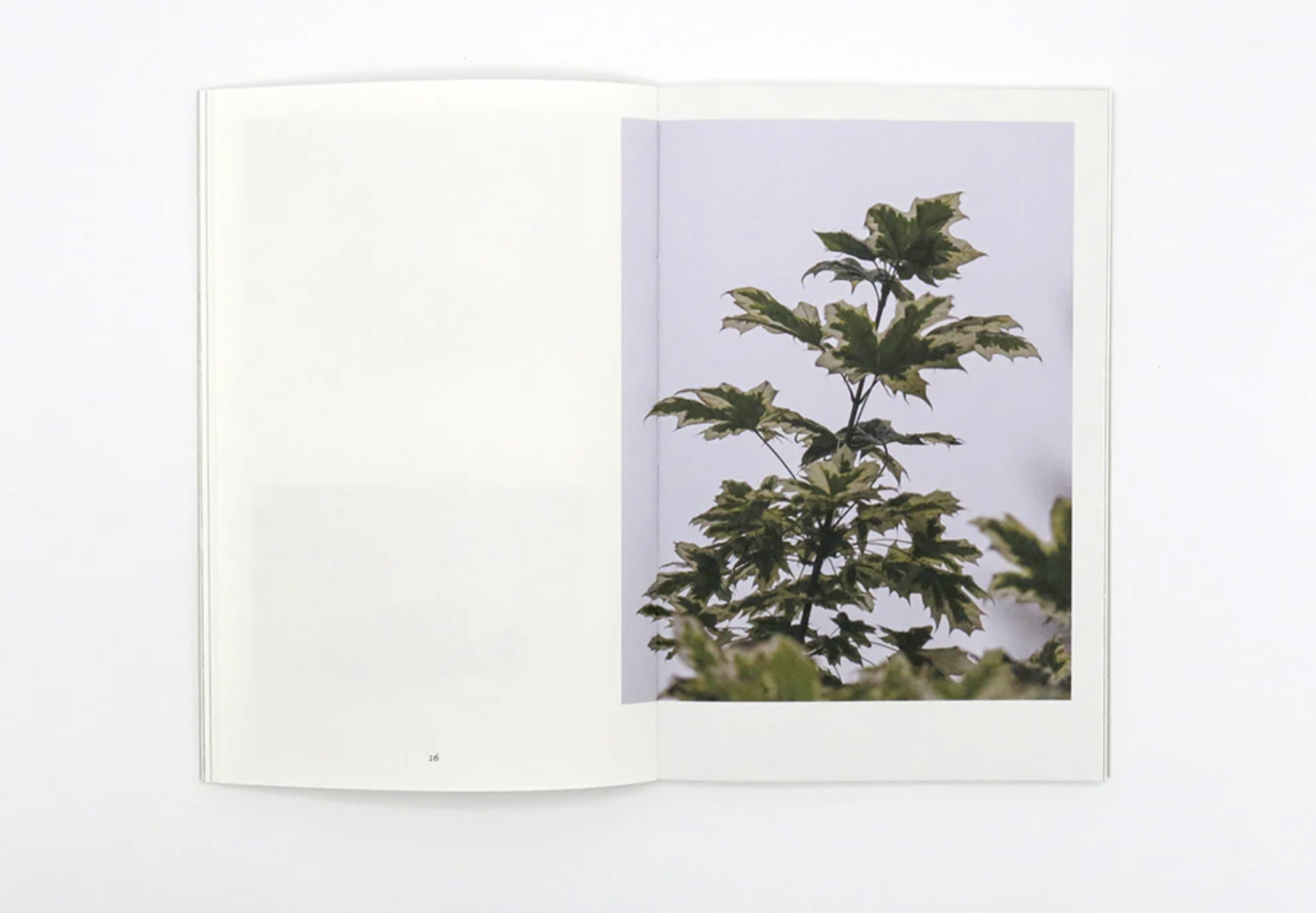
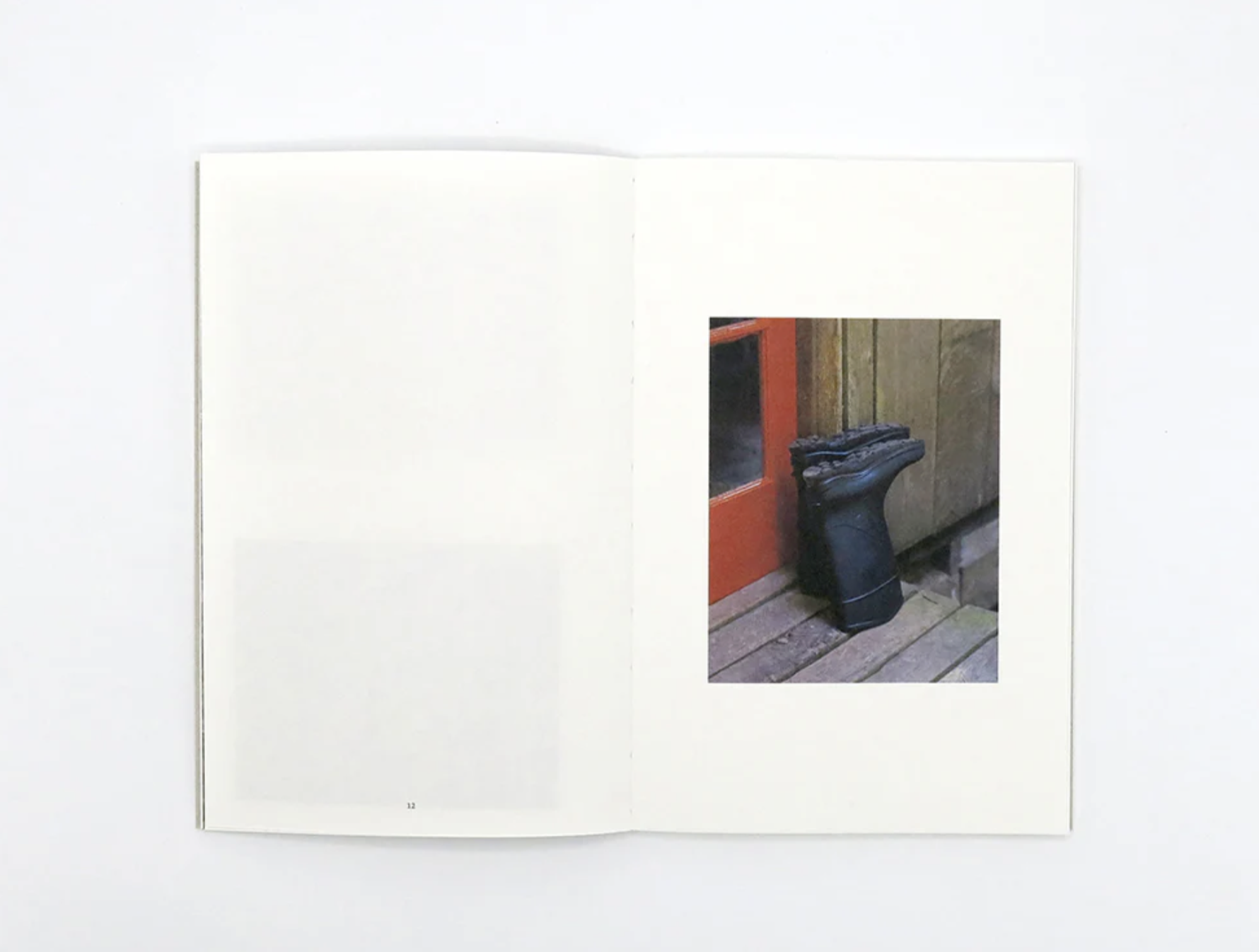
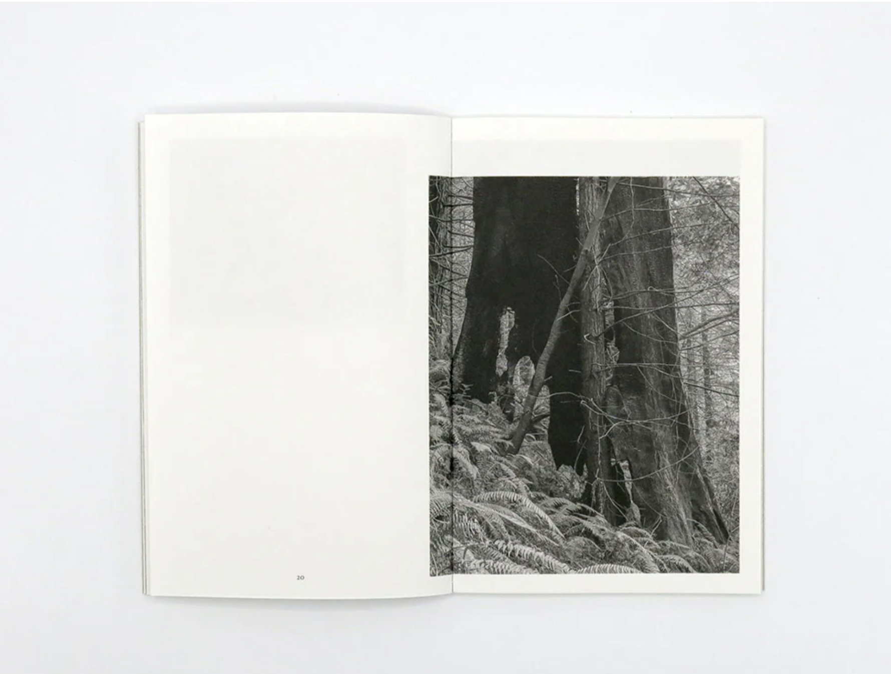
The photographs alternate between midshot landscapes and still life’s largely. The landscape’s feel like glimpses into the photographers viewpoint. Each photo like a transient moment from his day.
Photos alternate between colour and black and white which prompts contemplation from viewers. From my viewing these choices may be purely aesthetic based as I can’t find a symbolic reason at first glance, but I do find it assists with the sense of the book feeling like a visual diary of sorts.
Refuge Pg 20-21, Leonard Smith, 2024
Refuge Pg 12, Leonard Smith, 2024What does it communicate?
The book communicates the probable sense of peace and escape Smith felt during his stay at Salmon Creek Farm. Each image is void of other people, merely capturing his surroundings as he sees them, and objects found around the retreat.
Are the photographer’s intentions clear?
The photographs taken outdoors feel less intentional and more ‘spur of the moment’. Captured in passing as he goes about his day. We see sections of forest and water, as well as man of the outbuildings found on the property. Those taken indoors however, are more specifically arranged assemblages and chosen single objects such as a head lamp, sage sticks and sculls. These feel almost like a catalogue, of items relating to his stay.
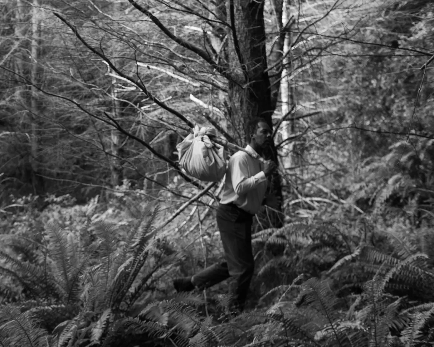
Runaway Slave, Leonard Smith, 2020What are the key images?
To me the self-portrait, known from further research to be titled as ‘Runaway Slave’ is the key image. It is the only photograph to feature a person. The title and depiction of himself trekking through the forest a bundle attached over his shoulder feels highly intentional. It feels like a challenge and statement after the devastating murder of George Floyd only weeks prior. The black and white image has a slight blur, a haziness about it that contributes to a sense of unease.

Refuge Pg 26, Leonard Smith, 2024Page Layout
Consider the placement of the images?
The placement of images throughout this book varies greatly. It alternates between centred small images, full bleed photos of shrubbery, spreads with small images on each page, and images aligned to the top right. Most of the papers honour the page margins though some bleed across the gutter by a sliver. The variety works, suiting the clearly exploratory nature of the project as a whole.
Is there visible logic or intention?
Whilst it is varying, it still feels intentional, as though each layout was chosen for each specific image with a high level of purposefulness.

Refuge - Inner Cover, Leonard Smith, 2024text
What has been included?
If spotted by the viewer within the French folds, the first section of text within the book is an essay by Fritz Haeg, a founder of Salmon Creek farm, detailing the history of the place and his memory of Smith’s time there too. It provides context for the role of place within the book. The value of it. As well as setting a sense of time, detailing the timing of the pandemic as coinciding with the photos creation.
What is the text and image relationship to each-other?
There is no text on any of the inner pages beyond the start and finish and the subtle, small page numbers that mark the book’s progression. This works. It allows the viewer to simply indulge in the journey taken throughout the book, and come to their own conclusions. To imagine what it might be like to stay there.
What fonts have been used?
The font used throughout this book is a serif font, Lyon Text (as outlined in the book’s colophon). This font uses fairly rounded, subtle serifs to provide a historic, nostalgic feel to the text. The roundness allows for a contemporary softness to come from the text too.

Refuge Pg 46, Leonard Smith, 2024Editing and sequencing
What is the narrative?
This book has no clear narrative or sequence, it more so being a product of someone with time to create and explore, as Smith did during his stay at Salmon Creek Farm. It explores his surroundings and captures objecs that resonate with his experience.
Have pairings been used?
The pairing on page 46 provides a rare comment on the cultural climate at the time, or even just a nod towards it. The book ‘if they come in the morning’ by Angela Y Davis depicted surrounded by an array of organic matter on a white backdrop. On the other side of the spread the cover image is seen. Branches framing a hazy, almost fully obscured landscape. There is a sense of loss and pain in this pairing. A moment of pause too.
Does it seem haphazard or intentional?
The pairings and sequencing feel intentional within the book though the overall the book has a looseness to its structure. Colours and shapes link and connect the images loosely providing a nice visual flow.

Refuge Pg 58, Leonard Smith, 2024
Refuge Pg 70, Leonard Smith, 2024OVERALL DESIGN
How has scale been used?
The book sits at an A5 type scale, which suits the work. It gives a journalistic-type feel to the book which suits the fact the images were taken as a sort of record and diary of his time at Salmon Creek. It feels personal.
What paper stock?
The cover is printed on Starline Grey Black 250gsm card, which has a soft grey/brown look to it and a mottled texture. This makes it feel almost like a notebook which works well.
The paper inside feels a bit like a visual diary’s paper, mimicking the Jornal-like approach to the book. The paper is thick but rough and a warmer tone. The Munken Premium Cream, 90gsm paper is quite matt and allows the photos to sit on it softly with no sheen. It feels quiet and subtle.
Have end sheets been included?
The book does not include end sheets however it does have French Flaps. Inside that first fold, in the front of the book, the main bulk of text is concealed with an essay by Fritz Haeg positioned across it.
Has a colophon been included?
The colophon on this book provides a brevity of contributor names and details about the book and its publishing.
What inspires me about the book?
What first caught my attention about this book was the cover. I love the textured, unrefined card used and the way the images blend seamlessly into it. I hope to also use a card material for my own cover.
I also appreciate the simplicity of the book’s layout. The journal-like approach really speaks to my own project, as does the matt and rather soft paper choice which allows each image to sit nicely on each page, with a certain subtlety. I hope to do the same in my own book.