Grace book cover, Rob Olver, 2024photobook analysis
Grace
Photography by Rob Olver
Text by Joanna Wharton
Published by Dawn till Dusk Publications, 2024
Grace forms a documentation of the devastating events Australia has undergone in the last 5 or so years, from fires, a pandemic, floods and drought. It captures the effects of these events on our land and people, the dark times and damage. It also, however, captures moments of beauty, of grace and peace. Providing hope in a land of uncertainty.
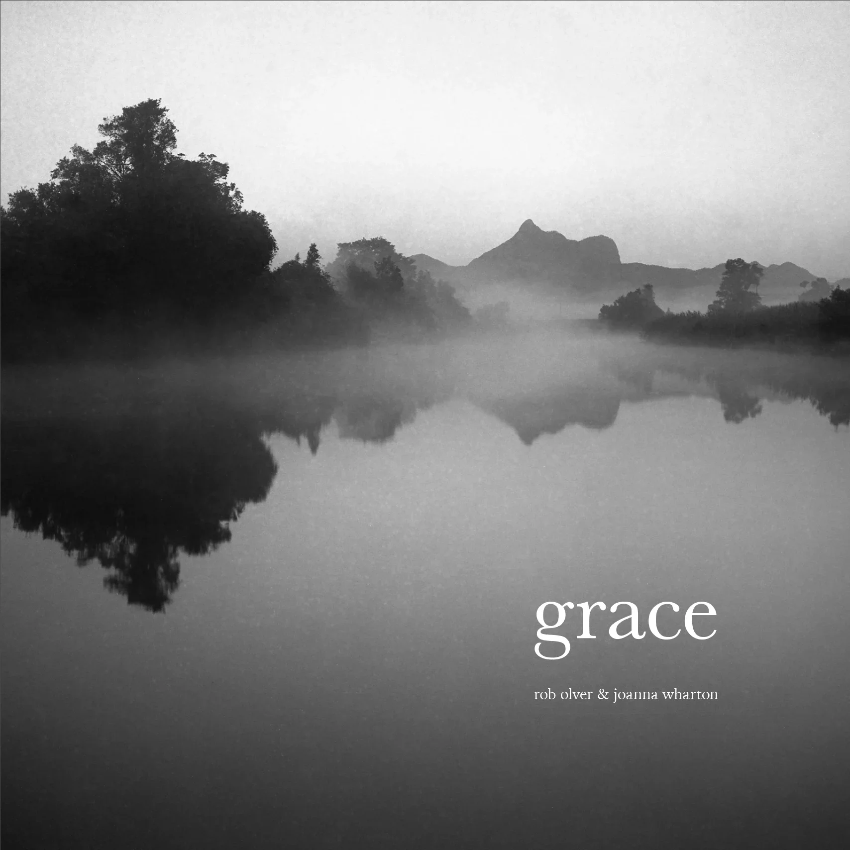
Cover Design
What image has been used?
This book greets viewers with an eerily quiet, black and white landscape featuring a misty, still lake. The image sits full bleed across the cover only interrupted by the title text and author names sitting in the lower right corner.
What is the impact of the design?
The use of this image sets a tone of melancholy across the book that contrasts the rather elegant word ‘grace’ as the title. The overwhelming midtones and shadows across the image feel both forlorn, and quiet.
Photography
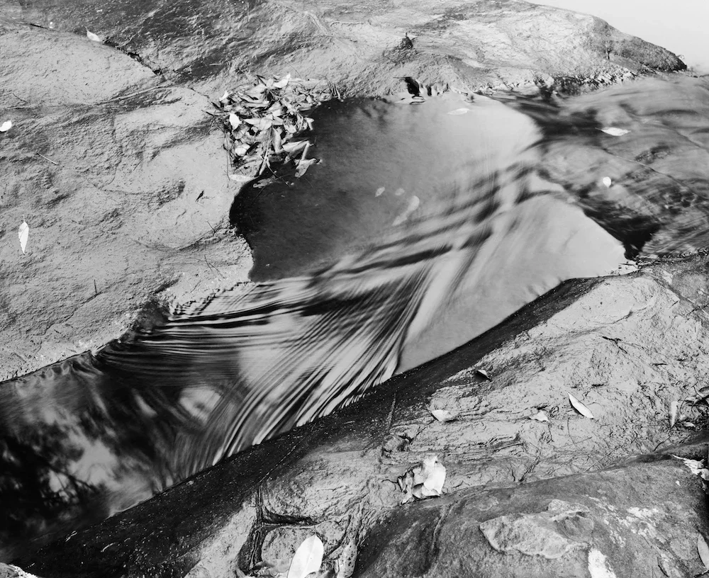
Grace Pg 93, Mountain Creek, Chillingham, Northern NSW, Rob Olver, n.dAre the photographers intention clear? What does it communicate?
The photographs document each devastating event in Australia’s early 2020’s well. Capturing the damage and devastation. We are struck by how desolate and broken things look. How drought stricken the land is, how even metal burns in a fire. Yet towards the end of the book, we see the title run true. Photos and words that project hope begin to weave into the sequence. An intentional attempt at creating light from dark situations. We see people gathered outdoors, uplifting landscapes and notes of colour deliberately used to lift the mood and feelings associated with the work.
What style of photography?
The photographs within this book are largely monochromatic, consisting of largely soft midtones. There is an absence of texture or fine detail, prioritising a look of gloom.
Towards the end of the book however some images begin to feature pops of colour, making certain elements stand out, as well as infusing a glimmer of hope into the book.
Do the techniques suit the subject matter?
The softness in which each of these images are captured, and the use of midtones suit the photographs and concept well. They have a historical and somewhat dreamlike feel about them, like memories from a hectic time, which is accurate.

Grace Pg 95, Byron Bay main beach, Northern NSW, Rob Olver, 2015What are the key images?
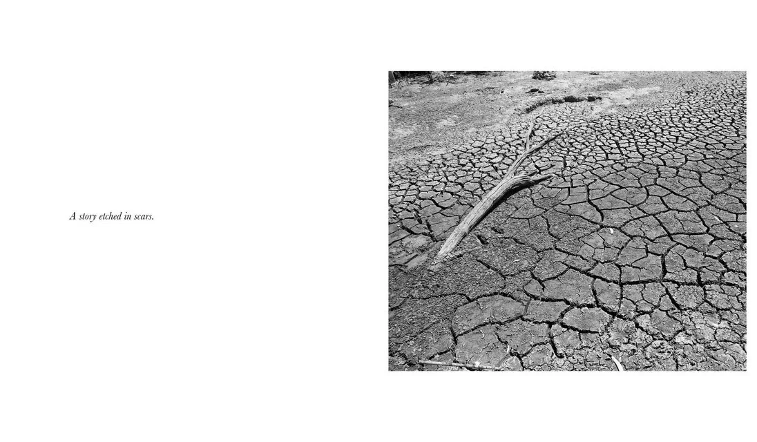
The image I find most impactful is the one on page 54. It shows a half burnt road sign next to a blackened, fire ravaged bushland. This image really captures the power and devastation of the fires. The ash smudges and deformed sign is only half decipherable. Metal burnt. As someone who lives in the bush this photo really captures that power and fear fires hold over Australians every year.
The other image I find to be really captivating, and vital to the visual narrative is one on page 94. This image captures a variety of people spread out across a beach. So many people carrying on their lives, enjoying the sun and just being happy. A shift from many of the earlier images. This photo draws the book to a close. Providing hope to the end of a darker narrative.
Page Layout
Consider the placement of the images?
All photographs in Grace are positioned to the right page of each spread and are centred on the page. The negative space surrounding them allows for a moment of pause, and provides breathing space for the photos. This space is needed given the overall darkness across the images.
Is there visible logic or intention?
Like many of the other books I have researched, this one too has a dairy-like feel about it. Like a record of events. Each image flows onto the next one with the same overarching context behind them. Whilst the scale and ratio of the images varies, they all feature the same amount of margin space to their sides and are perfectly centred, the only change being the space above and below. This shifts depending on if the always landscape orientated images are of a 3x2 or a 4x5 ratio.
Text
Grace Pg 27, Walgett, North West NSW, Rob Olver, 2019What fonts have been used?
A serif font has been used throughout the book adding an air of seriousness to it, which suits the subject matter. The book also remains in lowercase lettering throughout, which softens it.
What has been included?
The French folds both include text on them. The front of the book features a summary of the book and the final page includes a short biography of the book’s authors.
Page 5 of the book includes an introduction by Olver describing the meaning and inspiration behind the book’s title and how it relates to the context of the book. Discussing how he uses ‘grace’ as a term for resilience in trying times, particularly in relation to the events of 2020 and the years surrounding.
What is the text and image relationship to each-other?
Throughout the book, various events are signposted by small titles marking a shift in subject matter in the images to come. These include flood, drought, fire, covid 19 and grace.
Small quotes also sit centred on pages adjacent to photos. For drought for example, it reads “Torrents of dreams pound against a wall of enmeshed debris” (Pg 8). The following photo shows just that, debris heaped against a straining fence.
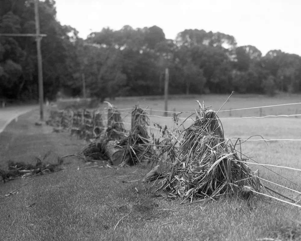
Grace Pg 9, Flood Debris, Dulguigan, Northern NSW, Rob Olver, 2017Editing and sequencing
Have pairings been used?
There is no pairing in the images however each is linked by their overarching topic. As one image transitions to the next, geometry does seem to link each composition for a cohesive and casual flow throughout the book.
Does it seem haphazard or intentional?
The sequencing is highly intentional. On third inspection of the book it becomes clear that each section, marking a different natural disaster ends with a more uplifting image. A moment of grace. The fire series ends with a coloured image showing new growth for example.
Overall Design
How has scale been used?
The book is a medium square format which suits a handheld reading well. This is a similar scale to which I may print my own book.
What paper stock?
The inner pages have been printed on a fairly smooth, bright white, thicker paper leaving a slight sheen to each photo.
The soft cover has been printed on a smooth, rather waxy paper with minimal sheen.
Have end sheets been included?
The book has no end sheets but does include French folds that fold to half the inner width.
Has a colophon been included?
The colophon of this book features information regarding publishing details, copyright information, and credits to the designers behind the book’s construction.
What inspires me?
From this book I am inspired to include captions to each image at then end of my own publication. I think it provides valuable context for those who want the option to read it without detracting from the images by having it throughout.
I also am interested in the consistent layout of each page. By keeping the layout more static the viewer is able to spend more time contemplating the images rather then searching them. Whilst a more dynamic layout would suit many books, the nature of this one, and my own suits a more consistent approach.