photobook analysis
teetering like a september myth
Angus Scott, 2022
Published by Photo Collective
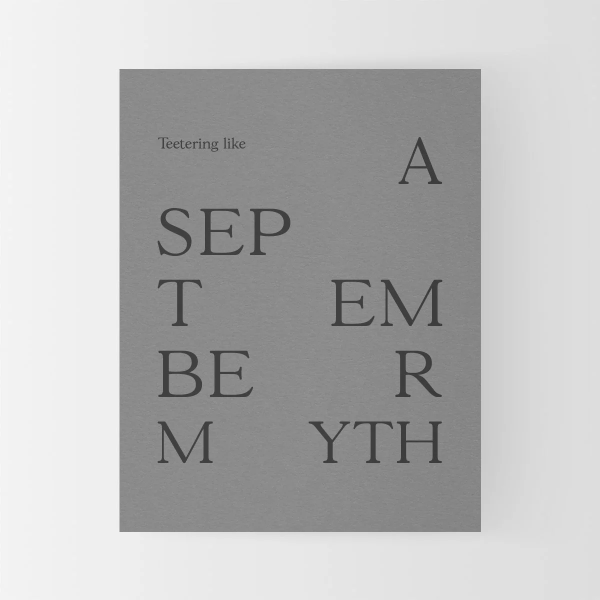
Teetering like a September myth - Book, Angus Scott, 2022The cover
No image has been used on this cover, leaving the design purely typographic. We are treated by a plain grey background, a soft muted midtone against a darker grey font. This combination evokes a sense of uncertainty and coldness at first glance despite the books almost personal feeling size. It sits at an around A5 scale, allowing for a hand held encounter. This provides a somewhat diaristic and quiet feeling for viewers to contrast the stormy tones its cover adorns.
The word teetering when combined with the intentional placement of each character gives a sense of unease. The way in which the characters are spaced links back to the word teetering. They are unstable, disjointed and confused.
Teetering like a September myth - Book, Angus Scott, 2022Role of text within the book
The initial text talks of finite existence. Things changing and ending. A time limit to seasons and life forms.
2 Pages in we see a paragraph to the left with a poetic extract describing a change in seasons.
On the right a small sentence, and a question stands “Or can I, truly, understand this? This sentence highlights the photographers own apparent indecisiveness about his work, giving a sense of creating for the purpose of creating, without a clear guiding meaning underpinning his initial workflow. Though from this initial glance this can only be guessed.
On a second inspection of the book I discovered additional text hidden within the cover. Text that speaks of grief and loss – which fits the typographic design. It also speaks of the changing seasons, how winter feels as though it takes things from us. And a hope for a coming summer.


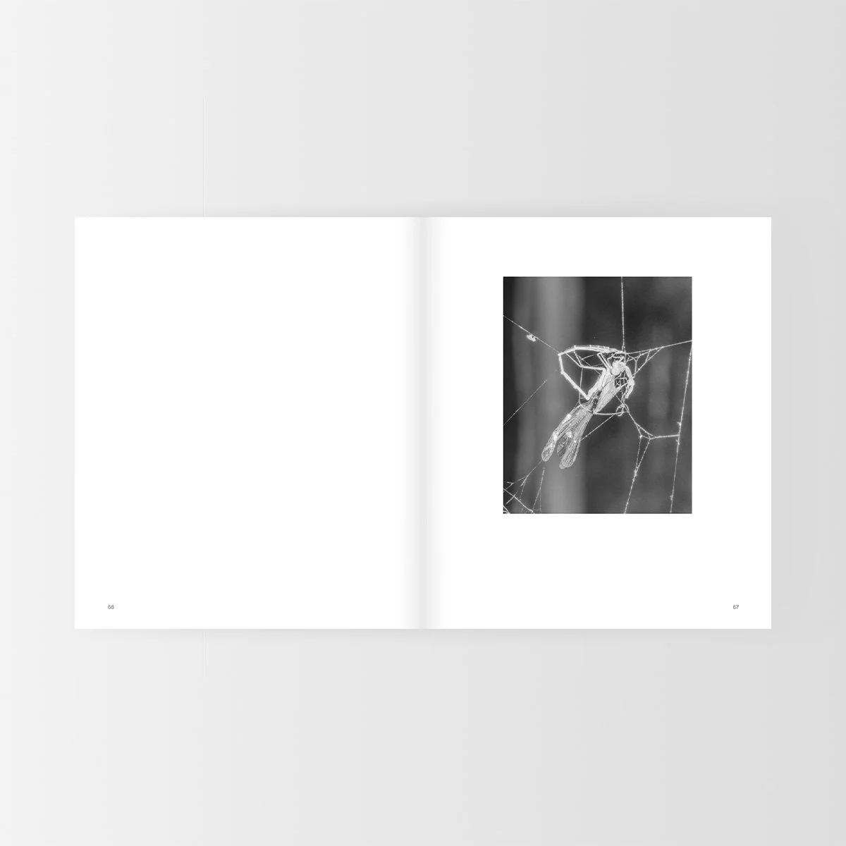
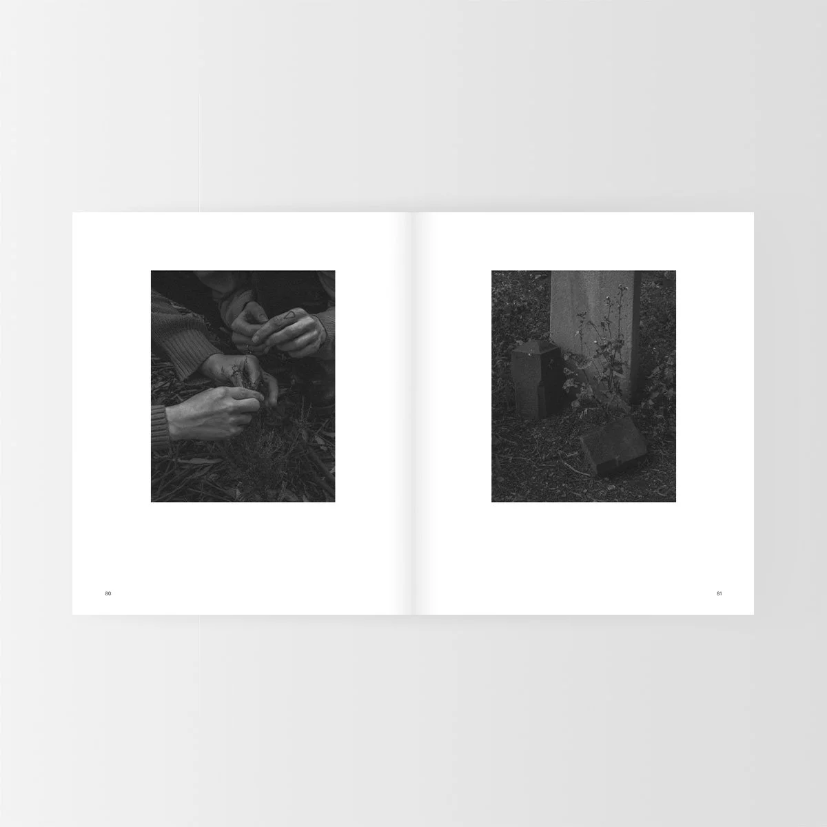
From: Teetering like a September myth, Angus Scott, 2022Teetering like a September myth - Pg. 35, Angus Scott, 2022Halfway through the book it shifts. There is a text exert on page 29 that discusses standing within a graveyard and holding ones breath as they drove past graveyards as a child. Talking about the process of standing there as a moment of ‘Untethering’. A sense of disconnection comes from this. The images immediately following this feel tight and gripping, like clinging on to something. A tree trunk strangled by a chain, a bird clinging to a hand. Birds captured in a frantic flight.
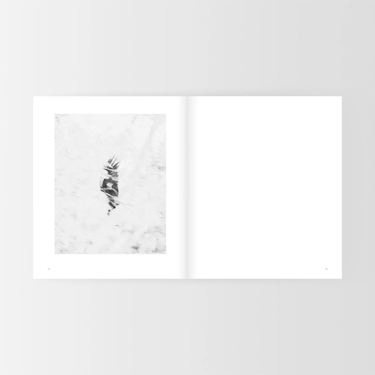
These images then descend into a more peaceful setting. A bird drinking from water. Representing the state of eventual ‘untethering’ Of relaxing.
The next exert of texts speaks of recognizing birds as individuals not just a collective ecosystem.
‘As I held my closest friend through morning, I remember what my father would tell me during moments of unease. Sit quiet, listen and count the birds. Each new call, a new individual.” Pg 45. Following this page we see an empty bird cage. The images after this point get darker.
Teetering like a September myth - Book, Angus Scott, 2022Photography
What does it communicate?
The photographs appear to sort of cling on. A nest wound around branches, an eye tightly closed. Someone taking their first step out of bed and a bird resting on a wire.
Is the photographer’s intention clear?
Yes and no, we feel the grief and jorney, and seasonal influence on his emotions and visual narrative, though his ups and downs do not feel planned. They feel experienced and recorded.
What style of photography does this book exhibit?
It is rather abstract and fleeting in nature. Capturing both brief moments with movement and moments of stillness too. It captures stills landscapes birds and human influence too.


Do the techniques used suit the subject matter?
The use of a sort of hazy high-key style suits the theme. It feels almost heavenly, within the light. A bit dissociative. The haze makes it feel as though something is not quite right, and the detail lost to highlights gives a sense of something missing.
What are the key images?
Two photographs that really stuck out to me are on pages 25 and 26 where we see an initial nostalgic feeling image of a tire swing hung from a tree. In the next page the swing is gone. A sense of absence remains.

Image from: Teetering like a September myth - Book, Angus Scott, 2022Sequencing and editing
what is the narrative?
This book follows a story of grief and acceptance. It feels really fleeting and journey based. Unplanned but taken as a reflection of the photographer’s journey over time.
The photographs colors emotion and subject matter reflect these shifts. From light to dark, varying in chaos to peace.
Is the sequencing haphazard or intentional?
You can tell the images are taken through a stream of consciousness over a period of time, though the layout created in post are chronical in feel.
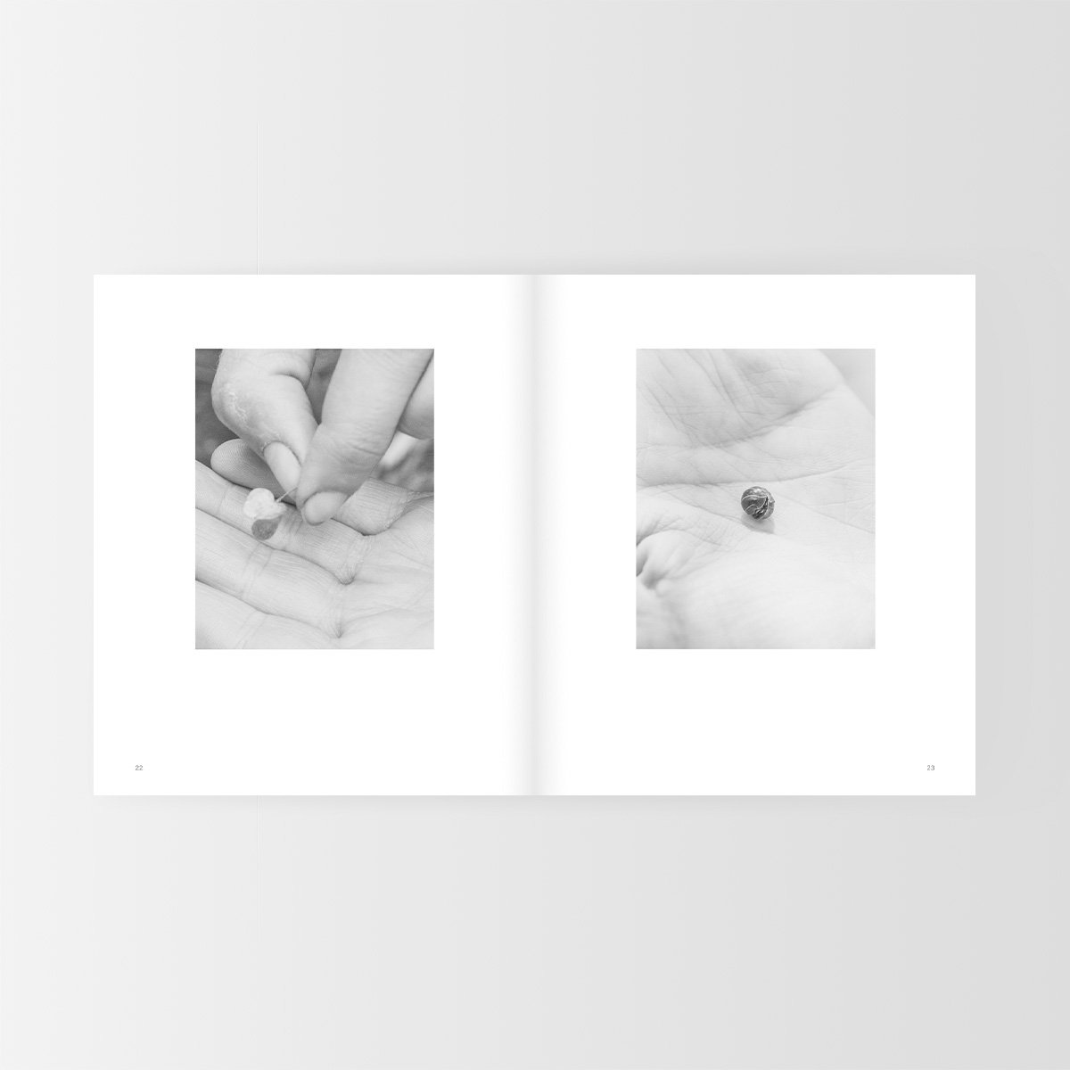
Teetering like a September myth, Pg 22-23, Angus Scott, 2022Page Layout
Following the initial text at the beginning of the book, we are stopped by a blank spread. This may be an intentional break between words and pictures. Perhaps to allow the viewer longer to digest his words, or to wipe our memories clean of them?
The layout is quite variable. Some images on the left some on the right. Images with slight variation in scale. There is little logic to their placement with some center aligned and some to the left or right of the page margins. We the viewers have to hunt for the images ourselves, immersing us within the book. Though none bridge the gutter. They all have a clear margin around the page.
This negative space around each already quite high-key image feels cohesive and settled in a way.

Teetering like a September myth, Pg 60-61, Angus Scott, 2022Overall Design
The paper stock used for this book suits it conceptually. The paper feels fairly thick. It is raw and unpolished suiting the reflective and personal nature of the book. This paper choice could be seen to resemble a journal in a way.

Teetering like a September myth, Angus Scott, 2022Personal reflection
What I am most inspired by in this book is the cover and use of colour and typography. Together these two elements work well to convey the inside mood and narrative within the book. The simplicity of the design both in terms of its materiality and aesthetic qualities work well with the concept. I would like to investigate the use of a purely typographic cover for my own book, as well as using more uncoated paper choices as I feel these lend a more personal and intimate feel. It bridges the gap between viewer and the photographer somehow.
I also like the use of single photos to a page with plenty of breathing room as this helps really accentuate each individual image. Given my photos are so symbolic, I need the photos as large as possible on each page, with appropriate borders, to allow viewers to pause and focus on one at a time.